
Alien: Romulus fonts
Film directed by Fede Alvarez for 20th Century Studios, released in cinemas in August 2024.
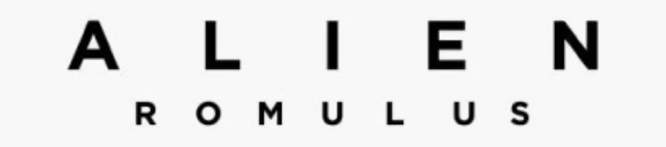
- ALIEN ROMULUS logo: Neue Helvetica (our visual match)
- Billing block and release date on the poster: Refrigerator Deluxe (our visual match)
Try the free alternatives
Type anything to see it in each free font suggested for the lettering you pick. Select a font's name to test it further and download it.
-
Alien: Romulus
-
Alien: Romulus
-
Alien: Romulus
-
Alien: Romulus
ALIEN ROMULUS logo
| What it is | A retail typeface |
|---|---|
| Typeface | Neue Helvetica |
| Foundry | Linotype |
| Licence | Commercial: sold by the foundry, and most uses need a paid licence. |
Our visual match Our own judgement after comparing the lettering side by side.
A DaFont thread from March 2024 that shows the stacked logo above the billing block is marked as identified with Neue Helvetica, on one member's answer, which nobody else confirmed, so this is our visual judgement rather than an agreed identification. The image has heavy, widely spaced ALIEN over a lighter, wider ROMULUS, and the plain grotesque shapes agree with that family; we compared them with the library's Helvetica-style fonts and did not test the retail fonts. 20th Century Studios has not named the typeface.
Sources: Alien ROMULUS (DaFont forum), Neue Helvetica (MyFonts)
License Neue Helvetica from Linotype
Free alternatives
-
Inter, weight 700 Similar
At weight 700 the same neutral grotesque capitals, with a round O and a straight-legged R close to the ROMULUS line. The letters are narrower than the logo's wide cut.
Compared by eye against the original.
-
Arimo, weight 700 Similar
At weight 700 Helvetica-like proportions and level-cut stroke ends on the S. Its R has a slanted leg and the letters are narrower.
Compared by eye against the original.
-
Archivo Black Similar
Heavy, wide capitals that suit the ALIEN line, with a square E and blunt A. It has no lighter weight for the second line.
Compared by eye against the original.
-
Roboto, weight 700 Similar
At weight 700 clean, even capitals of similar colour. The curves are slightly squarer and the M is narrower.
Compared by eye against the original.
Billing block and release date on the poster
| What it is | A retail typeface |
|---|---|
| Typeface | Refrigerator Deluxe |
| Designer | Mark Simonson |
| Foundry | Mark Simonson Studio |
| Licence | Commercial: sold by the foundry, and most uses need a paid licence. |
Our visual match Our own judgement after comparing the lettering side by side.
A DaFont thread from August 2024 that shows the foot of the poster, with the credits and the line giving the August 16 release date, is marked as identified with Refrigerator Deluxe on one member's answer, which nobody else confirmed, so this is our visual judgement rather than an agreed identification. The sample has narrow block capitals with squared curves and wide letterspacing, which fits the foundry's description of a face based on mid-century block lettering. We did not test the retail font.
Sources: Alien Romulus Poster Font (DaFont forum), Refrigerator Deluxe (Mark Simonson Studio)
License Refrigerator Deluxe from Mark Simonson Studio
Free alternatives
-
Big Shoulders Text, weight 700 Similar
At weight 700 narrow block capitals with straight sides and tight corners on the D and O, like the names in the credits. The strokes are slightly thinner.
Compared by eye against the original.
-
Saira Extra Condensed, weight 600 Similar
At weight 600 condensed capitals with squared curves and an even stroke. Its R and S are a little rounder.
Compared by eye against the original.
-
Bebas Neue Similar
Compact all-capitals letters of the same height and weight. The bowls are rounder, so it looks less like sign lettering.
Compared by eye against the original.
-
Barlow Condensed, weight 600 Same mood
At weight 600 a sturdy condensed sans with rounded corners. It is wider and softer than the poster type.
Compared by eye against the original.
What the labels mean
- Our visual match: Our own judgement after comparing the lettering side by side.
- Similar: The same style, with differences you can see.
- Same mood: Gives the same feel without being a look-alike.
What we link to
We link only to owners (the rights holder, the foundry or its official reseller) and to designers' own pages, and we host a fan-made font only with its designer's permission. Every free alternative is published under an open licence and downloads from its page on this site.
More from Alien
Alien: Romulus and Alien are trademarks of 20th Century Studios. Simple But How is not affiliated with or endorsed by 20th Century Studios.