
Assassin's Creed (2007) font
Action-adventure game set during the Third Crusade, developed by Ubisoft Montreal for PlayStation 3 and Xbox 360.
- Game
- 2007
- Assassin's Creed
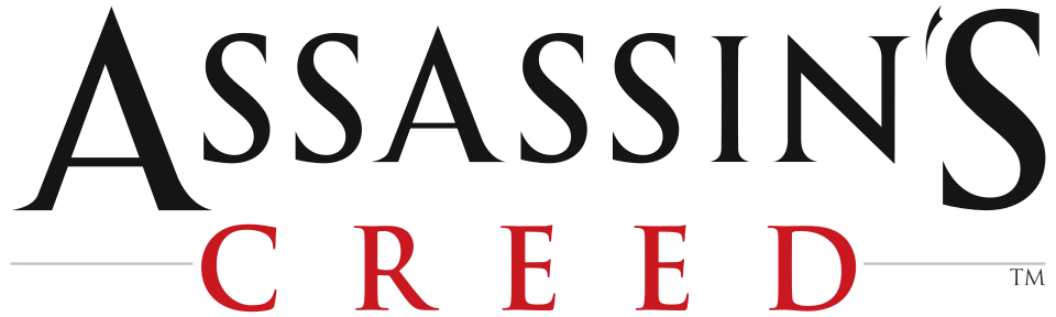
- ASSASSIN'S CREED wordmark in the logo: Modified Trajan (our visual match)
Try the free alternatives
Type anything to see it in each free font. Select a font's name to test it further and download it.
-
Assassin's Creed
-
Assassin's Creed
-
Assassin's Creed
ASSASSIN'S CREED wordmark in the logo
| What it is | A typeface that was altered for this title |
|---|---|
| Typeface | Trajan |
| Designer | Carol Twombly |
| Foundry | Adobe |
| Licence | Commercial: sold by the foundry, and most uses need a paid licence. |
Our visual match Our own judgement after comparing the lettering side by side.
Ubisoft has not named a font, and we found no thread about the 2007 logo itself. A DaFont thread on the Revelations logo is marked identified as Trajan Bold, slightly modified, and a thread on Assassin's Creed III answers its logo with Trajan; by our comparison the 2007 wordmark is the same lettering. We set ASSASSIN'S CREED in Adobe Fonts' tester for Trajan and the S, I and N match, while the logo's A is enlarged with a long hairline stroke, its final S is oversized with a hooked tail, and its weight sits between Trajan's Regular and Bold. CREED is set below in widely spaced red capitals.
Sources: Font for Assasin's Creed Revelations? (DaFont forum), Assassin's Creed 3 Font? (DaFont forum), Trajan (Adobe Fonts)
Free alternatives
-
Cinzel, weight 600 Similar
Cinzel is modelled on the same Roman inscriptional capitals as Trajan, so S, I and N have the same flared serifs and stroke contrast. It is wider than the logo and has no enlarged A or hooked final S.
Compared by eye against the original.
-
Cormorant SC, weight 600 Similar
Narrow, high-contrast roman capitals close to the logo's proportions. Its serifs are finer and more Garamond-like than Trajan's.
Compared by eye against the original.
-
Marcellus SC Same mood
Classical capitals with flared rather than serifed ends, giving the same carved-stone feel. It reads lighter and has no true serifs.
Compared by eye against the original.
What the labels mean
- Our visual match: Our own judgement after comparing the lettering side by side.
- Similar: The same style, with differences you can see.
- Same mood: Gives the same feel without being a look-alike.
What we link to
We link only to owners (the rights holder, the foundry or its official reseller) and to designers' own pages, and we host a fan-made font only with its designer's permission. Every free alternative is published under an open licence and downloads from its page on this site.
More from Assassin's Creed
- Assassin's Creed Valhalla (2020, game) ASSASSIN'S CREED wordmark in the logo: Modified Trajan
- Assassin's Creed (2016, film) ASSASSIN'S CREED wordmark on the poster: Modified Trajan
- Assassin's Creed IV: Black Flag (2013, game) ASSASSIN'S CREED IV wordmark in the logo: Modified Trajan
- Assassin's Creed II (2009, game) ASSASSIN'S CREED II wordmark in the logo: Modified Trajan
Assassin's Creed is a trademark of Ubisoft. Simple But How is not affiliated with or endorsed by Ubisoft.