
Dune (2021) font
Denis Villeneuve's adaptation of the first half of the novel, produced by Legendary Pictures and released by Warner Bros.
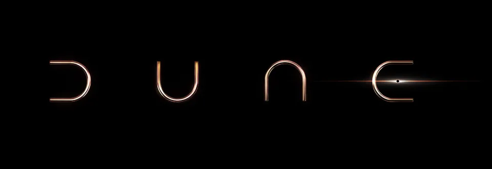
- DUNE wordmark: Custom lettering (community identification)
Try the free alternatives
Type anything to see it in each free font. Select a font's name to test it further and download it.
-
Dune
-
Dune
-
Dune
-
Dune
DUNE wordmark
| What it is | Custom lettering drawn for this title, not a font you can install |
|---|---|
| Licence | Proprietary: owned by the rights holder and not offered for licensing. |
Community identification Agreed by people who identify fonts, with no official word.
A Fonts In Use entry on a poster for the film describes DUNE as the official title treatment, created by Legendary in custom letterforms, and says the word reads the same upside down. Each letter is one thin U-shaped stroke turned a different way, with a dot inside the E. The studio publishes no font of it; the entry names the free fan-made recreation Dune Rise.
Sources: Dune (2021) poster (Fonts In Use)
Fan-made replicas
Fonts made by fans to recreate this lettering. They are not official, and each author sets their own terms.
- Dune Rise by Fontswan (Jesta Designs). Free.
Sources: Dune Rise by Fontswan (DaFont), Dune (2021) poster (Fonts In Use)
Free alternatives
-
Quicksand, weight 300 Similar
At weight 300 it draws D and U with the same thin, even line, round bowls and rounded ends. Its N and E are ordinary letters, where the logo repeats one U shape four times.
Compared by eye against the original.
-
Comfortaa, weight 300 Similar
At weight 300 it has thin, even strokes with fully rounded ends and a round-bottomed U. It is slightly heavier than the logo, again with a conventional N and E.
Compared by eye against the original.
-
Nova Round Same mood
Its N is an arch, the one letter here that echoes the logo's turned U. It is far heavier than the logo, with slanted stroke ends.
Compared by eye against the original.
-
Gruppo Same mood
Wide, thin, loosely spaced capitals that give the same spare look. All four letters keep their conventional shapes.
Compared by eye against the original.
What the labels mean
- Community identification: Agreed by people who identify fonts, with no official word.
- Similar: The same style, with differences you can see.
- Same mood: Gives the same feel without being a look-alike.
What we link to
We link only to owners (the rights holder, the foundry or its official reseller) and to designers' own pages, and we host a fan-made font only with its designer's permission. Every free alternative is published under an open licence and downloads from its page on this site.
More from Dune
- Dune: Part Two (2024, film) DUNE wordmark: Custom lettering
- Dune: Prophecy (2024, TV show) DUNE wordmark in the logo: Custom lettering
- Dune: Spice Wars (2022, game) DUNE wordmark in the logo: Custom lettering
- Dune (1984, film) DUNE title in the opening credits and logo: Modified Albertus
- Dune (1965, book) Title on the Berkley and Ace paperbacks, 1975 to 1988: Davison Art Nouveau
Dune is a trademark of Legendary (films, series and games) and Herbert Properties LLC (novels). Simple But How is not affiliated with or endorsed by Legendary (films, series and games) and Herbert Properties LLC (novels).