
Five Nights at Freddy's (2023) fonts
Horror film directed by Emma Tammi for Blumhouse Productions and released by Universal Pictures.
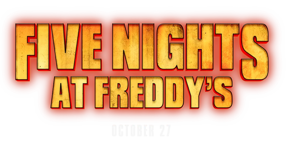
- Title on the theatrical poster: Compacta Bold (community identification)
- Neon title on the teaser: Dohrma (community identification)
Try the free alternatives
Type anything to see it in each free font suggested for the lettering you pick. Select a font's name to test it further and download it.
-
Five Nights at Freddy's
-
Five Nights at Freddy's
-
Five Nights at Freddy's
-
Five Nights at Freddy's
Title on the theatrical poster
| What it is | A retail typeface |
|---|---|
| Typeface | Compacta Bold |
| Designer | Fred Lambert |
| Foundry | Letraset (digital version from ITC) |
| Licence | Commercial: sold by the foundry, and most uses need a paid licence. |
Community identification Agreed by people who identify fonts, with no official word.
In a DaFont forum thread about the poster title, two replies name Compacta, one of them Compacta Bold; the thread is not marked identified and Universal has not named a font. We typed the title into the type tester on the reseller's Compacta page, and Compacta Bold matches the tight, heavy condensed capitals, the spurred G and the straight-legged R. On the poster the letters are filled with a scratched yellow texture and outlined in red.
Sources: FNAF Movie Logo Font? (DaFont forum), Compacta by ITC (MyFonts)
License Compacta Bold from Letraset (digital version from ITC)
Free alternatives
-
Anton Similar
Heavy condensed capitals with the same tight spacing and slot-like counters. Its curves are rounder than Compacta's squared bowls.
Compared by eye against the original.
-
Big Shoulders Display, weight 900 Similar
At weight 900 narrow, squared capitals close to Compacta's construction. It is a little lighter, with more space inside the letters.
Compared by eye against the original.
-
Sofia Sans Extra Condensed, weight 900 Similar
At weight 900 it matches the title's dark colour. Its letters are slightly wider and its curves softer.
Compared by eye against the original.
-
League Gothic Similar
Condensed gothic capitals of the same tall proportions. It is noticeably lighter than Compacta Bold.
Compared by eye against the original.
Neon title on the teaser
| What it is | A retail typeface |
|---|---|
| Typeface | Dohrma |
| Designer | Jonathan Hill |
| Foundry | The Northern Block |
| Licence | Commercial: sold by the foundry, and most uses need a paid licence. |
Community identification Agreed by people who identify fonts, with no official word.
A DaFont forum thread about the green and orange neon teaser logo is marked identified as Dohrma, after an earlier reply suggested Compacta and was rejected. Neither Blumhouse nor Universal has named the font. The foundry presents Dohrma as a modern revival of Othello and lists alternate forms of N and Y among its features. We typed the title into the foundry's type tester: the flat-topped A, squared D and R and heavy rounded-square shapes agree, and the logo's N with a rounded shoulder and its Y shaped like a lowercase y match the kind of alternates the foundry describes, which we did not switch on.
Sources: fnaf movie teaser font? (DaFont forum), Dohrma (The Northern Block)
License Dohrma from The Northern Block
Free alternatives
-
Bungee Similar
Heavy rounded-square capitals whose Y is cup-shaped like the logo's. It is wider and has no stroke contrast.
Compared by eye against the original.
-
Squada One Similar
Condensed squared capitals with a similar upright, blocky rhythm. It is lighter, and its N and Y are conventional.
Compared by eye against the original.
-
Teko, weight 700 Similar
At weight 700 heavy squared capitals with small counters. Its letters are narrower and its corners sharper.
Compared by eye against the original.
-
Big Shoulders Display, weight 900 Same mood
At weight 900 tall, dense capitals with a similar marquee feel. Its letters are much narrower and less square.
Compared by eye against the original.
What the labels mean
- Community identification: Agreed by people who identify fonts, with no official word.
- Similar: The same style, with differences you can see.
- Same mood: Gives the same feel without being a look-alike.
What we link to
We link only to owners (the rights holder, the foundry or its official reseller) and to designers' own pages, and we host a fan-made font only with its designer's permission. Every free alternative is published under an open licence and downloads from its page on this site.
More from Five Nights at Freddy's
Five Nights at Freddy's is a trademark of Scott Cawthon. Simple But How is not affiliated with or endorsed by Scott Cawthon.