
Friends: The Reunion fonts
Unscripted reunion special released on HBO Max in May 2021, produced by Warner Bros. Unscripted Television with Fulwell 73.
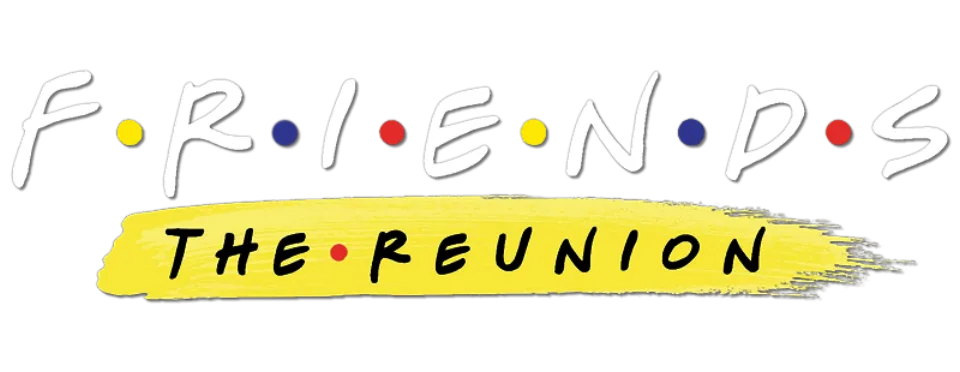
- FRIENDS wordmark in the logo: Custom lettering (our visual match)
- THE REUNION line in the logo: Not identified
Try the free alternatives
Type anything to see it in each free font suggested for the lettering you pick. Select a font's name to test it further and download it.
-
Friends: The Reunion
-
Friends: The Reunion
-
Friends: The Reunion
-
Friends: The Reunion
-
Friends: The Reunion
FRIENDS wordmark in the logo
| What it is | Custom lettering drawn for this title, not a font you can install |
|---|---|
| Licence | Proprietary: owned by the rights holder and not offered for licensing. |
Our visual match Our own judgement after comparing the lettering side by side.
No source discusses the special's logo. On the key art issued with the trailer, the wordmark is by our comparison the series logo unchanged, in white with red, blue and yellow dots. That the series logo is hand lettering and not a font is our own reading; the DaFont request about it is answered only with a fan-made recreation.
Sources: Official Trailer & Key Art Released For HBO Max's Friends: The Reunion (Warner Bros. Discovery press release), Serie Friends (DaFont forum), Gabriel Weiss' Friends (DaFont)
Fan-made replicas
Fonts made by fans to recreate this lettering. They are not official, and each author sets their own terms.
- Gabriel Weiss' Friends by Gabriel Weiss. Donationware: free to use, and the author asks for a donation.
Sources: Gabriel Weiss' Friends (DaFont), Serie Friends (DaFont forum)
Free alternatives
-
Mansalva Similar
Marker strokes of about the logo's weight, with rounded ends and a slight forward lean. Its I carries bars at top and bottom, and its letters are wider and more regular than the logo's.
Compared by eye against the original.
-
Covered By Your Grace Similar
Quick marker capitals with a zigzag S and uneven heights, close to the logo's nervous rhythm. It is lighter and much narrower.
Compared by eye against the original.
-
Gochi Hand Similar
Round-ended marker lettering with the same casual, slightly uneven look. It is heavier and wider, and its curves are smoother and tidier.
Compared by eye against the original.
-
Kalam, weight 700 Same mood
At weight 700 a slanted felt-pen hand of similar blackness. Its letters are regular and evenly proportioned, so it lacks the logo's jumpy shapes.
Compared by eye against the original.
-
Permanent Marker Same mood
A broad marker face with the right informality. It is much heavier, with rough edges and blunt stroke ends where the logo's are rounded.
Compared by eye against the original.
THE REUNION line in the logo
This font has not been identified. Nothing we found identifies this line. It is black marker capitals on a yellow paint stroke, with a red dot between the two words, drawn to echo the series logo. A search of Fonts In Use and of the DaFont forum turned up no thread about it.
Free alternatives
-
Mansalva Similar
Slanted marker capitals of about the same weight with rounded stroke ends, close to the line under the logo. Its I has bars at top and bottom and its letters are a little wider.
Compared by eye against the original.
-
Kalam, weight 700 Similar
At weight 700 a slanted felt-pen hand of similar thickness. Its shapes are more regular than the hand-drawn line.
Compared by eye against the original.
-
Gochi Hand Similar
Round-ended marker lettering with the same informal feel. It is upright, heavier and wider.
Compared by eye against the original.
-
Nanum Pen Script Same mood
A lighter brush-pen hand with lively, uneven capitals. Its strokes are thinner and taper at the ends.
Compared by eye against the original.
What the labels mean
- Our visual match: Our own judgement after comparing the lettering side by side.
- Similar: The same style, with differences you can see.
- Same mood: Gives the same feel without being a look-alike.
What we link to
We link only to owners (the rights holder, the foundry or its official reseller) and to designers' own pages, and we host a fan-made font only with its designer's permission. Every free alternative is published under an open licence and downloads from its page on this site.
More from Friends
Friends: The Reunion and Friends are trademarks of Warner Bros. Entertainment. Simple But How is not affiliated with or endorsed by Warner Bros. Entertainment.