
A Knight of the Seven Kingdoms font
HBO prequel series created by Ira Parker and George R. R. Martin, first shown in January 2026.
- TV show
- 2026
- Game of Thrones
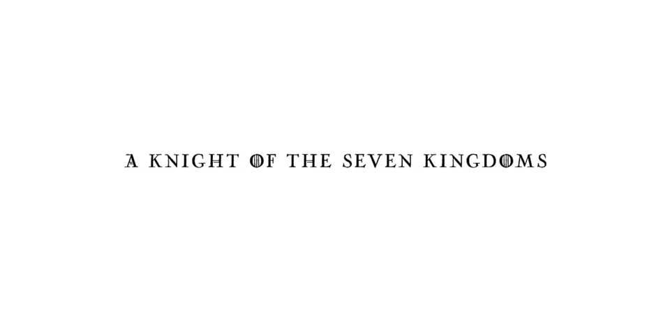
- Series logo: Modified Trajan (our visual match)
Try the free alternatives
Type anything to see it in each free font. Select a font's name to test it further and download it.
-
A Knight of the Seven Kingdoms
-
A Knight of the Seven Kingdoms
-
A Knight of the Seven Kingdoms
-
A Knight of the Seven Kingdoms
-
A Knight of the Seven Kingdoms
Series logo
| What it is | A typeface that was altered for this title |
|---|---|
| Typeface | Trajan |
| Designer | Carol Twombly |
| Foundry | Adobe |
| Licence | Commercial: sold by the foundry, and most uses need a paid licence. |
Our visual match Our own judgement after comparing the lettering side by side.
Nobody has identified this logo: the only DaFont thread about the series has no answer, and the person asking says only that the lettering resembles Nicolas Cochin without matching it. By our own comparison with the reseller's type tester the capitals follow Trajan in the S, E, V, N, G, D and M, and the O carries the vertical bars of the Game of Thrones logo, which the community traces to modified Trajan. Beside the logo on Wikimedia Commons the strokes are of regular weight, not bold, the letters are narrow, and the K has a longer leg than Trajan's.
Sources: A Knight of the Seven Kingdoms font (DaFont forum), A Game of Thrones Font? (DaFont forum), Trajan by Adobe (MyFonts)
Free alternatives
-
Cinzel, weight 500 Similar
At weight 500 it has the stroke weight of the logo and the same Roman capitals in S, E, V, N and M. Its letters are wider, its K has a short plain leg where the logo's is long, and its O has no bars.
Compared by eye against the original.
-
Castoro Titling Similar
Classical titling capitals with a wide M and round O in Trajan's proportions. It is lighter, set with more space between the letters, and its serifs are finer.
Compared by eye against the original.
-
Marcellus SC Similar
Roman capitals with flared stroke endings in place of full serifs, and less contrast. The proportions follow Trajan, but the terminals of S and C and the leg of R are simpler.
Compared by eye against the original.
-
Cormorant SC, weight 500 Similar
At weight 500 an elegant serif whose lowercase is small capitals, which suits lettering set in large and small capitals. It is a Garamond-style face: higher contrast, sharper serifs and a narrower M than Trajan.
Compared by eye against the original.
-
Forum Similar
Light Roman capitals with classical proportions and small flared serifs. It is thinner than Trajan Regular and its round letters are narrower.
Compared by eye against the original.
What the labels mean
- Our visual match: Our own judgement after comparing the lettering side by side.
- Similar: The same style, with differences you can see.
What we link to
We link only to owners (the rights holder, the foundry or its official reseller) and to designers' own pages, and we host a fan-made font only with its designer's permission. Every free alternative is published under an open licence and downloads from its page on this site.
More from Game of Thrones
A Knight of the Seven Kingdoms and Game of Thrones are trademarks of Home Box Office (television series) and George R. R. Martin (novels). Simple But How is not affiliated with or endorsed by Home Box Office (television series) and George R. R. Martin (novels).