
Grand Theft Auto VI font
Next main game in the series, set in the state of Leonida; Rockstar Games lists it for release on 19 November 2026 on PlayStation 5 and Xbox Series X|S.
- Game
- 2026
- Grand Theft Auto
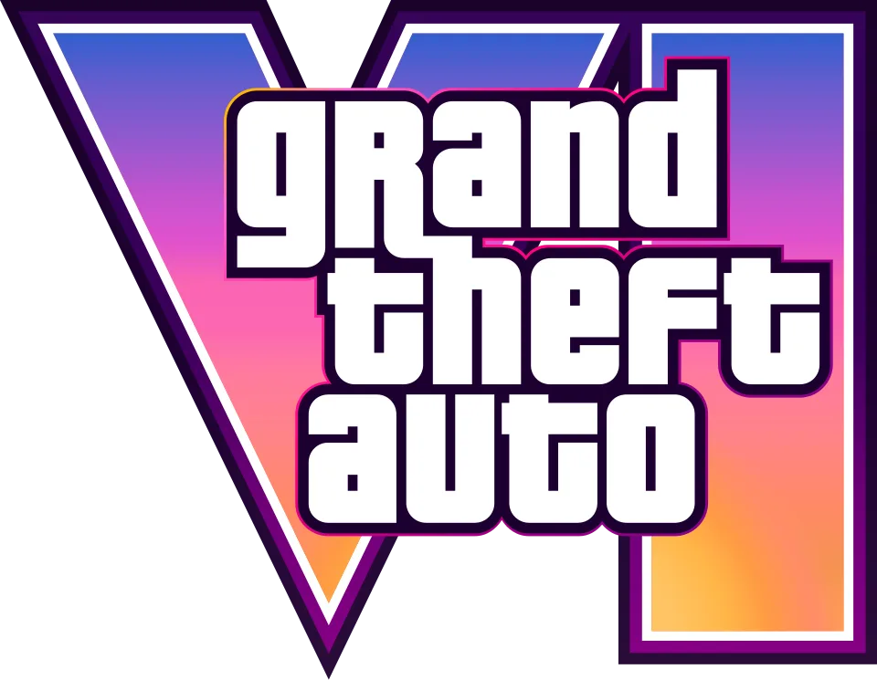
- grand theft auto wordmark in the logo: Pricedown (our visual match)
Try the free alternatives
Type anything to see it in each free font. Select a font's name to test it further and download it.
-
Grand Theft Auto VI
-
Grand Theft Auto VI
-
Grand Theft Auto VI
-
Grand Theft Auto VI
grand theft auto wordmark in the logo
| What it is | A retail typeface |
|---|---|
| Typeface | Pricedown |
| Designer | Ray Larabie |
| Foundry | Typodermic Fonts |
| Licence | Commercial: sold by the foundry, and most uses need a paid licence. |
Our visual match Our own judgement after comparing the lettering side by side.
We found no published identification of this logo. By our own comparison with the artwork on Rockstar's site, the white wordmark is the same stacked Pricedown lettering that Fonts In Use documents for Grand Theft Auto III and the games after it. The large VI behind it, filled with a pink, purple and orange gradient, is drawn artwork in the style of the earlier numerals, and no font has been proposed for it.
Sources: Grand Theft Auto VI (Rockstar Games), Grand Theft Auto III, Sony PlayStation 2 (Fonts In Use), Pricedown (Typodermic Fonts)
License Pricedown from Typodermic Fonts
Free alternatives
-
Squada One Similar
The nearest structure in our library: squared letters with rounded corners, slit-like counters and tight spacing, as in the wordmark. It is lighter and narrower, and it has ordinary lowercase where Pricedown mixes in a capital R, F and T.
Compared by eye against the original.
-
Teko, weight 700 Similar
At weight 700 its a, n, d and e are the same rounded rectangles with narrow vertical counters. It is clearly lighter and more condensed, and its t and f have plain lowercase shapes.
Compared by eye against the original.
-
Russo One Same mood
A heavy sans with squared curves that gives a similar blocky headline. It is wider and more open, with conventional letter shapes and none of the wordmark's slit counters.
Compared by eye against the original.
-
Passion One, weight 900 Same mood
At weight 900 it has the wordmark's near-solid weight, tiny counters and letters that almost touch. Its shapes are round and bulging rather than squared.
Compared by eye against the original.
What the labels mean
- Our visual match: Our own judgement after comparing the lettering side by side.
- Similar: The same style, with differences you can see.
- Same mood: Gives the same feel without being a look-alike.
What we link to
We link only to owners (the rights holder, the foundry or its official reseller) and to designers' own pages, and we host a fan-made font only with its designer's permission. Every free alternative is published under an open licence and downloads from its page on this site.
More from Grand Theft Auto
- Grand Theft Auto V (2013, game) grand theft auto wordmark in the logo: Pricedown
- Grand Theft Auto: San Andreas (2004, game) grand theft auto wordmark in the logo: Pricedown
- Grand Theft Auto: Vice City (2002, game) grand theft auto wordmark in the logo: Pricedown
- Grand Theft Auto III (2001, game) grand theft auto wordmark in the logo: Pricedown
- Grand Theft Auto (1997, game) Logo on the original PC box: Powerhouse
Grand Theft Auto VI and Grand Theft Auto are trademarks of Rockstar Games (Take-Two Interactive). Simple But How is not affiliated with or endorsed by Rockstar Games (Take-Two Interactive).