
Harry Potter and the Philosopher's Stone font
First film, directed by Chris Columbus for Warner Bros.; released in the US as Harry Potter and the Sorcerer's Stone.
- Film
- 2001
- Harry Potter
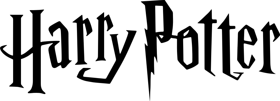
- HARRY POTTER logo: Custom lettering (community identification)
Try the free alternatives
Type anything to see it in each free font. Select a font's name to test it further and download it.
-
Harry Potter and the Philosopher's Stone
-
Harry Potter and the Philosopher's Stone
-
Harry Potter and the Philosopher's Stone
-
Harry Potter and the Philosopher's Stone
HARRY POTTER logo
| What it is | Custom lettering drawn for this title, not a font you can install |
|---|---|
| Licence | Proprietary: owned by the rights holder and not offered for licensing. |
Community identification Agreed by people who identify fonts, with no official word.
Warner Bros. has not said who drew the film logo, and nobody has matched it to a typeface. A DaFont forum request about this logo is answered with Harry P, a fan-made font, and the University of British Columbia's note on its first editions observes that the lettering of the US book cover is the one used for the films. Scholastic credits that cover lettering to Mary GrandPré; we could not establish who reworked it for the screen.
Sources: Harry Potter logo (DaFont forum), British and American Editions (UBC Library, Harry Potter first edition collection), 25 Facts About the Harry Potter Book Series (Scholastic press kit, PDF)
Fan-made replicas
Fonts made by fans to recreate this lettering. They are not official, and each author sets their own terms.
- Harry P by GemFonts / Typotheticals. Free.
Sources: Harry P by GemFonts / Typotheticals (DaFont), Harry Potter logo (DaFont forum)
Free alternatives
-
Jolly Lodger Similar
Tall, narrow letters with wedge-shaped strokes and uneven heights, the nearest in proportion to the logo. Its strokes are blunter, and it has no lightning-bolt P or long pointed serifs.
Compared by eye against the original.
-
Amarante Similar
A narrow display face with flared stems and sharp, quirky serifs that echo the logo's spiky ends. It is wider and more regular, and all its letters sit on one line.
Compared by eye against the original.
-
New Rocker Same mood
Heavy letters with pointed, blackletter-like spurs give a similar dark fantasy feel. It is much wider and squarer than the logo.
Compared by eye against the original.
-
Henny Penny Same mood
Bouncing letters of different sizes recall the logo's uneven baseline. Its curls and soft curves are playful where the logo is sharp.
Compared by eye against the original.
What the labels mean
- Community identification: Agreed by people who identify fonts, with no official word.
- Similar: The same style, with differences you can see.
- Same mood: Gives the same feel without being a look-alike.
What we link to
We link only to owners (the rights holder, the foundry or its official reseller) and to designers' own pages, and we host a fan-made font only with its designer's permission. Every free alternative is published under an open licence and downloads from its page on this site.
More from Harry Potter
- Hogwarts Legacy (2023, game) HOGWARTS LEGACY logo: Modified Tongari
- Harry Potter 20th Anniversary: Return to Hogwarts (2022, TV show) HARRY POTTER logo: Custom lettering
- Fantastic Beasts and Where to Find Them (2016, film) FANTASTIC BEASTS logo: Custom lettering
- Harry Potter and the Philosopher's Stone (1997, book) Cover title on the UK edition (Bloomsbury): Cochin
Harry Potter and the Philosopher's Stone and Harry Potter are trademarks of Warner Bros. Entertainment. Simple But How is not affiliated with or endorsed by Warner Bros. Entertainment.