
Shrek the Third fonts
DreamWorks Animation sequel directed by Chris Miller and co-directed by Raman Hui.
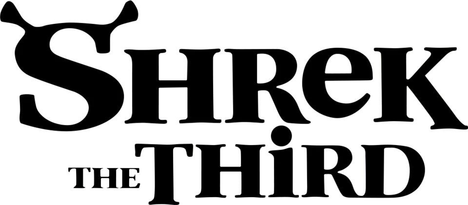
- SHREK wordmark in the logo: Not identified
- THE THIRD line in the logo: Not identified
Try the free alternatives
Type anything to see it in each free font suggested for the lettering you pick. Select a font's name to test it further and download it.
-
Shrek the Third
-
Shrek the Third
-
Shrek the Third
-
Shrek the Third
SHREK wordmark in the logo
This font has not been identified. No identification was found for this logo, and Fonts In Use has no entry. By our comparison the wordmark is the 2001 lettering. The wordmark is heavy, flared serif lettering that mixes capitals with a round lowercase-style e at capital height, and its S ends in two ogre ears, so it was almost certainly drawn for the film.
Free alternatives
-
Elsie, weight 900 Similar
At weight 900 it has the wordmark's heavy, high-contrast flared strokes and a round lowercase-style e that sits at capital height. Its S has no ear-shaped ends and its K is shorter-legged.
Compared by eye against the original.
-
Almendra, weight 700 Similar
At weight 700 its calligraphic capitals and uncial e give the same storybook mix of upper- and lowercase forms. It is rougher and narrower than the logo.
Compared by eye against the original.
-
Kurale Similar
Shares the flared serifs, the round e and the long kicked-out leg of the K. It is much lighter than the wordmark.
Compared by eye against the original.
-
Cinzel Decorative, weight 900 Same mood
Heavy inscriptional capitals with swashes on S and R that give a similar fairy-tale flourish. Its E is a capital form and the letters are wider.
Compared by eye against the original.
THE THIRD line in the logo
This font has not been identified. No source discusses this line. It is drawn in the same style as the wordmark: small capitals for THE, then THIRD with a dotted lowercase-style i and flared serifs, so it belongs with the custom lettering rather than a font.
Free alternatives
-
Elsie, weight 900 Similar
At weight 900 its heavy, high-contrast capitals and flared serifs match the line's colour. Its H and R are plainer than the logo's.
Compared by eye against the original.
-
Almendra, weight 700 Similar
At weight 700 it mixes uncial and capital forms in the same storybook way, and its dotted i suits THIRD. It is rougher and narrower.
Compared by eye against the original.
-
Kurale Similar
The same flared serif structure with rounded, slightly uncial forms. It is much lighter than the logo.
Compared by eye against the original.
What the labels mean
- Similar: The same style, with differences you can see.
- Same mood: Gives the same feel without being a look-alike.
What we link to
We link only to owners (the rights holder, the foundry or its official reseller) and to designers' own pages, and we host a fan-made font only with its designer's permission. Every free alternative is published under an open licence and downloads from its page on this site.
More from Shrek
Shrek the Third and Shrek are trademarks of DreamWorks Animation. Simple But How is not affiliated with or endorsed by DreamWorks Animation.