
The Last of Us Part I fonts
Remake of the 2013 game for PlayStation 5, developed by Naughty Dog and published by Sony Interactive Entertainment in September 2022.
- Game
- 2022
- The Last of Us
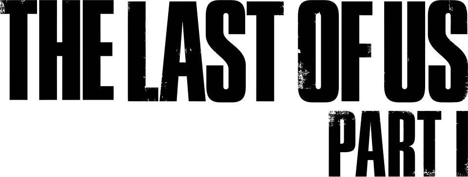
- Logo: Modified Press Gothic (community identification)
- Menus, options and collectible notes: FF DIN (community identification)
- Chapter title cards: Neue Helvetica Bold (community identification)
Try the free alternatives
Type anything to see it in each free font suggested for the lettering you pick. Select a font's name to test it further and download it.
-
The Last of Us Part I
-
The Last of Us Part I
-
The Last of Us Part I
-
The Last of Us Part I
-
The Last of Us Part I
Logo
| What it is | A typeface that was altered for this title |
|---|---|
| Typeface | Press Gothic |
| Designer | Patrick Griffin, after Aldo Novarese's Metropol |
| Foundry | Canada Type |
| Licence | Commercial: sold by the foundry, and most uses need a paid licence. |
Community identification Agreed by people who identify fonts, with no official word.
The remake keeps the 2013 wordmark and adds PART I in the same lettering. Fonts In Use's entry on the series names Press Gothic for the franchise title. A regular replier in a later DaFont thread disagrees: he finds Press Gothic too wide, with counters that are too open, and suggests the logo was made by mixing and editing the heavier weights of Tungsten Narrow. We set the words in a copy of Press Gothic installed on our machine beside the logo file on Wikimedia Commons: the word runs to almost the same overall width and the narrow, flat-sided letters share their structure, while the logo is clearly heavier, its counters are reduced to slits and it carries a worn print texture; Tungsten Compressed, the only Tungsten we could render, is far narrower. So we record an altered Press Gothic, not the font as sold. Naughty Dog has not named a typeface.
Sources: The Last of Us video game series (Fonts In Use), The Last of Us (DaFont forum), Press Gothic by Canada Type (MyFonts)
License Press Gothic from Canada Type
Free alternatives
-
Saira Extra Condensed, weight 900 Similar
At weight 900 it comes nearest to the logo's darkness: flat-sided letters, an O whose counter is a narrow slit and an A with a flat top. It is noticeably wider than the logo, its corners are squarer and more engineered, and it has no worn texture.
Compared by eye against the original.
-
Anton Similar
A heavy condensed poster face with the same solid colour and flat-topped A. Its letters are a little wider and its counters more open than the logo's.
Compared by eye against the original.
-
Big Shoulders Display, weight 900 Similar
At weight 900 it has tall, flat-sided capitals and an O with a slit-like counter. It is slightly lighter than the logo and its letters sit further apart.
Compared by eye against the original.
-
Smooch Sans, weight 900 Similar
At weight 900 it matches the logo's weight and narrow counters. The arms of T and F reach further out, which makes the word wider and less compact.
Compared by eye against the original.
-
League Gothic Similar
The closest in width and structure: tall, narrow, flat-sided capitals packed almost as tightly as the logo's. It is lighter, with more open counters, and has no worn texture.
Compared by eye against the original.
Menus, options and collectible notes
| What it is | A retail typeface |
|---|---|
| Typeface | FF DIN |
| Designer | Albert-Jan Pool |
| Foundry | FontFont (now part of Monotype) |
| Licence | Commercial: sold by the foundry, and most uses need a paid licence. |
Community identification Agreed by people who identify fonts, with no official word.
Fonts In Use's entry on the series says FF DIN Regular and Medium are, with few exceptions, the only typeface in the games' interface, and its screenshots of Part I show the main menu, the graphics options and a collectible note. The squared round letters and narrow build in those screenshots fit DIN, but we did not set the text in the foundry's font ourselves, and Naughty Dog has not named it.
Sources: The Last of Us video game series (Fonts In Use), FF DIN by FontFont (MyFonts)
License FF DIN from FontFont (now part of Monotype)
Free alternatives
-
Barlow Similar
Set as the first line of a note from the game it has nearly the same narrow width, even stroke and squared-off round letters. Its curves are a touch softer.
Compared by eye against the original.
-
Gidole Similar
An open-source design in the DIN style with the same squared rounds and technical look. It is slightly lighter and more loosely spaced than the game's text, and it has a single weight.
Compared by eye against the original.
-
Bai Jamjuree Same mood
Squared, technical letterforms that give the same utilitarian feel. It is wider than DIN and its corners are boxier.
Compared by eye against the original.
-
Golos Text Same mood
A clean, even sans that suits the same plain menus. It is wider and rounder than the game's type, so a line of text runs noticeably longer.
Compared by eye against the original.
Chapter title cards
| What it is | A retail typeface |
|---|---|
| Typeface | Neue Helvetica Bold |
| Designer | D. Stempel AG studio, after Max Miedinger |
| Foundry | Linotype (now part of Monotype) |
| Licence | Commercial: sold by the foundry, and most uses need a paid licence. |
Community identification Agreed by people who identify fonts, with no official word.
Fonts In Use's entry on the series says the cards that mark a change of chapter are set in Neue Helvetica Bold, and shows the card that opens the first chapter of Part I. We set the card's words, 20 YEARS LATER, in the Helvetica Neue Bold installed on our machine and compared them with that screenshot: the weight, the wide capitals and the R with its curved, upright leg agree, though the screenshot is too small to tell Neue Helvetica from the older Helvetica. Naughty Dog has not named the font.
Sources: The Last of Us video game series (Fonts In Use), Neue Helvetica by Linotype (MyFonts)
License Neue Helvetica Bold from Linotype (now part of Monotype)
Free alternatives
-
Arimo, weight 700 Similar
At weight 700 it gives the card's plain bold capitals at almost the same weight and proportions. It is spaced more loosely than the tightly set card.
Compared by eye against the original.
-
Inter, weight 700 Similar
At weight 700 it has the same neutral, even-width capitals. Its letters are slightly narrower and its curves a little squarer.
Compared by eye against the original.
-
Roboto, weight 700 Similar
At weight 700 it is close in weight and tone for a short line of capitals. It is narrower than the card's lettering and its round letters are less circular.
Compared by eye against the original.
What the labels mean
- Community identification: Agreed by people who identify fonts, with no official word.
- Similar: The same style, with differences you can see.
- Same mood: Gives the same feel without being a look-alike.
What we link to
We link only to owners (the rights holder, the foundry or its official reseller) and to designers' own pages, and we host a fan-made font only with its designer's permission. Every free alternative is published under an open licence and downloads from its page on this site.
More from The Last of Us
The Last of Us Part I and The Last of Us are trademarks of Sony Interactive Entertainment. Simple But How is not affiliated with or endorsed by Sony Interactive Entertainment.