
The Legend of Zelda: Breath of the Wild fonts
Open-world game developed by Nintendo EPD for the Nintendo Switch and Wii U.
- Game
- 2017
- The Legend of Zelda
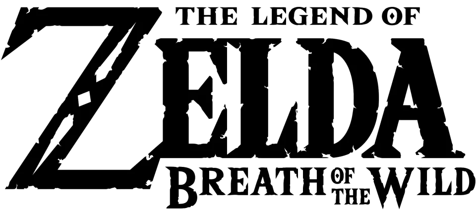
- ZELDA wordmark in the logo: Custom lettering (our visual match)
- THE LEGEND OF and BREATH OF THE WILD lines: Unnamed display typeface used by Nintendo (our visual match)
- Dialogue and menu text: Rodin (community identification)
Try the free alternatives
Type anything to see it in each free font suggested for the lettering you pick. Select a font's name to test it further and download it.
-
The Legend of Zelda: Breath of the Wild
-
The Legend of Zelda: Breath of the Wild
-
The Legend of Zelda: Breath of the Wild
-
The Legend of Zelda: Breath of the Wild
ZELDA wordmark in the logo
| What it is | Custom lettering drawn for this title, not a font you can install |
|---|---|
| Licence | Proprietary: owned by the rights holder and not offered for licensing. |
Our visual match Our own judgement after comparing the lettering side by side.
The logo keeps the series' ZELDA lettering and redraws it with chipped, eroded edges. Nobody has matched it to a typeface: a DaFont thread about the clean version of the letters is answered with the fan font Triforce, and the fan font The Wild Breath of Zelda exists because the weathered version is not a font either. By our own comparison it is drawn lettering.
Sources: The Legend of Zelda font (DaFont forum), The Wild Breath of Zelda (DaFont)
Fan-made replicas
Fonts made by fans to recreate this lettering. They are not official, and each author sets their own terms.
- The Wild Breath of Zelda by Chequered Ink. Free.
Sources: The Wild Breath of Zelda (DaFont)
Free alternatives
-
Gupter, weight 700 Similar
At weight 700 it gives narrow, sturdy roman capitals with pointed serifs and a sharp-topped A, the nearest to the wordmark's proportions. It is lighter, and its Z is an ordinary letter without the logo's oversized, notched diagonal.
Compared by eye against the original.
-
Cinzel, weight 900 Similar
At weight 900 its capitals end in sharp triangular serifs like those of the wordmark. The letters are much wider, with thinner hairlines, so a word set in it looks broader and more classical.
Compared by eye against the original.
-
IM Fell English SC Same mood
Its ragged, worn outlines recall the chipped edges of this version of the wordmark. It is far lighter and wider than the logo's letters.
Compared by eye against the original.
-
Almendra, weight 700 Same mood
At weight 700 its calligraphic, fantasy-novel flavour suits the same subject. The uncial-style E and A make it clearly a different design.
Compared by eye against the original.
THE LEGEND OF and BREATH OF THE WILD lines
| What it is | A typeface owned by the rights holder and not sold |
|---|---|
| Typeface | Unnamed display typeface used by Nintendo |
| Licence | Proprietary: owned by the rights holder and not offered for licensing. |
Our visual match Our own judgement after comparing the lettering side by side.
No official source names this face. Artsy Omni, who rebuilt the game's display lettering as the fan font Hylia Serif, describes the original as a font file used by Nintendo that Hylia Serif only approximates. By our own comparison the two small lines of the logo are that same design, roughened: heavy capitals and small capitals with wedge serifs and a diamond-shaped opening in the O, matching Hylia Serif's published character set.
Sources: Hylia Serif (Artsy Omni)
Fan-made replicas
Fonts made by fans to recreate this lettering. They are not official, and each author sets their own terms.
- Hylia Serif by Artsy Omni (Omni Jacala). Free.
Sources: Hylia Serif (Artsy Omni), "GAME OVER" font from Zelda TOTK (DaFont forum)
Free alternatives
-
Grenze, weight 800 Similar
At weight 800 it is a heavy serif with wedge-shaped, slightly angular stroke ends, close to the weight and bite of the logo lines. Its edges are clean and its O is an ordinary oval, without the diamond-shaped opening.
Compared by eye against the original.
-
IM Fell English SC Same mood
Capitals and small capitals with ragged, worn outlines, which echoes the chipped edges of the lettering. It is far lighter and is an old book face, not a display design.
Compared by eye against the original.
-
Almendra, weight 700 Same mood
At weight 700 it has a hand-cut fantasy flavour that suits the same use. Its uncial-style E and softer shapes make it a different design.
Compared by eye against the original.
Dialogue and menu text
| What it is | A retail typeface |
|---|---|
| Typeface | Rodin |
| Foundry | Fontworks |
| Licence | Commercial: sold by the foundry, and most uses need a paid licence. |
Community identification Agreed by people who identify fonts, with no official word.
A DaFont forum thread on a screenshot of the Adventure Log marks Rodin, a Japanese gothic from Fontworks, as the identified font, after earlier replies had settled for Proxima Nova as merely similar. We typed words from that screenshot into the tester on FONTPLUS, a web font service that carries Rodin, and the spurred G, single-storey g, two-storey a and straight-tailed y agree. The game slants the face for body text. Nintendo has not named it.
Sources: Zelda: Breath of the Wild dialogue font (DaFont forum), Rodin Pro B (FONTPLUS)
Free alternatives
-
Arimo, weight 700 Similar
At weight 700 it shares the letters that mark Rodin's Latin: a G with a spur, a single-storey g, a two-storey a and a nearly straight tail on the y. It also has an italic for the game's slanted text. Its shapes are a little narrower; we compared the upright.
Compared by eye against the original.
-
Zen Kaku Gothic New, weight 700 Similar
At weight 700 it is a Japanese gothic with a plain grotesque Latin and a single-storey g, and like Rodin it covers Japanese. Its G has no spur and the tail of its y curves.
Compared by eye against the original.
-
Hanken Grotesk, weight 700 Similar
At weight 700 it has the spurred G, straight-tailed y and even, open build of Rodin's Latin. Its g is the two-storey kind, which gives it away in running text.
Compared by eye against the original.
What the labels mean
- Community identification: Agreed by people who identify fonts, with no official word.
- Our visual match: Our own judgement after comparing the lettering side by side.
- Similar: The same style, with differences you can see.
- Same mood: Gives the same feel without being a look-alike.
What we link to
We link only to owners (the rights holder, the foundry or its official reseller) and to designers' own pages, and we host a fan-made font only with its designer's permission. Every free alternative is published under an open licence and downloads from its page on this site.
More from The Legend of Zelda
- The Legend of Zelda: Tears of the Kingdom (2023, game) ZELDA wordmark in the logo: Custom lettering
- The Legend of Zelda: Ocarina of Time (1998, game) ZELDA wordmark in the logo: Custom lettering
- The Legend of Zelda: A Link to the Past (1991, game) ZELDA wordmark in the logo: Custom lettering
- The Legend of Zelda (1986, game) ZELDA on the box and cartridge: Modified ITC Zapf International
The Legend of Zelda: Breath of the Wild and The Legend of Zelda are trademarks of Nintendo. Simple But How is not affiliated with or endorsed by Nintendo.