
The Simpsons (1989) fonts
Animated Fox series created by Matt Groening, running as a half-hour show since December 1989.
- TV show
- 1989
- The Simpsons
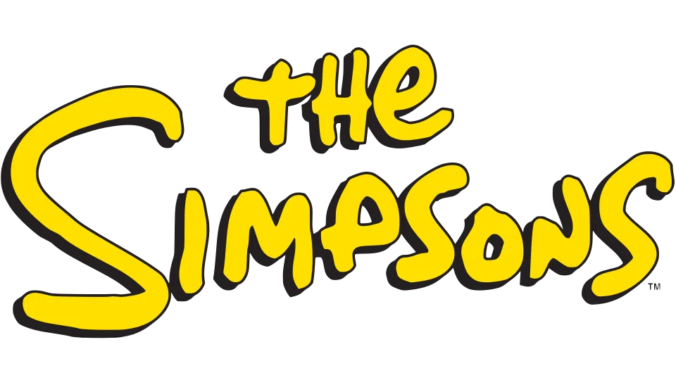
- Series logo and title card: Custom lettering (our visual match)
- On-screen credits: Groening (also reported as Matt) (community identification)
Try the free alternatives
Type anything to see it in each free font suggested for the lettering you pick. Select a font's name to test it further and download it.
-
The Simpsons
-
The Simpsons
-
The Simpsons
-
The Simpsons
Series logo and title card
| What it is | Custom lettering drawn for this title, not a font you can install |
|---|---|
| Licence | Proprietary: owned by the rights holder and not offered for licensing. |
Our visual match Our own judgement after comparing the lettering side by side.
Neither Fox nor Disney has named a typeface for the logo and none is sold. A DaFont thread that shows the logo is answered only with Simpsonfont, a fan-made font, and in a longer thread about the credits font a regular describes Simpsonfont as derived from the logo. The label rests on our own look at the logo, which agrees with hand lettering: the three S shapes in SIMPSONS all differ, and capital and lowercase forms are mixed.
Sources: The Simpsons font (DaFont forum), font? (DaFont forum), Simpsonfont (DaFont)
Fan-made replicas
Fonts made by fans to recreate this lettering. They are not official, and each author sets their own terms.
- Simpsonfont by Sharkshock (Dennis Ludlow). Personal use only.
Sources: Simpsonfont (DaFont), The Simpsons font (DaFont forum)
"Personal use only" rules out commercial work: anything you sell, client projects, merchandise and monetised videos. Treat a replica with no stated licence the same way.
Free alternatives
-
Gochi Hand Similar
Even, round-ended marker strokes on a bouncing baseline give the same hand-drawn cartoon look. It is lighter than the logo and has ordinary lowercase shapes where the logo mixes capital and lowercase forms.
Compared by eye against the original.
-
Chewy Similar
Heavy, soft-cornered letters that lean and bounce like the logo's. Its strokes swell and thin more, and its shapes are more polished.
Compared by eye against the original.
-
Mali, weight 700 Same mood
At weight 700 a rounded, friendly handwriting face with even strokes. It is upright and regular, without the logo's wobble.
Compared by eye against the original.
-
Gloria Hallelujah Same mood
Marker handwriting with the loose, uneven shapes of a cartoonist's hand. It is much thinner than the logo.
Compared by eye against the original.
On-screen credits
| What it is | A typeface owned by the rights holder and not sold |
|---|---|
| Typeface | Groening (also reported as Matt) |
| Designer | Mark Heliger and Paul Feldman, from Matt Groening's handwriting |
| Licence | Proprietary: owned by the rights holder and not offered for licensing. |
Community identification Agreed by people who identify fonts, with no official word.
The Simpsons Archive's FAQ says the credits and most merchandise use a proprietary font built from Matt Groening's handwriting, which it calls Matt, credits to Apple employees, and says was made squarer and larger partway through season seven. Luc Devroye's type index carries a 2019 account by Paul Feldman, who says he and Mark Heliger digitised samples Groening inked for them in 1990, for Groening's print work in the show's first year, and handed over the fonts as Groening and Groening Bold under non-disclosure agreements. The two accounts differ on the name and on who made it, Feldman's does not mention the on-screen credits directly, and the studio has published nothing. DaFont threads on credit frames, which we checked, reach the same answer: a custom font that is not available.
Sources: Mark Heliger (Luc Devroye, Type Design Information), Cowan Design Associates (Luc Devroye, Type Design Information), L.I.S.A., section 2: Creation of The Simpsons (The Simpsons Archive), font? (DaFont forum), The Simpsons CREDITS FONT!!! (DaFont forum)
Fan-made replicas
Fonts made by fans to recreate this lettering. They are not official, and each author sets their own terms.
- Akbar by Jon Bernhardt. Licence not stated.
Sources: The Akbar Font (Jon Bernhardt), Akbar (DaFont), Mark Heliger (Luc Devroye, Type Design Information)
"Personal use only" rules out commercial work: anything you sell, client projects, merchandise and monetised videos. Treat a replica with no stated licence the same way.
Free alternatives
-
Short Stack Similar
Upright hand printing with an even stroke, round letters and generous spacing, like the credits. It is a little heavier and its shapes are more uniform.
Compared by eye against the original.
-
Mali Similar
Round, evenly drawn handwriting with open spacing. Its letters are wider and slightly more formal.
Compared by eye against the original.
-
Architects Daughter Similar
Printed handwriting of one stroke thickness with rounded ends. It is wider and looser, with longer cross-strokes.
Compared by eye against the original.
-
Patrick Hand Same mood
A tidy felt-pen hand that gives the same hand-lettered credit feel. It is narrower and more tightly spaced.
Compared by eye against the original.
What the labels mean
- Community identification: Agreed by people who identify fonts, with no official word.
- Our visual match: Our own judgement after comparing the lettering side by side.
- Similar: The same style, with differences you can see.
- Same mood: Gives the same feel without being a look-alike.
What we link to
We link only to owners (the rights holder, the foundry or its official reseller) and to designers' own pages, and we host a fan-made font only with its designer's permission. Every free alternative is published under an open licence and downloads from its page on this site.
More from The Simpsons
The Simpsons is a trademark of 20th Television (Disney). Simple But How is not affiliated with or endorsed by 20th Television (Disney).