
The Witcher fonts
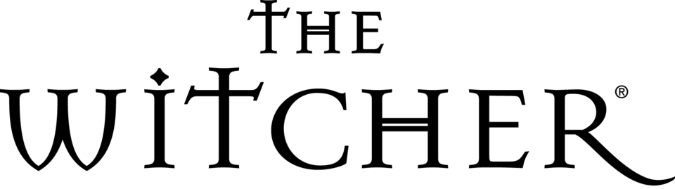
CD Projekt has never named a typeface for any Witcher logo, and each era looks different. The 2007 game used flared roman capitals with a dagger-shaped T; The Witcher 2 replaced them with wide, blade-cut lettering that a DaFont thread treats as drawn rather than set, and The Witcher 3 redrew that lettering heavier and rougher. The Netflix series went another way entirely: thin geometric capitals that the DaFont forum identifies as Hurme Geometric Sans 2, which matches when we set the title in the foundry's tester.
Games
TV shows
The Witcher is a trademark of CD Projekt. Simple But How is not affiliated with or endorsed by CD Projekt.