
Toy Story (1995) fonts
Pixar's first feature film, released by Walt Disney Pictures and directed by John Lasseter.
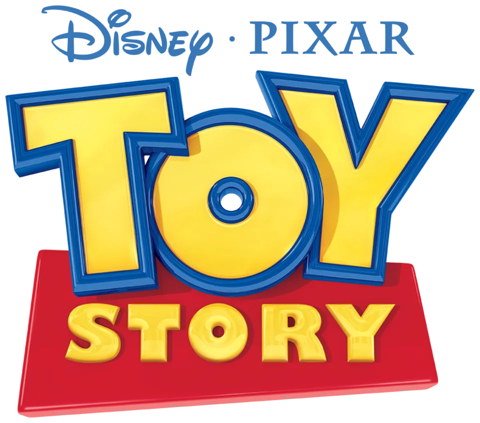
- TOY wordmark in the logo: Modified Eagle Bold (community identification)
- STORY line in the logo: Gill Sans Ultra Bold (community identification)
Try the free alternatives
Type anything to see it in each free font suggested for the lettering you pick. Select a font's name to test it further and download it.
-
Toy Story
-
Toy Story
-
Toy Story
-
Toy Story
TOY wordmark in the logo
| What it is | A typeface that was altered for this title |
|---|---|
| Typeface | Eagle Bold |
| Designer | David Berlow, after Morris Fuller Benton |
| Foundry | Font Bureau |
| Licence | Commercial: sold by the foundry, and most uses need a paid licence. |
Community identification Agreed by people who identify fonts, with no official word.
Pixar has not named a font. A reader comment on the Fonts In Use entry for this logo names Eagle Bold for TOY, and the site's editor accepted it, noting the arms of the T that taper toward the stem; DaFont forum members later say the same, while one regular argues the T and Y owe nothing to Gill Sans. Typed in the foundry's tester, Eagle Bold matches the wedge-shaped T arms and the broad flat-topped Y, while the logo's letters are heavier, tilted on a bouncing baseline, and its O has the smaller counter that members match to Gill Sans Ultra Bold.
Sources: Toy Story logo (Fonts In Use), "Toy" font? (DaFont forum), Toy Story (DaFont forum), Eagle by Font Bureau (MyFonts), Eagle in use (Fonts In Use)
License Eagle Bold from Font Bureau
Free alternatives
-
Peace Sans Similar
A geometric heavy sans with a perfectly round O and a small round counter, like the logo's O, and a wide Y with flat-cut arms. Its T has a plain bar where the logo's arms thicken toward their outer ends.
Compared by eye against the original.
-
League Spartan, weight 900 Similar
At weight 900 it shares the geometric skeleton of Eagle: a circular O and a wide, straight-armed Y. It is lighter than the logo, its O counter is much larger, and the T has no taper.
Compared by eye against the original.
-
Paytone One Similar
Heavy, compact capitals with the same blunt, toy-like weight. Its O is narrower with a bigger counter, and the T and Y are plain rather than wedged.
Compared by eye against the original.
-
Chango Same mood
An extra-black display face with a fat oval O and a tiny counter that gives the same chunky, playful feel. It is much wider and softer-cornered than the logo's letters.
Compared by eye against the original.
STORY line in the logo
| What it is | A retail typeface |
|---|---|
| Typeface | Gill Sans Ultra Bold |
| Designer | Eric Gill |
| Foundry | Monotype |
| Licence | Commercial: sold by the foundry, and most uses need a paid licence. |
Community identification Agreed by people who identify fonts, with no official word.
Fonts In Use lists Gill Kayo, another name for Gill Sans Ultra Bold, for this logo, and several DaFont threads on it mark Gill Sans Ultra Bold as identified for STORY. Typed in the reseller's tester, the S, the pin-hole counters of O and R, and the wide Y line up with the logo without visible changes. Disney and Pixar have not confirmed it.
Sources: Toy Story logo (Fonts In Use), WHAT THE FONT ? TOY STORY (DaFont forum), Toy Story (DaFont forum), Gill Sans Std Ultra Bold (MyFonts), Gill Kayo in use (Fonts In Use)
License Gill Sans Ultra Bold from Monotype
Free alternatives
-
Chango Similar
Wide, very heavy capitals with a round O holding a pin-hole counter and a small-bowled R, close to Gill Ultra Bold's colour. Its corners are rounder and the S is more swollen than in the logo.
Compared by eye against the original.
-
Peace Sans Similar
Near-solid weight with a circular O and a dot-sized counter, as in STORY. It is more geometric than Gill: the S is stiffer and the R's leg is straight instead of curved.
Compared by eye against the original.
-
Bowlby One Similar
Matches the black weight and the flat-ended S. Its O and R are narrower and their counters are taller slits rather than small dots.
Compared by eye against the original.
-
Rammetto One Similar
Very heavy letters with tiny counters and a squat Y. The O's counter is a slanted oval, which the logo's round dot is not.
Compared by eye against the original.
What the labels mean
- Community identification: Agreed by people who identify fonts, with no official word.
- Similar: The same style, with differences you can see.
- Same mood: Gives the same feel without being a look-alike.
What we link to
We link only to owners (the rights holder, the foundry or its official reseller) and to designers' own pages, and we host a fan-made font only with its designer's permission. Every free alternative is published under an open licence and downloads from its page on this site.
More from Toy Story
Toy Story is a trademark of Disney and Pixar. Simple But How is not affiliated with or endorsed by Disney and Pixar.