
Wednesday (2022) font
Netflix series created by Alfred Gough and Miles Millar, with Tim Burton directing episodes; a second season followed in 2025.
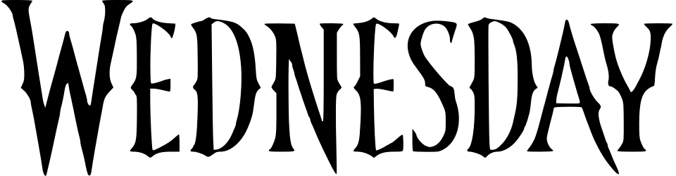
- WEDNESDAY wordmark in the logo: Modified Nu*Creactivo 2008 (our visual match)
Try the free alternatives
Type anything to see it in each free font. Select a font's name to test it further and download it.
-
Wednesday
-
Wednesday
-
Wednesday
-
Wednesday
WEDNESDAY wordmark in the logo
| What it is | A typeface that was altered for this title |
|---|---|
| Typeface | Nu*Creactivo 2008 |
| Designer | bran |
| Licence | Open licence: free to use, including in commercial work. |
Our visual match Our own judgement after comparing the lettering side by side.
Netflix has not named a font or a lettering artist, and a Creative Bloq column calls the wordmark custom typography without citing anyone. In the DaFont forum thread on the logo one member calls Nu*Creactivo 2008, a free Western display face posted to DaFont in 2008, an almost perfect match, while others offer fan fonts and say it is likely custom. The label is our own comparison of DaFont's specimen with the logo: the W with spurs halfway up its outer strokes, the N whose diagonal runs below the baseline to a point, the spurred E and the forked Y all match, while the logo is taller and narrower, has smooth instead of roughened edges and enlarges the first W. Whether the designers started from this font or from an older model it shares is not known.
Sources: Wednesday Wandinha Mercredi Mercoledi Netflix series font (DaFont forum), Nu*Creactivo 2008 by bran (DaFont), Netflix's Wednesday typeface is sheer genius (Creative Bloq)
Free alternatives
-
Bigelow Rules Similar
Tall, narrow capitals with flared stems and small spurs, close to the logo's proportions. It is much lighter, and its N has an ordinary diagonal instead of one that drops below the line.
Compared by eye against the original.
-
Smythe Similar
Condensed capitals with tapering stems and pointed, flared ends that echo the logo's sharp serifs. It is a little wider and rounder, and it lacks the mid-height spurs.
Compared by eye against the original.
-
Metal Mania Similar
Spiky display capitals whose N also sends its diagonal down below the baseline. It is heavier and wider than the logo, and its edges are deliberately ragged.
Compared by eye against the original.
-
Amarante Same mood
Flared, slightly gothic capitals that give a similar dark, old-fashioned tone. They are wider and calmer, with none of the logo's spikes.
Compared by eye against the original.
What the labels mean
- Our visual match: Our own judgement after comparing the lettering side by side.
- Similar: The same style, with differences you can see.
- Same mood: Gives the same feel without being a look-alike.
What we link to
We link only to owners (the rights holder, the foundry or its official reseller) and to designers' own pages, and we host a fan-made font only with its designer's permission. Every free alternative is published under an open licence and downloads from its page on this site.
More from Wednesday
Wednesday is a trademark of Tee and Charles Addams Foundation. Simple But How is not affiliated with or endorsed by Tee and Charles Addams Foundation.