
Back to the Future fonts
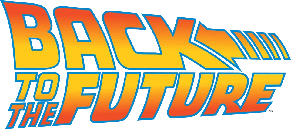
The Back to the Future logo is drawn lettering, not a typeface: heavy, wide, forward-leaning capitals in a red-to-yellow gradient, with BACK set large and its K trailing into an arrow with speed lines. A Canadian design association credits Andrew Probert, a concept artist on the first film, with the logotype, and Universal has never released it as a font. The sequels, the animated series and the Telltale game reuse the same lettering, adding a serif Roman numeral or a short tag line beside it; fans have rebuilt the alphabet as the Back to the Future 2002 font.
Games
Films
TV shows
Back to the Future is a trademark of Universal Pictures. Simple But How is not affiliated with or endorsed by Universal Pictures.