
Back to the Future Part II font
The first sequel, filmed back to back with Part III for Universal Pictures and Amblin Entertainment; it takes Marty to 2015.
- Film
- 1989
- Back to the Future
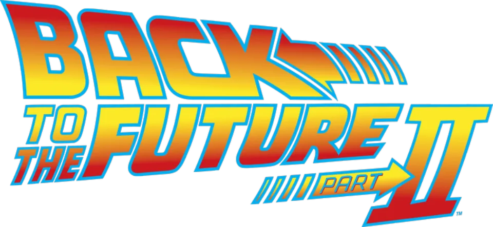
- BACK TO THE FUTURE logo: Custom lettering (our visual match)
Try the free alternatives
Type anything to see it in each free font. Select a font's name to test it further and download it.
-
Back to the Future Part II
-
Back to the Future Part II
-
Back to the Future Part II
-
Back to the Future Part II
BACK TO THE FUTURE logo
| What it is | Custom lettering drawn for this title, not a font you can install |
|---|---|
| Licence | Proprietary: owned by the rights holder and not offered for licensing. |
Our visual match Our own judgement after comparing the lettering side by side.
No source discusses this logo on its own. By our own comparison with the 1985 artwork it reuses the same drawn lettering unchanged, so the custom-lettering label and the designer credit for the first film carry over. Added beside it are a small PART on an arrow and a tall serif numeral II drawn in the same gradient; we could not match the numeral to a typeface.
Sources: Top 5 film logos (RGD), Back to the Future (DaFont forum)
Fan-made replicas
Fonts made by fans to recreate this lettering. They are not official, and each author sets their own terms.
- Back to the Future 2002 by Cyril Bourreau. Licence not stated.
Sources: Back to the Future (DaFont forum), Copyright to Back to the Future 2002 font? (DaFont forum)
"Personal use only" rules out commercial work: anything you sell, client projects, merchandise and monetised videos. Treat a replica with no stated licence the same way.
Free alternatives
-
Kanit, weight 900, italic Similar
At weight 900 italic it has the logo's wide, heavy, forward-leaning capitals with round bowls on B and R and a broad U. Its slant is gentler, and it has no perspective swelling or arrow on the K.
Compared by eye against the original.
-
Archivo, weight 900, italic Similar
At weight 900 italic it matches the width and blackness of the lettering, with a straight-legged R like the logo's. Its curves are more grotesque and less geometric, and the C closes up more.
Compared by eye against the original.
-
Changa One, italic Similar
The italic has the same soft, rounded heavy capitals and open C. It is slightly narrower than the logo and its strokes end in rounder corners.
Compared by eye against the original.
-
Fugaz One Same mood
A built-in slanted display face with the same sporty, speeding feel. It is narrower and more condensed than the logo, so the letters read taller.
Compared by eye against the original.
What the labels mean
- Our visual match: Our own judgement after comparing the lettering side by side.
- Similar: The same style, with differences you can see.
- Same mood: Gives the same feel without being a look-alike.
What we link to
We link only to owners (the rights holder, the foundry or its official reseller) and to designers' own pages, and we host a fan-made font only with its designer's permission. Every free alternative is published under an open licence and downloads from its page on this site.
More from Back to the Future
- Back to the Future: The Game (2010, game) BACK TO THE FUTURE logo: Custom lettering
- Back to the Future: The Animated Series (1991, TV show) BACK TO THE FUTURE logo: Custom lettering
- Back to the Future Part III (1990, film) BACK TO THE FUTURE logo: Custom lettering
- Back to the Future (1985, film) BACK TO THE FUTURE logo: Custom lettering
Back to the Future Part II and Back to the Future are trademarks of Universal Pictures. Simple But How is not affiliated with or endorsed by Universal Pictures.