
Batman: The Animated Series fonts
Animated series from Warner Bros. Animation, first broadcast on Fox Kids from 1992 to 1995.
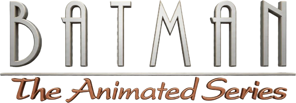
- BATMAN wordmark in the logo: Modified Plaza (community identification)
- THE ANIMATED SERIES line in the logo: Modified Empire (community identification)
Try the free alternatives
Type anything to see it in each free font suggested for the lettering you pick. Select a font's name to test it further and download it.
-
Batman: The Animated Series
-
Batman: The Animated Series
-
Batman: The Animated Series
BATMAN wordmark in the logo
| What it is | A typeface that was altered for this title |
|---|---|
| Typeface | Plaza |
| Designer | Alan Meeks |
| Foundry | Letraset (digital version from ITC) |
| Licence | Commercial: sold by the foundry, and most uses need a paid licence. |
Community identification Agreed by people who identify fonts, with no official word.
A Fonts In Use entry identifies Plaza, an Art Deco face that Alan Meeks drew for Letraset in 1975, as the main typeface of the series' branding, and a second entry notes the same Plaza logo on the tie-in comic. We set BATMAN in MyFonts' type tester for Plaza and the shapes match: the B with a small top and a large lower bowl, the round-topped A with a spur at its left shoulder and the N whose diagonal meets the right stem high up. The logo's letters are wider and heavier than the font's. Warner Bros. has not commented.
Sources: Batman: The Animated Series (1992–1993) and The Adventures of Batman & Robin (1994–1995) (Fonts In Use), The Batman Adventures issue 17 (Fonts In Use), Plaza by ITC (MyFonts)
License Plaza from Letraset (digital version from ITC)
Free alternatives
-
Tulpen One Similar
Shares the logo's Deco skeleton, including a round-topped A. It is far narrower and hairline thin, its N is an ordinary diagonal N where the logo's diagonal meets the right stem high up, and its M is rounded where the logo's is a sharp V.
Compared by eye against the original.
-
Nova Slim Similar
Even-stroked capitals with a round-topped A, at a width nearer the logo's. Its N and M are arches, where the logo's N has a short high diagonal and its M is a sharp V, and its stroke ends are cut at a slant.
Compared by eye against the original.
-
Poiret One Same mood
A light Art Deco sans that suits the same 1930s setting. Its A is pointed and its N an ordinary diagonal N, so the wordmark's signature shapes are missing.
Compared by eye against the original.
THE ANIMATED SERIES line in the logo
| What it is | A typeface that was altered for this title |
|---|---|
| Typeface | Empire |
| Designer | Morris Fuller Benton |
| Foundry | American Type Founders (digital version from Bitstream) |
| Licence | Commercial: sold by the foundry, and most uses need a paid licence. |
Community identification Agreed by people who identify fonts, with no official word.
The Fonts In Use entry on the series says the title pairs Plaza with capitals from Empire, Morris Fuller Benton's 1937 design. Next to MyFonts' type tester for Bitstream's Empire, the widely spaced line on the series artwork has the same very narrow, even-stroked capitals, but its A is closed with a flat top where the digital font's comes to a point, so the letters were either altered or taken from another version of the face. Other versions of the logo replace this line with a slanted script, which the same entry identifies as Present.
Sources: Batman: The Animated Series (1992–1993) and The Adventures of Batman & Robin (1994–1995) (Fonts In Use), Empire by Bitstream (MyFonts)
License Empire from American Type Founders (digital version from Bitstream)
Free alternatives
-
Tulpen One Similar
Very narrow, hairline capitals with a closed, round-topped A, close to the line in the logo. Its M is rounded at the top where the logo's has sharp diagonals.
Compared by eye against the original.
-
Big Shoulders Display, weight 300 Similar
At weight 300 it gives tall, narrow, even-stroked capitals of about the same colour. Its A comes to a point.
Compared by eye against the original.
-
Six Caps Same mood
Extremely condensed capitals that give the same tall, tight line. Heavier and more tightly packed than the line in the logo.
Compared by eye against the original.
What the labels mean
- Community identification: Agreed by people who identify fonts, with no official word.
- Similar: The same style, with differences you can see.
- Same mood: Gives the same feel without being a look-alike.
What we link to
We link only to owners (the rights holder, the foundry or its official reseller) and to designers' own pages, and we host a fan-made font only with its designer's permission. Every free alternative is published under an open licence and downloads from its page on this site.
More from Batman
- The Batman (2022, film) THE BATMAN wordmark in the logo: Modified PL Fiorello Condensed
- Batman: Arkham Knight (2015, game) BATMAN wordmark in the logo: Not identified
- The Dark Knight (2008, film) THE DARK KNIGHT wordmark on the poster: Not identified
- Batman (1989, film) BATMAN wordmark on the poster: Not identified
Batman: The Animated Series and Batman are trademarks of DC. Simple But How is not affiliated with or endorsed by DC.