
The Batman font
Matt Reeves's film for Warner Bros., with Robert Pattinson; its red logo was first shown in August 2020.
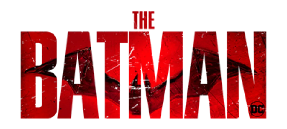
- THE BATMAN wordmark in the logo: Modified PL Fiorello Condensed (community identification)
Try the free alternatives
Type anything to see it in each free font. Select a font's name to test it further and download it.
-
The Batman
-
The Batman
-
The Batman
-
The Batman
THE BATMAN wordmark in the logo
| What it is | A typeface that was altered for this title |
|---|---|
| Typeface | PL Fiorello Condensed |
| Foundry | Photo-Lettering (digital version from Monotype) |
| Licence | Commercial: sold by the foundry, and most uses need a paid licence. |
Community identification Agreed by people who identify fonts, with no official word.
Warner Bros. has not named a font. Three DaFont forum threads on the logo, two from August 2020 and one from March 2022, are marked identified as Fiorello Condensed, and a reply in one of them reports a near-exact overlay. We set THE BATMAN in MyFonts' type tester for PL Fiorello Condensed and it agrees: the squared B with slit counters, the flat-topped A and the M whose V drops to the baseline all match, while the H of THE has a level bar in the logo where the font's is slanted.
Sources: font? The Batman (DaFont forum), The BATMAN 2021 FONT ? (DaFont forum), THE BATMAN (DaFont forum), PL Fiorello Condensed by Monotype (MyFonts)
License PL Fiorello Condensed from Photo-Lettering (digital version from Monotype)
Free alternatives
-
Anton Similar
Tall, heavy condensed capitals with a flat-topped A and narrow counters, the same poster style as the logo. It is wider, and the V of its M stops short of the baseline where the logo's reaches it.
Compared by eye against the original.
-
Sofia Sans Extra Condensed, weight 900 Similar
At weight 900 it is as dense as the logo, and the V of its M runs most of the way down. Its corners are slightly rounded and its letters are wider.
Compared by eye against the original.
-
Alumni Sans, weight 900 Similar
At weight 900 it packs flat-topped, straight-sided capitals as tightly as the logo. The letters are wider and the V of the M is shallower.
Compared by eye against the original.
-
League Gothic Same mood
A classic tall condensed gothic that gives the same headline feel. It is clearly lighter than the logo.
Compared by eye against the original.
What the labels mean
- Community identification: Agreed by people who identify fonts, with no official word.
- Similar: The same style, with differences you can see.
- Same mood: Gives the same feel without being a look-alike.
What we link to
We link only to owners (the rights holder, the foundry or its official reseller) and to designers' own pages, and we host a fan-made font only with its designer's permission. Every free alternative is published under an open licence and downloads from its page on this site.
More from Batman
- Batman: Arkham Knight (2015, game) BATMAN wordmark in the logo: Not identified
- The Dark Knight (2008, film) THE DARK KNIGHT wordmark on the poster: Not identified
- Batman: The Animated Series (1992, TV show) BATMAN wordmark in the logo: Modified Plaza
- Batman (1989, film) BATMAN wordmark on the poster: Not identified
The Batman and Batman are trademarks of DC. Simple But How is not affiliated with or endorsed by DC.