
Breaking Bad fonts
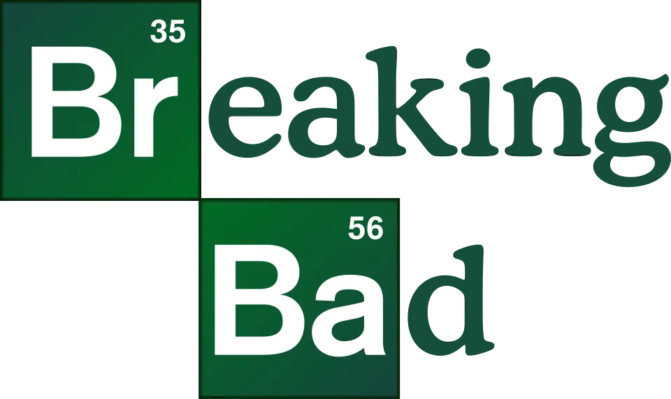
The Breaking Bad logo puts the element symbols Br and Ba in periodic-table tiles, set in a bold grotesque that matches Arial, and finishes each word in the soft, round-serifed Cooper. Nobody at the studio has named either face; the show's first graphic designer credits the idea to creator Vince Gilligan. Better Call Saul swaps this for two deliberately cheap-looking scripts, one of them the open-licence Dancing Script, and El Camino uses heavy condensed capitals that we could not identify.
Films
TV shows
Breaking Bad is a trademark of Sony Pictures Television. Simple But How is not affiliated with or endorsed by Sony Pictures Television.