
Breaking Bad (2008) fonts
AMC crime drama created by Vince Gilligan and produced by Sony Pictures Television; five seasons from 2008 to 2013.
- TV show
- 2008
- Breaking Bad
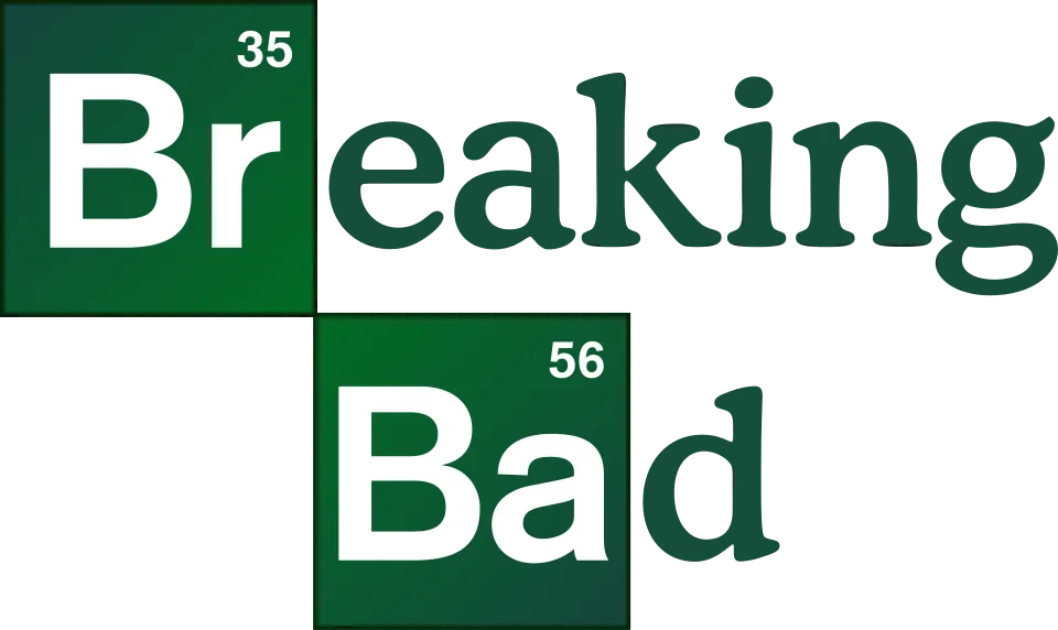
- Letters outside the tiles in the logo (eaking, d): Cooper BT Medium (community identification)
- Element symbols Br and Ba in the logo: Arial Bold (community identification)
- Formulas and numbers in the title sequence: Attic Antique (community identification)
Try the free alternatives
Type anything to see it in each free font suggested for the lettering you pick. Select a font's name to test it further and download it.
-
Breaking Bad
-
Breaking Bad
-
Breaking Bad
-
Breaking Bad
Letters outside the tiles in the logo (eaking, d)
| What it is | A retail typeface |
|---|---|
| Typeface | Cooper BT Medium |
| Designer | Oswald Bruce Cooper |
| Foundry | Bitstream |
| Licence | Commercial: sold by the foundry, and most uses need a paid licence. |
Community identification Agreed by people who identify fonts, with no official word.
Two DaFont forum threads identify the letters eaking and d as Cooper Medium, Bitstream's medium weight of Cooper. We set the same letters in Cooper BT Medium in the reseller's type tester and the round a, the curved arm of the k and the flag-shaped ear of the g agree with the logo; in the title sequence the letters are broken up to look eroded. A third thread's answer of Bundy was rejected by the person who asked. No one at AMC or Sony has named the face: Steven Maes, the show's lead graphic designer for its first three seasons, says only that the logo was Vince Gilligan's work.
Sources: 2 fonts in breaking bad pls? (DaFont forum), Breaking Bad (DaFont forum), Breaking Bad Logo (DaFont forum), Alumnus Steven Maes created iconic graphics for 'Breaking Bad' (Mirage, University of New Mexico), Cooper BT by Bitstream (MyFonts)
License Cooper BT Medium from Bitstream
Fan-made replicas
Fonts made by fans to recreate this lettering. They are not official, and each author sets their own terms.
- Heart Breaking Bad by Chequered Ink. Free.
Sources: Heart Breaking Bad by Chequered Ink (DaFont), Br and Ba Font? (DaFont forum)
Free alternatives
-
Laila, weight 600 Similar
At weight 600 it has the same soft, rounded serifs and low contrast, with a round two-storey a and a g with an open ear. Its letters are a little narrower and the ear of the g is a small ball where Cooper's is a flag.
Compared by eye against the original.
-
Averia Serif Libre, weight 700 Similar
At weight 700 its blurred, rounded corners give the same soft-edged look, and the k has a curved arm. It is heavier than the logo letters and less even in outline.
Compared by eye against the original.
-
Fraunces, weight 600 Similar
At weight 600 it is a soft old-style serif of the same weight, with a similar a and a g with a curled ear. Its serifs are flatter and sharper at the corners than Cooper's.
Compared by eye against the original.
-
Gupter, weight 700 Same mood
At weight 700 it is a sturdy, friendly serif of similar colour. Its serifs are square slabs, so it lacks the rounded softness of the logo letters.
Compared by eye against the original.
Element symbols Br and Ba in the logo
| What it is | A retail typeface |
|---|---|
| Typeface | Arial Bold |
| Designer | Robin Nicholas and Patricia Saunders |
| Foundry | Monotype |
| Licence | Commercial: sold by the foundry, and most uses need a paid licence. |
Community identification Agreed by people who identify fonts, with no official word.
The DaFont thread about the two tiles marks Arial as the identified font and a second member there agrees on Arial Bold; a third member names Arial in another thread, where one reply offers Helvetica Bold, and a fourth thread offers Basic Commercial Bold. We set Br and Ba in the Arial Bold and Helvetica Bold installed on our machine and in Arimo, and compared them with the logo file on Wikimedia Commons: the r ends in a slanted cut, as in Arial and Arimo, where Helvetica's is cut level. The small atomic numbers on the tiles look like the same face. There is no official statement.
Sources: Br and Ba Font? (DaFont forum), 2 fonts in breaking bad pls? (DaFont forum), Breaking Bad (DaFont forum), Arial by Monotype (MyFonts)
License Arial Bold from Monotype
Free alternatives
-
Arimo, weight 700 Close match
At weight 700. Arimo was drawn to match Arial's widths, and the B, r and a have the same shapes as on the tiles, including the slanted end of the r and the short tail on the a.
Compared by eye against the original.
-
Inter, weight 700 Similar
At weight 700 it has the same plain, upright B and a two-storey a of similar width. Its r ends in a squared-off cut and its a has no tail, so it leans towards Helvetica.
Compared by eye against the original.
-
Roboto, weight 700 Similar
At weight 700 it is a neutral grotesque of the same weight and x-height. Its letters are slightly narrower and its curves a little flatter at the sides.
Compared by eye against the original.
Formulas and numbers in the title sequence
| What it is | A retail typeface |
|---|---|
| Typeface | Attic Antique |
| Designer | Brian Willson |
| Foundry | Three Islands Press |
| Licence | Commercial: sold by the foundry, and most uses need a paid licence. |
Community identification Agreed by people who identify fonts, with no official word.
Two DaFont threads, each showing a frame of the opening titles with the formula C10H15N, the number 149.24 and the word meth drifting in green smoke, are answered with Attic Antique, one in 2019 and one in 2022. Beside the specimen on Adobe Fonts the heavy serif letters with chipped, worn edges agree, though the frames are soft. One asker mentions a tutorial that named Humana Serif and says it looks nothing like it. The cast and crew names are in a separate bold sans; one forum member proposed Franklin Gothic for them and nobody confirmed it.
Sources: "Breaking Bad" Font please!!! (DaFont forum), Breaking Bad intro font (DaFont forum), Breaking Bad Credits (DaFont forum), Attic Antique (Adobe Fonts)
License Attic Antique from Three Islands Press
Free alternatives
-
Averia Serif Libre, weight 700 Similar
At weight 700 it is a heavy text serif whose softened, uneven outline gives the same worn-print look. Its wear is a smooth blur where Attic Antique has chipped, ragged edges.
Compared by eye against the original.
-
Besley, weight 700 Similar
At weight 700 it has the heavy bracketed serifs and round, sturdy letters of the same Clarendon kind. Its outlines are clean, with none of the distress.
Compared by eye against the original.
-
Special Elite Same mood
A worn typewriter face with the same battered edges. Its letters are monoline and typewriter-shaped where the title sequence uses a bold book serif.
Compared by eye against the original.
-
IM Fell DW Pica Same mood
Digitised from old printed type, so it keeps rough, inky edges. It is an old-style face with lighter strokes and old-style figures that drop below the line.
Compared by eye against the original.
What the labels mean
- Community identification: Agreed by people who identify fonts, with no official word.
- Close match: Most people would take it for the same font at a glance.
- Similar: The same style, with differences you can see.
- Same mood: Gives the same feel without being a look-alike.
What we link to
We link only to owners (the rights holder, the foundry or its official reseller) and to designers' own pages, and we host a fan-made font only with its designer's permission. Every free alternative is published under an open licence and downloads from its page on this site.
More from Breaking Bad
Breaking Bad is a trademark of Sony Pictures Television. Simple But How is not affiliated with or endorsed by Sony Pictures Television.