
Call of Duty: Black Ops fonts
Cold War first-person shooter developed by Treyarch and published by Activision.
- Game
- 2010
- Call of Duty
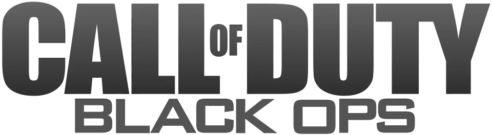
- CALL OF DUTY wordmark in the logo: Modified Impact (community identification)
- BLACK OPS line in the logo: Bank Gothic (community identification)
Try the free alternatives
Type anything to see it in each free font suggested for the lettering you pick. Select a font's name to test it further and download it.
-
Call of Duty: Black Ops
-
Call of Duty: Black Ops
-
Call of Duty: Black Ops
CALL OF DUTY wordmark in the logo
| What it is | A typeface that was altered for this title |
|---|---|
| Typeface | Impact |
| Designer | Geoffrey Lee |
| Foundry | Stephenson Blake (digital version from Monotype) |
| Licence | Commercial: sold by the foundry, and most uses need a paid licence. |
Community identification Agreed by people who identify fonts, with no official word.
In two DaFont forum threads about the Black Ops box art, repliers say the CALL OF DUTY part is Impact and link an earlier thread marked identified as Impact widened by hand; Fonts In Use's note that the series logo used Impact until 2023 agrees. Activision has not confirmed it. On the box the wordmark is the same widened capitals with a stacked OF, in white.
Sources: Call of Duty (Black Ops), what font is that? (DaFont forum), "Black Ops"'s font? (DaFont forum), Call of duty (DaFont forum)
License Impact from Stephenson Blake (digital version from Monotype)
Fan-made replicas
Fonts made by fans to recreate this lettering. They are not official, and each author sets their own terms.
- Call of Ops Duty by Chequered Ink. Free.
Free alternatives
-
Oswald, weight 700 Similar
At weight 700 heavy condensed grotesque capitals close to the logo's width, with a straight-sided O and an upright C. Its strokes are lighter than the stretched logo letters and the counters are more open.
Compared by eye against the original.
-
Anton Similar
Drawn in the manner of Impact, with the same tall, tightly spaced capitals and slot-like counters. It is narrower than the logo, whose letters were widened.
Compared by eye against the original.
-
Sofia Sans Extra Condensed, weight 900 Similar
At weight 900 it matches the logo's dark colour and tight fit. Its C, O and U are rounder and the letters slightly narrower.
Compared by eye against the original.
BLACK OPS line in the logo
| What it is | A retail typeface |
|---|---|
| Typeface | Bank Gothic |
| Designer | Morris Fuller Benton |
| Foundry | American Type Founders (digital version from Bitstream) |
| Licence | Commercial: sold by the foundry, and most uses need a paid licence. |
Community identification Agreed by people who identify fonts, with no official word.
Two DaFont forum threads posted at the game's launch, both showing the box art, are marked identified as Bank Gothic for the BLACK OPS line; one reply there compared it with Agency FB and Eurostile instead. Activision has not confirmed it. We typed BLACK OPS into the reseller's type tester, and Bank Gothic Medium matches the squared C, O, P and S and the straight-armed K.
Sources: Call of Duty (Black Ops), what font is that? (DaFont forum), "Black Ops"'s font? (DaFont forum), Bank Gothic by Bitstream (MyFonts)
License Bank Gothic from American Type Founders (digital version from Bitstream)
Free alternatives
-
Science Gothic Close match
Built on the Bank Gothic model, with the same broad squared capitals, round-cornered O and C and even strokes. At the regular weight it is close to the logo line.
Compared by eye against the original.
-
Aldrich Similar
Squared capitals with softly rounded corners and a flat-sided O. It is narrower and slightly lighter than Bank Gothic Medium.
Compared by eye against the original.
-
Orbitron, weight 500 Similar
At weight 500 squared geometric capitals of similar colour. Its letters are wider and its A has a flat top, unlike the pointed A of the logo.
Compared by eye against the original.
-
Quantico Same mood
Square capitals with cut-off corners instead of rounded ones. It has the same technical mood with a different corner shape.
Compared by eye against the original.
What the labels mean
- Community identification: Agreed by people who identify fonts, with no official word.
- Close match: Most people would take it for the same font at a glance.
- Similar: The same style, with differences you can see.
- Same mood: Gives the same feel without being a look-alike.
What we link to
We link only to owners (the rights holder, the foundry or its official reseller) and to designers' own pages, and we host a fan-made font only with its designer's permission. Every free alternative is published under an open licence and downloads from its page on this site.
More from Call of Duty
- Call of Duty: Black Ops 6 (2024, game) CALL OF DUTY wordmark in the logo: Custom lettering
- Call of Duty: Modern Warfare (2019, game) CALL OF DUTY wordmark in the logo: Modified Impact
- Call of Duty 4: Modern Warfare (2007, game) CALL OF DUTY wordmark in the logo: Modified Impact
- Call of Duty (2003, game) CALL OF DUTY wordmark in the logo: Modified Impact
Call of Duty: Black Ops and Call of Duty are trademarks of Activision. Simple But How is not affiliated with or endorsed by Activision.