
Call of Duty: Black Ops 6 fonts
Early-1990s first-person shooter co-developed by Treyarch and Raven Software and published by Activision.
- Game
- 2024
- Call of Duty
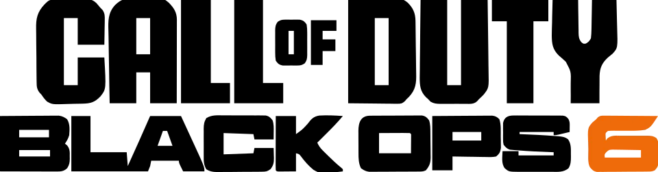
- CALL OF DUTY wordmark in the logo: Custom lettering (confirmed)
- BLACK OPS 6 line in the logo: Not identified
- Menus and headings: Kairos Sans Condensed (community identification)
- Subtitles: Monospace 821 Bold (community identification)
Try the free alternatives
Type anything to see it in each free font suggested for the lettering you pick. Select a font's name to test it further and download it.
-
Call of Duty: Black Ops 6
-
Call of Duty: Black Ops 6
-
Call of Duty: Black Ops 6
-
Call of Duty: Black Ops 6
-
Call of Duty: Black Ops 6
CALL OF DUTY wordmark in the logo
| What it is | Custom lettering drawn for this title, not a font you can install |
|---|---|
| Licence | Proprietary: owned by the rights holder and not offered for licensing. |
Confirmed Stated by the rights holder, the designer, the foundry or official brand material.
Activision's brand guidelines describe the franchise logo introduced in 2023 as its own mark, inspired by aircraft numbering and utilitarian type, with bevelled corners, unified widths and squared-off stems, and say it set the foundation for Hitmarker, a typeface designed only for Call of Duty. The guidelines forbid redrawing or respacing the logo, and Hitmarker is not sold. Fonts In Use credits Hitmarker to the foundry NaN.
Sources: Logos & Wordmark (Call of Duty brand guidelines), The Typeface (Call of Duty brand guidelines), Call of Duty: Modern Warfare 3 video game (Fonts In Use)
Free alternatives
-
Squada One Similar
Condensed, squared capitals with a flat-topped A and heavy upright stems, close to the logo's proportions. It is lighter, and its corners are only slightly clipped.
Compared by eye against the original.
-
Teko, weight 700 Similar
At weight 700 heavy, squared condensed capitals with small counters. Its letters are a little wider and the corners are not bevelled.
Compared by eye against the original.
-
Big Shoulders Display, weight 900 Similar
At weight 900 it matches the logo's narrow, dense letters. Its curves are rounder and its A is pointed.
Compared by eye against the original.
-
Chakra Petch, weight 700 Same mood
Shares the bevelled corners on C, O, U and D, but it is much wider and lighter than the logo.
Compared by eye against the original.
-
Black Ops One Same mood
A heavy military stencil with cut corners that gives the same utilitarian feel. The stencil breaks and wide letters set it apart.
Compared by eye against the original.
BLACK OPS 6 line in the logo
This font has not been identified. Not identified. Fonts In Use shows the logo without naming its lettering, and our searches of the DaFont forum found no thread about it. The line is very wide, heavy squared capitals with tiny counters, followed by an orange outlined 6. Activision's brand site says the variable cut of Hitmarker is intended for title art, but it does not say this logo uses it, so we leave the line unnamed.
Free alternatives
-
Goldman, weight 700 Similar
At weight 700 wide, very heavy squared capitals with small counters, close to the line's colour. Its letters are a little narrower.
Compared by eye against the original.
-
Orbitron, weight 900 Similar
At weight 900 extended squared capitals with rounded corners. Its counters are larger and its C and S more geometric.
Compared by eye against the original.
-
Russo One Similar
Heavy squared capitals with softened corners. It is narrower than the logo line.
Compared by eye against the original.
-
Syncopate, weight 700 Same mood
Wide, heavy capitals with the same broad stance, but its O and S are round rather than squared.
Compared by eye against the original.
Menus and headings
| What it is | A retail typeface |
|---|---|
| Typeface | Kairos Sans Condensed |
| Designer | Terrance Weinzierl |
| Foundry | Monotype |
| Licence | Commercial: sold by the foundry, and most uses need a paid licence. |
Community identification Agreed by people who identify fonts, with no official word.
Fonts In Use, working from Activision's own press screenshots, says Kairos Sans Condensed sets most of the interface, from big headings to minor labels, with TT Lakes Neue for longer text and Noto Sans for player names and the scoreboard. Activision has not confirmed the names. We looked at Kairos Sans, an octagonal sans with cut corners, in the reseller's type tester before comparing library fonts with it.
Sources: Call of Duty: Black Ops 6 video game (Fonts In Use), Kairos Sans by Monotype (MyFonts)
License Kairos Sans Condensed from Monotype
Free alternatives
-
Chakra Petch, weight 500 Similar
At weight 500 it shares Kairos Sans's octagonal letters with cut-off corners. It is wider than the Condensed width.
Compared by eye against the original.
-
Tomorrow, weight 500 Similar
At weight 500 chamfered, squared letters with the same technical mood. It is heavier and wider than Kairos Sans Condensed.
Compared by eye against the original.
-
Saira Condensed, weight 500 Similar
At weight 500 it matches the condensed width and squared rounds, but its corners are rounded instead of cut.
Compared by eye against the original.
Subtitles
| What it is | A retail typeface |
|---|---|
| Typeface | Monospace 821 Bold |
| Designer | Max Miedinger |
| Foundry | Bitstream |
| Licence | Commercial: sold by the foundry, and most uses need a paid licence. |
Community identification Agreed by people who identify fonts, with no official word.
Fonts In Use says the subtitles, and the gun statistics on the weapon modification screen, are set in Monospace 821 Bold, Bitstream's monospaced Helvetica design, and reads it as a nod to transcripts in a series about covert operations. Activision has not confirmed it. We set a line of dialogue in the reseller's type tester to compare it with the library fonts.
Sources: Call of Duty: Black Ops 6 video game (Fonts In Use), Monospace 821 by Bitstream (MyFonts)
License Monospace 821 Bold from Bitstream
Free alternatives
-
Roboto Mono, weight 700 Similar
At weight 700 a grotesque monospace with the same plain, Helvetica-like a, e and G. Its letters are slightly narrower.
Compared by eye against the original.
-
Noto Sans Mono, weight 700 Similar
At weight 700 a neutral grotesque monospace of similar colour. Its curves are a little more squared.
Compared by eye against the original.
-
Cousine, weight 700 Similar
At weight 700 a monospace in the Arial and Helvetica tradition with a comparable bold. Its letters are wider and more open.
Compared by eye against the original.
What the labels mean
- Confirmed: Stated by the rights holder, the designer, the foundry or official brand material.
- Community identification: Agreed by people who identify fonts, with no official word.
- Similar: The same style, with differences you can see.
- Same mood: Gives the same feel without being a look-alike.
What we link to
We link only to owners (the rights holder, the foundry or its official reseller) and to designers' own pages, and we host a fan-made font only with its designer's permission. Every free alternative is published under an open licence and downloads from its page on this site.
More from Call of Duty
- Call of Duty: Modern Warfare (2019, game) CALL OF DUTY wordmark in the logo: Modified Impact
- Call of Duty: Black Ops (2010, game) CALL OF DUTY wordmark in the logo: Modified Impact
- Call of Duty 4: Modern Warfare (2007, game) CALL OF DUTY wordmark in the logo: Modified Impact
- Call of Duty (2003, game) CALL OF DUTY wordmark in the logo: Modified Impact
Call of Duty: Black Ops 6 and Call of Duty are trademarks of Activision. Simple But How is not affiliated with or endorsed by Activision.