
Diary of a Wimpy Kid (2007) fonts
First book of Jeff Kinney's illustrated novel series, published by Amulet Books, an imprint of Abrams.
- Book
- 2007
- Diary of a Wimpy Kid
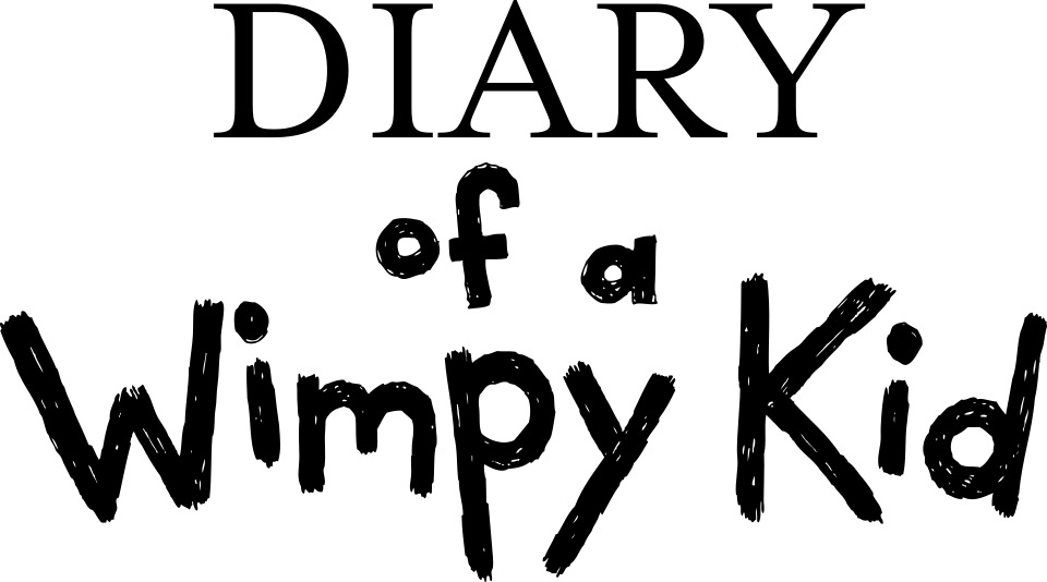
- DIARY line in the cover logo: Mrs Eaves (our visual match)
- of a Wimpy Kid lettering in the cover logo: Not identified
- Handwritten-style text of the book: WimpyKid (confirmed)
Try the free alternatives
Type anything to see it in each free font suggested for the lettering you pick. Select a font's name to test it further and download it.
-
Diary of a Wimpy Kid
-
Diary of a Wimpy Kid
-
Diary of a Wimpy Kid
DIARY line in the cover logo
| What it is | A retail typeface |
|---|---|
| Typeface | Mrs Eaves |
| Designer | Zuzana Licko |
| Foundry | Emigre |
| Licence | Commercial: sold by the foundry, and most uses need a paid licence. |
Our visual match Our own judgement after comparing the lettering side by side.
A DaFont forum identifier names Mrs Eaves for this word on the cover of a later book in the series, The Getaway. The first book's cover carries the same DIARY lettering by our comparison, and checked against Emigre's own Mrs Eaves specimen the wide D and A and the long straight leg of the R agree. Neither Abrams nor Kinney has said what it is.
Sources: Diary of a wimpy kid (DaFont forum), Mrs Eaves type specimen (Emigre)
Free alternatives
-
Baskervville Similar
A Baskerville revival, the model Mrs Eaves was drawn from, with the same wide capitals and long R leg. It has a little more contrast and sharper serifs.
Compared by eye against the original.
-
Libre Baskerville Similar
Wide transitional capitals of similar build. It is heavier and its serifs are blunter than on the cover.
Compared by eye against the original.
-
Cormorant Garamond, weight 500 Similar
At weight 500 it gives elegant, open capitals with a long R leg. It is narrower and more delicate than Mrs Eaves.
Compared by eye against the original.
of a Wimpy Kid lettering in the cover logo
This font has not been identified. The bouncy marker letters look hand-drawn, with scribbled fills in the black version of the logo, but we found no statement from Kinney or Abrams about who drew them. In the main DaFont forum thread on the cover, one user suggests Coop Forged and is disputed, and we could not check it in a foundry tester. Fonts In Use has no entry for the series.
Free alternatives
-
Gochi Hand Similar
Heavy marker strokes with a round-bottomed W and an uneven baseline, close to the cover's lettering. Its letters are more regular and less scribbled.
Compared by eye against the original.
-
Caveat Brush Similar
Thick, quick-looking strokes with the same informal mixed case. It slants slightly and is narrower than the logo.
Compared by eye against the original.
-
Chewy Same mood
Chunky, rounded cartoon letters with a similar playful weight. Its strokes are smooth and blobby rather than drawn with a marker.
Compared by eye against the original.
-
Finger Paint Same mood
Its streaky strokes recall the scribbled fill of the black logo. It is much lighter and looser than the cover lettering.
Compared by eye against the original.
Handwritten-style text of the book
| What it is | A typeface owned by the rights holder and not sold |
|---|---|
| Typeface | WimpyKid |
| Licence | Proprietary: owned by the rights holder and not offered for licensing. |
Confirmed Stated by the rights holder, the designer, the foundry or official brand material.
Asked on NPR in October 2009 about the lettering, Kinney said the books use a font based on his own handwriting, chosen so they would look handwritten and approachable. Penguin's Wimpy Kid Club site for UK readers serves that font to visitors as a web font named WimpyKid, alongside WimpyKidDialogue; we read the names inside the files and deleted them. The copy of WimpyKidDialogue on wimpykid.com records Jeff Kinney as its copyright holder. We found neither on sale from any foundry.
Sources: Cheese, Wimpy Kids And The Perils Of Middle School (NPR, 2009), Wimpy Kid Club (Penguin Random House UK), Official Wimpy Kid site
Free alternatives
-
Short Stack Similar
Neat, upright, monoline print with round letters and a barred J, close to Kinney's font. It is wider and more even than his hand.
Compared by eye against the original.
-
Patrick Hand Similar
Tidy upright handwriting with simple strokes and a similar x-height. Its strokes vary more in weight and its letters are narrower.
Compared by eye against the original.
-
Schoolbell Similar
A schoolchild's print, used on the official Wimpy Kid website, with the same casual, upright feel. Its strokes are thinner and it has more character in the f and y.
Compared by eye against the original.
-
Gaegu Similar
Rounded, slightly wobbly print with open letters. It is spaced more loosely and its shapes are softer than Kinney's.
Compared by eye against the original.
What the labels mean
- Confirmed: Stated by the rights holder, the designer, the foundry or official brand material.
- Our visual match: Our own judgement after comparing the lettering side by side.
- Similar: The same style, with differences you can see.
- Same mood: Gives the same feel without being a look-alike.
What we link to
We link only to owners (the rights holder, the foundry or its official reseller) and to designers' own pages, and we host a fan-made font only with its designer's permission. Every free alternative is published under an open licence and downloads from its page on this site.
More from Diary of a Wimpy Kid
Diary of a Wimpy Kid is a trademark of Wimpy Kid, Inc. Simple But How is not affiliated with or endorsed by Wimpy Kid, Inc.