
Diary of a Wimpy Kid (2021) fonts
Animated film written by Jeff Kinney and directed by Swinton O. Scott III, released on Disney+.
- Film
- 2021
- Diary of a Wimpy Kid
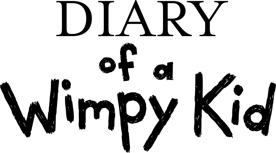
- DIARY line in the logo: Mrs Eaves (our visual match)
- of a Wimpy Kid lettering in the logo: Not identified
Try the free alternatives
Type anything to see it in each free font suggested for the lettering you pick. Select a font's name to test it further and download it.
-
Diary of a Wimpy Kid
-
Diary of a Wimpy Kid
DIARY line in the logo
| What it is | A retail typeface |
|---|---|
| Typeface | Mrs Eaves |
| Designer | Zuzana Licko |
| Foundry | Emigre |
| Licence | Commercial: sold by the foundry, and most uses need a paid licence. |
Our visual match Our own judgement after comparing the lettering side by side.
The Disney+ poster uses the books' lockup again, with DIARY in the same serif capitals by our comparison. The Mrs Eaves identification comes from the DaFont forum for a book cover, checked by us against Emigre's specimen.
Sources: Diary of a wimpy kid (DaFont forum), Mrs Eaves type specimen (Emigre)
Free alternatives
-
Baskervville Similar
A Baskerville revival, the model Mrs Eaves was drawn from, with the same wide capitals and long R leg. It has a little more contrast and sharper serifs.
Compared by eye against the original.
-
Libre Baskerville Similar
Wide transitional capitals of similar build. It is heavier and its serifs are blunter than in the logo.
Compared by eye against the original.
of a Wimpy Kid lettering in the logo
This font has not been identified. The same hand-drawn lettering as on the books and the earlier films, by our comparison with the Disney+ poster. We found nothing naming a font or an artist.
Free alternatives
-
Gochi Hand Similar
Heavy marker strokes with a round-bottomed W and an uneven baseline, close to the logo lettering. Its letters are more regular and less scribbled.
Compared by eye against the original.
-
Caveat Brush Similar
Thick, quick-looking strokes with the same informal mixed case. It slants slightly and is narrower than the logo.
Compared by eye against the original.
What the labels mean
- Our visual match: Our own judgement after comparing the lettering side by side.
- Similar: The same style, with differences you can see.
What we link to
We link only to owners (the rights holder, the foundry or its official reseller) and to designers' own pages, and we host a fan-made font only with its designer's permission. Every free alternative is published under an open licence and downloads from its page on this site.
More from Diary of a Wimpy Kid
Diary of a Wimpy Kid is a trademark of Wimpy Kid, Inc. Simple But How is not affiliated with or endorsed by Wimpy Kid, Inc.