
Fortnite (2017) fonts
Online game developed and published by Epic Games; Save the World and Battle Royale launched in 2017.
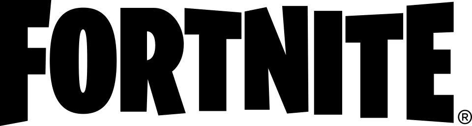
- FORTNITE logo: Modified Burbank Big Condensed Black (community identification)
- Menu headings and buttons from 2017 to 2023: Burbank Big Condensed Black (community identification)
- Interface text since November 2023: Heading Now (community identification)
- Small text in menus and chat: Noto Sans (community identification)
Try the free alternatives
Type anything to see it in each free font suggested for the lettering you pick. Select a font's name to test it further and download it.
-
Fortnite
-
Fortnite
-
Fortnite
-
Fortnite
FORTNITE logo
| What it is | A typeface that was altered for this title |
|---|---|
| Typeface | Burbank Big Condensed Black |
| Designer | Tal Leming |
| Foundry | House Industries |
| Licence | Commercial: sold by the foundry, and most uses need a paid licence. |
Community identification Agreed by people who identify fonts, with no official word.
A Fonts In Use entry identifies the logo as a customised setting of Burbank Big Condensed Black, and two DaFont threads about the Fortnite font are marked identified as Burbank, one of them as Burbank Big Condensed Bold. Tal Leming, who designed the family, writes on his own portfolio that Fortnite players have spent billions of hours looking at it, which confirms the family though not the exact logo style. Epic has not described the logo, and House Industries' site refuses automated requests, so we could not set the word in the foundry's tester ourselves.
Sources: Fortnite (Fonts In Use), Burbank (Type Supply, Tal Leming's portfolio), FORTNITE FONT PLEASE HELP (DaFont forum), Epic Games's Fortnite font (DaFont forum)
License Burbank Big Condensed Black from House Industries
Free alternatives
-
Londrina Solid, weight 900 Similar
At weight 900 it is the closest in our library: tall condensed capitals with slightly uneven stems, a narrow slot for the O's counter and the same hand-cut wobble. It is a little lighter and its letters are slightly wider.
Compared by eye against the original.
-
Ranchers Similar
Heavy condensed capitals with small counters and a slight bounce, near the logo's proportions. Its letters are more regular and sit closer together, so it has less of the logo's bounce.
Compared by eye against the original.
-
Luckiest Guy Similar
The free font most often suggested for the Fortnite look: chunky, bouncy capitals with angled cuts. It is much wider than Burbank Big Condensed, with a round O, so it reads as a cousin rather than a copy.
Compared by eye against the original.
-
Anton Same mood
Matches the height, width and weight of the wordmark for a bold condensed headline. It is perfectly regular, with none of Burbank's tilt and bounce.
Compared by eye against the original.
Menu headings and buttons from 2017 to 2023
| What it is | A retail typeface |
|---|---|
| Typeface | Burbank Big Condensed Black |
| Designer | Tal Leming |
| Foundry | House Industries |
| Licence | Commercial: sold by the foundry, and most uses need a paid licence. |
Community identification Agreed by people who identify fonts, with no official word.
Fonts In Use describes Burbank as the primary font for the game's menus, and VideoGamer names Burbank Big Condensed Black as the font the game used from 2017 until update 27.10 in November 2023. Official material confirms the family but not this role: Epic's Fortnite Creative documentation lists Burbank only as a text font for in-world billboards, and Tal Leming, who designed the typeface, writes that hundreds of millions of Fortnite players have seen it. In a 2018 lobby screenshot the season banner, level number and Ready button are in the condensed Burbank style, while the tab labels and body text are in a plain sans.
Sources: Using Billboard Devices in Fortnite Creative (Epic Developer Community), Burbank (Type Supply, Tal Leming's portfolio), Fortnite (Fonts In Use), Fortnite players complain about new font (VideoGamer)
License Burbank Big Condensed Black from House Industries
Free alternatives
-
Londrina Solid, weight 900 Similar
At weight 900 it is the closest in our library: tall condensed capitals with slightly uneven stems, a narrow slot for the O's counter and the same hand-cut wobble. It is a little lighter and its letters are slightly wider.
Compared by eye against the original.
-
Ranchers Similar
Heavy condensed capitals with small counters and a slight bounce, near the logo's proportions. Its letters are more regular and sit closer together, so it has less of the logo's bounce.
Compared by eye against the original.
-
Luckiest Guy Similar
The free font most often suggested for the Fortnite look: chunky, bouncy capitals with angled cuts. It is much wider than Burbank Big Condensed, with a round O, so it reads as a cousin rather than a copy.
Compared by eye against the original.
-
Anton Same mood
Matches the height, width and weight of the wordmark for a bold condensed headline. It is perfectly regular, with none of Burbank's tilt and bounce.
Compared by eye against the original.
Interface text since November 2023
| What it is | A retail typeface |
|---|---|
| Typeface | Heading Now |
| Foundry | Zetafonts |
| Licence | Commercial: sold by the foundry, and most uses need a paid licence. |
Community identification Agreed by people who identify fonts, with no official word.
VideoGamer reported in November 2023 that update 27.10 changed the in-game text away from Burbank Big Condensed Black, without naming the replacement. On Epic's developer forum an island creator wrote that same month that the new font added to Fortnite is called Heading Now, and in June 2026 a known-issues post by Epic staff listed Heading Now weights, 67 Extra Bold and 85 Medium, among the typefaces available to creators. That shows the family is part of Fortnite's interface toolkit; Epic has not said in a form we could find that the game's own menus use it, and we did not compare a current screenshot with the foundry's specimen.
Sources: Fortnite players complain about new font (VideoGamer), Custom Widget UI Buttons Compile Error (Epic Developer Community Forums), v41.00 Known Issues and Pre-Release Updates (Epic Developer Community Forums), Heading Now by Zetafonts (MyFonts)
License Heading Now from Zetafonts
Free alternatives
-
Inter, weight 900 Similar
At weight 900 it is nearest to Zetafonts' specimen of Heading Now in its wide extra-bold style: a tight, heavy grotesque with flat stroke ends and a square-shouldered B and P. Inter is slightly narrower and its S is less compact.
Compared by eye against the original.
-
Archivo, weight 900 Similar
At weight 900 it has the same dense, wide capitals and horizontal terminals. It is a little wider still and its counters are rounder.
Compared by eye against the original.
-
Schibsted Grotesk, weight 900 Similar
At weight 900 it gives the same plain, heavy headline with tight spacing. Its curves are softer and its A is narrower than in the Heading Now specimen.
Compared by eye against the original.
Small text in menus and chat
| What it is | An open-licence typeface |
|---|---|
| Typeface | Noto Sans |
| Foundry | |
| Licence | Open licence: free to use, including in commercial work. |
Community identification Agreed by people who identify fonts, with no official word.
A DaFont thread asking about the text inside the game, as opposed to the logo, is marked identified as Noto Sans, and Epic's Fortnite Creative documentation lists Notosans as the default text font for in-world signs. Fonts In Use lists the near-identical Open Sans for the game without saying where. In our comparison a 2018 lobby screenshot fits both, and the two cannot be told apart at that size.
Sources: Fortnite in-game font (DaFont forum), Using Billboard Devices in Fortnite Creative (Epic Developer Community), Fortnite (Fonts In Use)
Official page at fonts.google.com
Noto Sans is in our library and free to use: test and download Noto Sans.
Free alternatives
-
Open Sans Close match
Nearly the same design as Noto Sans: the same open letter shapes, proportions and stroke weight at 400, hard to tell apart in running text. Set at the same size on our sheet, Open Sans runs a hair narrower.
Compared by eye against the original.
-
Roboto Similar
A neutral sans of similar weight and x-height that works for the same small labels. Its curves are flatter-sided and its letters sit closer together.
Compared by eye against the original.
-
Inter Similar
Clear at small sizes with a tall x-height, like the game's body text. Its shapes are squarer and its apertures tighter than Noto Sans.
Compared by eye against the original.
What the labels mean
- Community identification: Agreed by people who identify fonts, with no official word.
- Close match: Most people would take it for the same font at a glance.
- Similar: The same style, with differences you can see.
- Same mood: Gives the same feel without being a look-alike.
What we link to
We link only to owners (the rights holder, the foundry or its official reseller) and to designers' own pages, and we host a fan-made font only with its designer's permission. Every free alternative is published under an open licence and downloads from its page on this site.
More from Fortnite
Fortnite is a trademark of Epic Games. Simple But How is not affiliated with or endorsed by Epic Games.