
LEGO Fortnite fonts
Survival crafting game inside Fortnite, made by Epic Games with the LEGO Group and launched in December 2023.
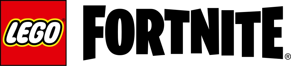
- FORTNITE wordmark in the logo: Modified Burbank Big Condensed Black (community identification)
- Headlines in key art and promotion: Modified Komplekt (confirmed)
Try the free alternatives
Type anything to see it in each free font suggested for the lettering you pick. Select a font's name to test it further and download it.
-
LEGO Fortnite
-
LEGO Fortnite
-
LEGO Fortnite
-
LEGO Fortnite
FORTNITE wordmark in the logo
| What it is | A typeface that was altered for this title |
|---|---|
| Typeface | Burbank Big Condensed Black |
| Designer | Tal Leming |
| Foundry | House Industries |
| Licence | Commercial: sold by the foundry, and most uses need a paid licence. |
Community identification Agreed by people who identify fonts, with no official word.
The logo places the LEGO Group's own red square mark beside the standard FORTNITE wordmark. The Fonts In Use entry on LEGO Fortnite states that the wordmark is the customised Burbank Big Condensed Black of the main game, and by our own comparison the two wordmarks are the same artwork. Epic has not described it.
Sources: LEGO Fortnite (Fonts In Use), Fortnite (Fonts In Use), Burbank (Type Supply, Tal Leming's portfolio)
License Burbank Big Condensed Black from House Industries
Free alternatives
-
Londrina Solid, weight 900 Similar
At weight 900 it is the closest in our library: tall condensed capitals with slightly uneven stems, a narrow slot for the O's counter and the same hand-cut wobble. It is a little lighter and its letters are slightly wider.
Compared by eye against the original.
-
Ranchers Similar
Heavy condensed capitals with small counters and a slight bounce, near the logo's proportions. Its letters are more regular and sit closer together, so it has less of the logo's bounce.
Compared by eye against the original.
-
Luckiest Guy Similar
The free font most often suggested for the Fortnite look: chunky, bouncy capitals with angled cuts. It is much wider than Burbank Big Condensed, with a round O, so it reads as a cousin rather than a copy.
Compared by eye against the original.
-
Anton Same mood
Matches the height, width and weight of the wordmark for a bold condensed headline. It is perfectly regular, with none of Burbank's tilt and bounce.
Compared by eye against the original.
Headlines in key art and promotion
| What it is | A typeface that was altered for this title |
|---|---|
| Typeface | Komplekt |
| Designer | Lewis McGuffie |
| Foundry | East of Rome |
| Licence | Commercial: sold by the foundry, and most uses need a paid licence. |
Confirmed Stated by the rights holder, the designer, the foundry or official brand material.
The Fonts In Use entry on LEGO Fortnite was contributed by Lewis McGuffie, whom Fonts In Use credits as the designer of Komplekt. He states that Epic Games and the LEGO Group used the typeface for the collaboration with small changes: an A that is narrower at the top and an S with more open counters. The entry is filed under advertising and tagged as slanted capitals with shadows and underlines, which is the headline lettering of the key art; the designer does not say which individual lines are set in it.
Sources: LEGO Fortnite (Fonts In Use), Komplekt in use (Fonts In Use), Komplekt (East of Rome)
License Komplekt from East of Rome
Free alternatives
-
Barlow Condensed, weight 900, italic Similar
At weight 900 italic it gives the same heavy, slanted, condensed capitals with flat stroke ends as the key-art headline. Its corners are slightly rounded and it lacks Komplekt's inky irregularity.
Compared by eye against the original.
-
Sofia Sans Extra Condensed, weight 900, italic Similar
At weight 900 italic it matches the headline's narrow width and dense colour. Its curves are rounder and its strokes more even.
Compared by eye against the original.
-
Alumni Sans, weight 900, italic Similar
At weight 900 italic it has the squared, compact D and U of the headline and a similar slant. It is a little narrower and more mechanical.
Compared by eye against the original.
-
Anton Same mood
A heavy condensed poster face with the same punch. It is upright only, so it misses the forward lean of the LEGO Fortnite headlines.
Compared by eye against the original.
What the labels mean
- Confirmed: Stated by the rights holder, the designer, the foundry or official brand material.
- Community identification: Agreed by people who identify fonts, with no official word.
- Similar: The same style, with differences you can see.
- Same mood: Gives the same feel without being a look-alike.
What we link to
We link only to owners (the rights holder, the foundry or its official reseller) and to designers' own pages, and we host a fan-made font only with its designer's permission. Every free alternative is published under an open licence and downloads from its page on this site.
More from Fortnite
LEGO Fortnite and Fortnite are trademarks of Epic Games. Simple But How is not affiliated with or endorsed by Epic Games.