
Halo: Combat Evolved fonts
First-person shooter developed by Bungie and published by Microsoft Game Studios as a launch title for the original Xbox.
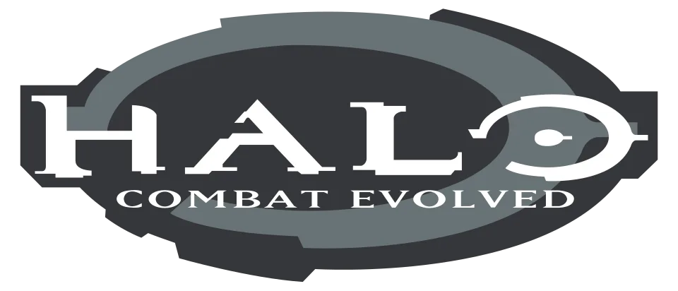
- HALO wordmark in the logo: Custom lettering (community identification)
- COMBAT EVOLVED line in the logo: Not identified
- Main menu: Handel Gothic (community identification)
- In-game text and help screens: Interstate (community identification)
Try the free alternatives
Type anything to see it in each free font suggested for the lettering you pick. Select a font's name to test it further and download it.
-
Halo: Combat Evolved
-
Halo: Combat Evolved
-
Halo: Combat Evolved
HALO wordmark in the logo
| What it is | Custom lettering drawn for this title, not a font you can install |
|---|---|
| Licence | Proprietary: owned by the rights holder and not offered for licensing. |
Community identification Agreed by people who identify fonts, with no official word.
Bungie.org's page on a 2000 deodorant advert that copied the logo reports Halo producer Nathan Bitner saying the lettering was a unique design not based on any existing font, and quotes a FontShop expert who saw it copied in the advert. Rolling Stone's history of Halo 2 says Lorraine McLees, Bungie's art director of marketing from April 1999, finalized the logo before its MacWorld reveal that year. The letters are very wide, with thin crossbars, heavy stems ending in small flared serifs, and an O drawn as a ring with a dot in the middle.
Sources: Lynx Phoenix ad (Marathon's Story, bungie.org), 'Halo 2' Is a Classic, But Its Development Was a Mess (Rolling Stone Australia)
Fan-made replicas
Fonts made by fans to recreate this lettering. They are not official, and each author sets their own terms.
- Halo by Will Turnbow. Free.
Sources: Halo 3: ODST Font? (DaFont forum), Halo: Reach Font Name (DaFont forum)
Free alternatives
-
Syncopate, weight 700 Similar
At weight 700 it has the wordmark's extended width and heavy stems. It has no serifs or thin crossbars, and its O is a plain oval rather than a ring.
Compared by eye against the original.
-
Holtwood One SC Same mood
Wide, heavy capitals with blunt serifs that give the same monumental feel. It is far heavier and narrower than the logo, with thick slab serifs instead of small flares.
Compared by eye against the original.
-
Michroma Same mood
Shares the very wide, flat-sided proportions. It is a light monoline sans, so it lacks the logo's weight and serifs.
Compared by eye against the original.
COMBAT EVOLVED line in the logo
This font has not been identified. No source names the face of the subtitle; the Fonts In Use entry on the game covers only the interface. On the original Xbox box it is a widely spaced classical roman in capitals, with a splayed M and bracketed serifs.
Free alternatives
-
Cinzel, weight 500 Similar
Roman inscriptional capitals with a splayed M and fine serifs, like the subtitle. Its letters are a little narrower and lighter.
Compared by eye against the original.
-
Spectral SC, weight 500 Similar
Wide classical capitals with bracketed serifs and an even rhythm, close to the line's colour. Its serifs are sharper and its M is less splayed.
Compared by eye against the original.
-
Cormorant SC, weight 600 Similar
Old-style roman capitals of a similar weight. It has more stroke contrast and narrower letters than the subtitle.
Compared by eye against the original.
Main menu
| What it is | A retail typeface |
|---|---|
| Typeface | Handel Gothic |
| Designer | Donald Handel and Robert Trogman |
| Foundry | Linotype (first issued by FotoStar) |
| Licence | Commercial: sold by the foundry, and most uses need a paid licence. |
Community identification Agreed by people who identify fonts, with no official word.
The Fonts In Use entry on the game, with screenshots of the title and difficulty menus, identifies the menu items as Handel Gothic. In the main menu screenshot the items CAMPAIGN, MULTIPLAYER and SETTINGS show the face's wide, rounded capitals and its P with an open bowl.
Sources: Halo: Combat Evolved video game (Fonts In Use), Handel Gothic (MyFonts)
License Handel Gothic from Linotype (first issued by FotoStar)
Free alternatives
-
Sansation, weight 700 Similar
At weight 700 it shares Handel Gothic's open-bowled P and the same mix of round and squared shapes. Its letters are narrower than the menu text.
Compared by eye against the original.
-
Aldrich Similar
Squarish, wide-set capitals with rounded corners, close to the menu's technical look. Its P is closed and its strokes are lighter.
Compared by eye against the original.
-
Jura, weight 600 Same mood
At weight 600 a rounded, slightly squared sans with the same futuristic tone. It is lighter and more condensed.
Compared by eye against the original.
In-game text and help screens
| What it is | A retail typeface |
|---|---|
| Typeface | Interstate |
| Designer | Tobias Frere-Jones |
| Foundry | Font Bureau |
| Licence | Commercial: sold by the foundry, and most uses need a paid licence. |
Community identification Agreed by people who identify fonts, with no official word.
The Fonts In Use entry on the game identifies most in-game text, such as the help panels and pickup prompts, as Interstate, and says the HUD uses the LCD face with modified numerals. The help panel in its screenshots shows Interstate's narrow-shouldered bold capitals with square dots and straight-cut stroke ends.
Sources: Halo: Combat Evolved video game (Fonts In Use), Interstate (Font Bureau)
License Interstate from Font Bureau
Free alternatives
-
Overpass, weight 700 Close match
Overpass, like Interstate, is drawn from the US highway sign alphabet, so the bold capitals share the same straight terminals and squarish curves. Its G and its spacing differ slightly.
Compared by eye against the original.
-
Barlow, weight 700 Similar
At weight 700 a slightly rounded grotesque with flat stroke ends and compact proportions. Its curves are softer and its letters a little narrower.
Compared by eye against the original.
-
Public Sans, weight 700 Same mood
A neutral bold sans of similar weight for readable panel text. It is wider and has none of Interstate's highway-sign character.
Compared by eye against the original.
What the labels mean
- Community identification: Agreed by people who identify fonts, with no official word.
- Close match: Most people would take it for the same font at a glance.
- Similar: The same style, with differences you can see.
- Same mood: Gives the same feel without being a look-alike.
What we link to
We link only to owners (the rights holder, the foundry or its official reseller) and to designers' own pages, and we host a fan-made font only with its designer's permission. Every free alternative is published under an open licence and downloads from its page on this site.
More from Halo
Halo: Combat Evolved and Halo are trademarks of Microsoft. Simple But How is not affiliated with or endorsed by Microsoft.