
Halo Infinite fonts
Developed by 343 Industries and published by Xbox Game Studios for Xbox and Windows.
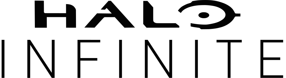
- HALO wordmark in the logo: Custom lettering (our visual match)
- INFINITE line in the logo: Not identified
Try the free alternatives
Type anything to see it in each free font suggested for the lettering you pick. Select a font's name to test it further and download it.
-
Halo Infinite
-
Halo Infinite
-
Halo Infinite
HALO wordmark in the logo
| What it is | Custom lettering drawn for this title, not a font you can install |
|---|---|
| Licence | Proprietary: owned by the rights holder and not offered for licensing. |
Our visual match Our own judgement after comparing the lettering side by side.
Nothing we found discusses this logo. By our comparison it uses the smoother redraw of the HALO wordmark that the series has carried since Halo 4: the same very wide letters and ringed O, with flared ends but no separate serifs and with sharper cuts in the A and L. That the original lettering is a Bungie design rather than a font rests on the producer's statement reported by bungie.org.
Sources: Lynx Phoenix ad (Marathon's Story, bungie.org)
Free alternatives
-
Syncopate, weight 700 Similar
At weight 700 it matches the redrawn wordmark's extended width and weight. Its letters are plain sans forms without the flared ends, and its O is an oval rather than a ring.
Compared by eye against the original.
-
Lexend Zetta, weight 700 Similar
At weight 700 wide, heavy capitals with generous built-in spacing. Its A and L have plain corners where the logo's are cut at an angle.
Compared by eye against the original.
-
Michroma Same mood
Very wide, flat-sided capitals with a modern feel. It is much lighter than the wordmark.
Compared by eye against the original.
INFINITE line in the logo
This font has not been identified. We found no identification of this line on Fonts In Use or the DaFont forum. Under the wordmark INFINITE is set in very thin, widely spaced capitals with no contrast and an E with equal arms.
Free alternatives
-
Lexend Zetta, weight 200 Similar
At weight 200 thin monoline capitals with very wide spacing built in, close to the line. Its letters are slightly wider than the logo's.
Compared by eye against the original.
-
Montserrat, weight 200 Similar
At weight 200 a thin geometric sans with plain I, N and E. It needs wide letter-spacing to match.
Compared by eye against the original.
-
Julius Sans One Similar
Light, wide capitals with even strokes. Its strokes are a little heavier than the logo's hairline letters.
Compared by eye against the original.
What the labels mean
- Our visual match: Our own judgement after comparing the lettering side by side.
- Similar: The same style, with differences you can see.
- Same mood: Gives the same feel without being a look-alike.
What we link to
We link only to owners (the rights holder, the foundry or its official reseller) and to designers' own pages, and we host a fan-made font only with its designer's permission. Every free alternative is published under an open licence and downloads from its page on this site.
More from Halo
Halo Infinite and Halo are trademarks of Microsoft. Simple But How is not affiliated with or endorsed by Microsoft.