
James Bond fonts
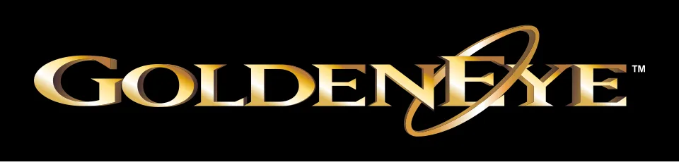
The one constant in Bond lettering is the 007 gun logo, which Eye magazine credits to Joe Caroff, commissioned in 1962 for the letterheads of the company making Dr. No, and which every film since has carried. Each film title gets its own treatment, and the documented ones are retail typefaces reworked by the poster designers: Emigre's Matrix for GoldenEye, light and distressed geometric sans-serifs for Casino Royale and Skyfall, and a modified Futura Black for No Time to Die. The books went their own way, from the ornamented capitals Ian Fleming devised for the first Casino Royale jacket to Raymond Hawkey's Helvetica covers for Pan.
Films
- No Time to Die (2021) NO TIME TO DIE title in the logo: Modified Futura Black
- Skyfall (2012) SKYFALL title in the logo: Modified Neutraface
- Casino Royale (2006) CASINO ROYALE title in the logo: Century Gothic
- GoldenEye (1995) GOLDENEYE title on the posters: Modified Matrix
- Dr. No (1962) DR. NO title on the British poster: Not identified
Books
James Bond is a trademark of London Operations, LLC. Simple But How is not affiliated with or endorsed by London Operations, LLC.