
Casino Royale fonts
Twenty-first Eon film and Daniel Craig's first as Bond, directed by Martin Campbell.
- Film
- 2006
- James Bond
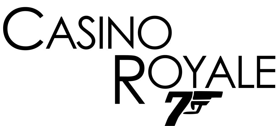
- CASINO ROYALE title in the logo: Century Gothic (community identification)
- 007 gun logo: Custom lettering (community identification)
Try the free alternatives
Type anything to see it in each free font suggested for the lettering you pick. Select a font's name to test it further and download it.
-
Casino Royale
-
Casino Royale
-
Casino Royale
CASINO ROYALE title in the logo
| What it is | A retail typeface |
|---|---|
| Typeface | Century Gothic |
| Foundry | Monotype |
| Licence | Commercial: sold by the foundry, and most uses need a paid licence. |
Community identification Agreed by people who identify fonts, with no official word.
No official source names the font. In the one DaFont forum thread on this logo, one member suggests Century Gothic and a second repeats the suggestion; nobody marks it identified and nobody proposes anything else. The researcher set the title in a licensed copy of Century Gothic Regular and found that the letters agree with the theatrical poster: the A, the circular O, the blunt corners of the N and the straight leg of the R. The logo sets a large C and R against smaller capitals. The closely related ITC Avant Garde Gothic cannot be ruled out at poster resolution.
Sources: Casino Royale font? (DaFont forum), Century Gothic by Monotype (MyFonts)
License Century Gothic from Monotype
Free alternatives
-
Questrial Similar
Built like Century Gothic, with a circular O and C, a pointed A, a blunt-cornered N and a straight-legged R. It has one weight only, a little heavier than the logo.
Compared by eye against the original.
-
Poppins, weight 300 Similar
At weight 300 it matches the logo's light stroke, with a pointed A and a near-circular O. Its capitals are slightly narrower.
Compared by eye against the original.
-
Urbanist, weight 300 Similar
At weight 300, a light geometric sans with a pointed A and round O. Slightly narrower overall than the logo's letters.
Compared by eye against the original.
007 gun logo
| What it is | Custom lettering drawn for this title, not a font you can install |
|---|---|
| Licence | Proprietary: owned by the rights holder and not offered for licensing. |
Community identification Agreed by people who identify fonts, with no official word.
Eye magazine's 2021 profile of Joe Caroff, written by the designer and author Thilo von Debschitz, reports that the company making Dr. No commissioned him in 1962 to design a logo for its letterheads, that he turned the 7 of 007 into a pistol, and that the mark was still in use 25 films later. Eye is a design magazine, not the rights holder, and no statement from the producers about the lettering was found; that it is drawn artwork, not type, is the magazine's account and fits the logo. On this film's logo the 7 and its pistol appear alone under the title. The rights holders publish no font of it.
Sources: The name's Caroff. Joe Caroff (Eye magazine)
Free alternatives
-
Bodoni Moda, weight 900, italic Similar
At weight 900 italic its zeros are steeply slanted ovals with hairline-thin tops and bottoms, like the logo's. The figures are narrower, and the 7 ends in a ball where the logo's stem becomes the pistol grip.
Compared by eye against the original.
-
DM Serif Display, italic Similar
Its italic has fat, slanted zeros and a plain straight-stemmed 7. Lighter than the logo, with less difference between thick and thin.
Compared by eye against the original.
-
Playfair Display, weight 900, italic Same mood
At weight 900 italic the figures have the same thick-and-thin drama. They are old-style figures with a curling 7, so they look more bookish.
Compared by eye against the original.
-
Racing Sans One Same mood
Heavy, forward-leaning figures that give the same sense of speed. Much less contrast between thick and thin than the logo's zeros.
Compared by eye against the original.
What the labels mean
- Community identification: Agreed by people who identify fonts, with no official word.
- Similar: The same style, with differences you can see.
- Same mood: Gives the same feel without being a look-alike.
What we link to
We link only to owners (the rights holder, the foundry or its official reseller) and to designers' own pages, and we host a fan-made font only with its designer's permission. Every free alternative is published under an open licence and downloads from its page on this site.
More from James Bond
- No Time to Die (2021, film) NO TIME TO DIE title in the logo: Modified Futura Black
- Skyfall (2012, film) SKYFALL title in the logo: Modified Neutraface
- GoldenEye (1995, film) GOLDENEYE title on the posters: Modified Matrix
- Dr. No (1962, film) DR. NO title on the British poster: Not identified
- Casino Royale (1953, book) Title lettering on the first-edition jacket: Custom lettering
Casino Royale and James Bond are trademarks of London Operations, LLC. Simple But How is not affiliated with or endorsed by London Operations, LLC.