
Guardians of the Galaxy font
Marvel Studios film directed by James Gunn, released in 2014.
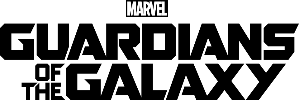
- Film logo: Not identified
Try the free alternatives
Type anything to see it in each free font. Select a font's name to test it further and download it.
-
Guardians of the Galaxy
-
Guardians of the Galaxy
-
Guardians of the Galaxy
-
Guardians of the Galaxy
-
Guardians of the Galaxy
Film logo
This font has not been identified. Marvel has not named a typeface, and the two DaFont threads on the logo end without an identification. One member there says the letters are a modified KP Duty supplied by Disney and Marvel for the film; another answers that it is similar at best, pointing to the G and S, and we could not check the claim against a foundry specimen. The other replies offer look-alikes and fonts made after the logo, of which Guardians, by Geronimo Font Studios, reproduces the octagonal letters closely in DaFont's preview.
Fan-made replicas
Fonts made by fans to recreate this lettering. They are not official, and each author sets their own terms.
- Guardians by Geronimo Font Studios (Anthony Bowe). Personal use only.
Sources: Guardians by Geronimo Font Studios (DaFont), Guardians in use (Fonts In Use), Guardians of the Galaxy Logo Font?? (DaFont forum)
"Personal use only" rules out commercial work: anything you sell, client projects, merchandise and monetised videos. Treat a replica with no stated licence the same way.
Free alternatives
-
Tektur, weight 900 Same mood
At weight 900 its heavy letters have clipped, chamfered corners like the logo's octagonal shapes. It is narrower, and its counters are larger than the logo's small openings.
Compared by eye against the original.
-
Oxanium, weight 800 Same mood
At weight 800 a squared techno sans with cut corners on G, D and S. It is lighter and narrower than the logo.
Compared by eye against the original.
-
Quantico, weight 700 Same mood
At weight 700 its G, D and S are built from straight strokes with angled corners. The strokes are much thinner than the logo's solid blocks.
Compared by eye against the original.
-
Russo One Same mood
A wide, heavy sans with squared curves that gives the same blocky headline feel. Its corners are rounded where the logo's are cut at an angle.
Compared by eye against the original.
-
Black Ops One Same mood
Heavy, wide military-style capitals with the logo's mass. It is a stencil face, so its letters are broken by gaps that the logo does not have.
Compared by eye against the original.
What the labels mean
- Same mood: Gives the same feel without being a look-alike.
What we link to
We link only to owners (the rights holder, the foundry or its official reseller) and to designers' own pages, and we host a fan-made font only with its designer's permission. Every free alternative is published under an open licence and downloads from its page on this site.
More from Marvel Cinematic Universe
- Spider-Man: No Way Home (2021, film) SPIDER-MAN wordmark in the logo: Modified Good Times
- Black Panther (2018, film) Film logo: Not identified
- Marvel Studios logo (2016, film) MARVEL wordmark in the logo: Modified Benton Sans Extra Compressed Black
- The Avengers (2012, film) AVENGERS wordmark in the logo: Custom lettering
Guardians of the Galaxy and Marvel Cinematic Universe are trademarks of Marvel (The Walt Disney Company). Simple But How is not affiliated with or endorsed by Marvel (The Walt Disney Company).