
Marvel Studios logo fonts
Studio logo introduced in 2016 and shown at the start of Marvel Studios films and series since.
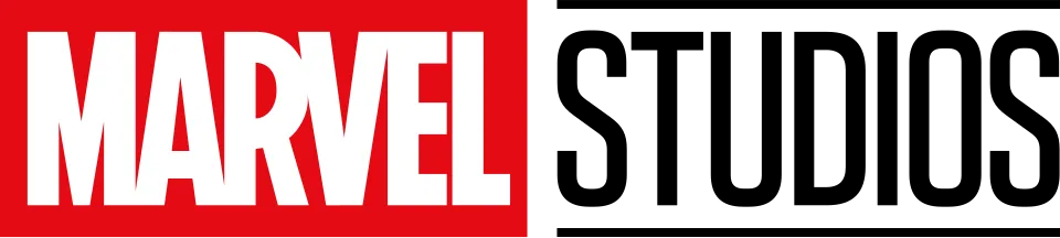
- MARVEL wordmark in the logo: Modified Benton Sans Extra Compressed Black (community identification)
- STUDIOS line in the logo: Tungsten (our visual match)
Try the free alternatives
Type anything to see it in each free font suggested for the lettering you pick. Select a font's name to test it further and download it.
-
Marvel Studios logo
-
Marvel Studios logo
-
Marvel Studios logo
-
Marvel Studios logo
-
Marvel Studios logo
MARVEL wordmark in the logo
| What it is | A typeface that was altered for this title |
|---|---|
| Typeface | Benton Sans Extra Compressed Black |
| Designer | Tobias Frere-Jones and Cyrus Highsmith |
| Foundry | Font Bureau |
| Licence | Commercial: sold by the foundry, and most uses need a paid licence. |
Community identification Agreed by people who identify fonts, with no official word.
Marvel has not named a typeface. Replies in several DaFont forum threads name Benton Sans Extra Compressed Black for the MARVEL wordmark, while one long-standing member there calls it only vaguely similar and another says it has been slightly modified, most visibly in the M. Set in that style in the reseller's type tester, the A, R, V, E and L agree in weight and shape; the logo's M is splayed where Benton's has upright sides, and the letters are squeezed together until they touch.
Sources: New Marvel Studios logo fonts? (DaFont forum), Marvel Logo Font Alternative (DaFont forum), Marvel Logo (DaFont forum), Benton Sans by Font Bureau (MyFonts)
License Benton Sans Extra Compressed Black from Font Bureau
Free alternatives
-
Anton Similar
A very heavy, flat-sided condensed sans whose M comes down to the baseline at its centre, like the wordmark. It is slightly wider, and its M has upright sides where the logo's are splayed.
Compared by eye against the original.
-
Sofia Sans Extra Condensed, weight 900 Similar
At weight 900 it matches the wordmark's dense colour and narrow, straight-sided letters. Its joins are a little softer and its M is upright.
Compared by eye against the original.
-
Alumni Sans, weight 900 Similar
At weight 900 a compact condensed sans close to the wordmark's weight. Its curves are squarer, which shows in the R, and the letters sit further apart.
Compared by eye against the original.
-
Bebas Neue Similar
Tall condensed capitals of the same build. It is clearly lighter than the wordmark, with more open counters.
Compared by eye against the original.
-
League Gothic Same mood
A classic condensed gothic that gives a similar headline feel. It is much narrower and lighter, so it does not pass for the wordmark.
Compared by eye against the original.
STUDIOS line in the logo
| What it is | A retail typeface |
|---|---|
| Typeface | Tungsten |
| Foundry | Hoefler&Co. |
| Licence | Commercial: sold by the foundry, and most uses need a paid licence. |
Our visual match Our own judgement after comparing the lettering side by side.
The DaFont thread on the 2016 logo does not settle this line: one member marks Tungsten Semibold as the identification and a later reply agrees that Tungsten fits, two others argue for Dharma Gothic and one for Kenyan Coffee. The label is our own comparison, which favours Tungsten without excluding the rival: in the reseller's type tester Tungsten Medium and Semibold both reproduce the S with its straight diagonal spine and the flat-sided D and O, and the logo's weight falls between the two, but Dharma Gothic is also very close in these seven letters. Marvel has not named the face.
Sources: New Marvel Studios logo fonts? (DaFont forum), Tungsten (Hoefler&Co.), Tungsten by Hoefler&Co. (MyFonts)
License Tungsten from Hoefler&Co.
Free alternatives
-
Big Shoulders Display, weight 600 Similar
At weight 600 it has flat-sided D and O and an S built from nearly straight strokes, like the STUDIOS line. It is narrower and its corners are tighter.
Compared by eye against the original.
-
Antonio, weight 500 Similar
At weight 500 a tall condensed sans with rounded-rectangle bowls close to the logo's proportions. Its S has a curved spine where the logo's is a straight diagonal.
Compared by eye against the original.
-
Saira Extra Condensed, weight 500 Similar
At weight 500 its squared curves and even strokes sit near the logo's weight. The letters are slightly wider and the S is less angular.
Compared by eye against the original.
-
Bebas Neue Similar
Condensed capitals with flat sides on D, O and U. It is heavier than the STUDIOS line and its S is rounder.
Compared by eye against the original.
-
Oswald Same mood
A condensed gothic with a similar clean, tall look at regular weight. It is wider and rounder throughout, so it reads as a different face.
Compared by eye against the original.
What the labels mean
- Community identification: Agreed by people who identify fonts, with no official word.
- Our visual match: Our own judgement after comparing the lettering side by side.
- Similar: The same style, with differences you can see.
- Same mood: Gives the same feel without being a look-alike.
What we link to
We link only to owners (the rights holder, the foundry or its official reseller) and to designers' own pages, and we host a fan-made font only with its designer's permission. Every free alternative is published under an open licence and downloads from its page on this site.
More from Marvel Cinematic Universe
Marvel Studios logo and Marvel Cinematic Universe are trademarks of Marvel (The Walt Disney Company). Simple But How is not affiliated with or endorsed by Marvel (The Walt Disney Company).