
Boruto: Naruto Next Generations fonts
Sequel anime series by Studio Pierrot following Naruto's son, Boruto Uzumaki.
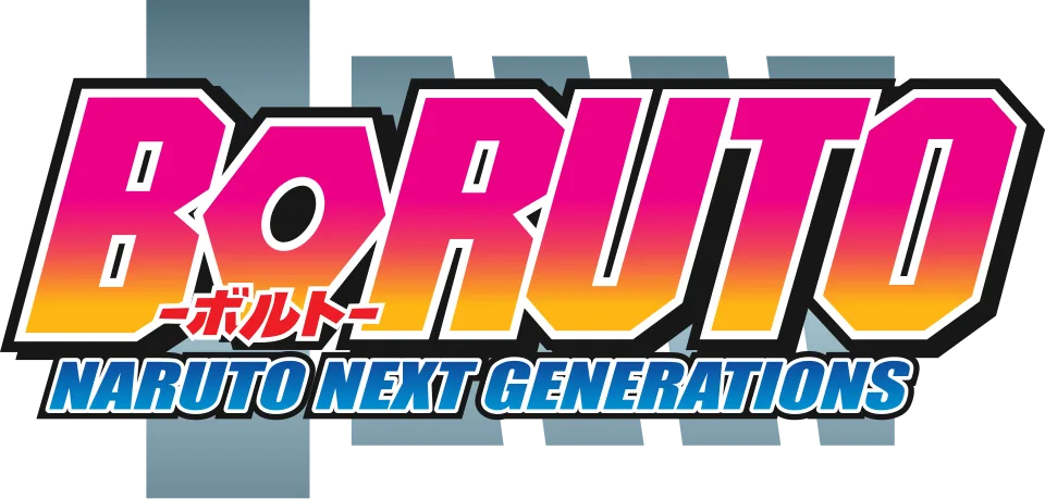
- BORUTO wordmark in the logo: Modified ITC Machine (community identification)
- NARUTO NEXT GENERATIONS line in the logo: Modified Impact (community identification)
Try the free alternatives
Type anything to see it in each free font suggested for the lettering you pick. Select a font's name to test it further and download it.
-
Boruto: Naruto Next Generations
-
Boruto: Naruto Next Generations
-
Boruto: Naruto Next Generations
-
Boruto: Naruto Next Generations
BORUTO wordmark in the logo
| What it is | A typeface that was altered for this title |
|---|---|
| Typeface | ITC Machine |
| Designer | Tom Carnase and Ronne Bonder |
| Foundry | ITC (International Typeface Corporation) |
| Licence | Commercial: sold by the foundry, and most uses need a paid licence. |
Community identification Agreed by people who identify fonts, with no official word.
A DaFont forum moderator identifies Machine for the BORUTO wordmark, which first appeared on the logo of the 2015 film Boruto: Naruto the Movie and was kept for the series. We typed BORUTO into MyFonts' tester in ITC Machine Pro Bold: the B, R, U and T share Machine's clipped corners and slit-like counters, while the logo leans the letters and replaces the octagonal O with a round, eye-shaped one. Other replies offer a fan replica and SF Hollywood Hills, which matches less well.
Sources: BORUTO FONT? (DaFont forum), ITC Machine (MyFonts)
License ITC Machine from ITC (International Typeface Corporation)
Free alternatives
-
Black Ops One Similar
Heavy capitals with clipped corners and narrow counters, the same blocky idea as Machine. It is wider and adds stencil breaks.
Compared by eye against the original.
-
Squada One Similar
Condensed heavy capitals with slit counters and small chamfers. Its corners are rounder and it is narrower than the logo.
Compared by eye against the original.
-
Chakra Petch, weight 700 Similar
At weight 700 it has the chamfered corners of Machine on a squarish skeleton. It is much lighter and its counters are open.
Compared by eye against the original.
-
Teko, weight 700 Same mood
At weight 700 it gives tall, squared-off capitals with a similar mechanical feel. It has no clipped corners.
Compared by eye against the original.
NARUTO NEXT GENERATIONS line in the logo
| What it is | A typeface that was altered for this title |
|---|---|
| Typeface | Impact |
| Designer | Geoffrey Lee |
| Foundry | Monotype (first issued by Stephenson Blake) |
| Licence | Commercial: sold by the foundry, and most uses need a paid licence. |
Community identification Agreed by people who identify fonts, with no official word.
Two DaFont forum threads, one answered by a regular identifier, name Impact for this line. Compared with Impact typed into MyFonts' tester, the letter shapes match, including the spurred G and the flat-sided O, but the logo slants them and sets them wider than the typeface. Studio Pierrot has not confirmed it.
Sources: Naruto Next Generations font (DaFont forum), What font is this? (BORUTO: NARUTO NEXT GENERATIONS Logo) (DaFont forum), Impact by Monotype (MyFonts)
License Impact from Monotype (first issued by Stephenson Blake)
Free alternatives
-
Anton Similar
A heavy condensed grotesque in the Impact mould, with the same tall x-height and tight spacing. It is upright where the logo slants.
Compared by eye against the original.
-
Oswald, weight 700 Similar
At weight 700 it gives similar condensed, flat-sided capitals. It is lighter and wider than Impact and upright.
Compared by eye against the original.
-
League Gothic Similar
A narrow gothic with the same compressed, poster-like rhythm. It is lighter and narrower than the logo line.
Compared by eye against the original.
What the labels mean
- Community identification: Agreed by people who identify fonts, with no official word.
- Similar: The same style, with differences you can see.
- Same mood: Gives the same feel without being a look-alike.
What we link to
We link only to owners (the rights holder, the foundry or its official reseller) and to designers' own pages, and we host a fan-made font only with its designer's permission. Every free alternative is published under an open licence and downloads from its page on this site.
More from Naruto
- Naruto to Boruto: Shinobi Striker (2018, game) NARUTO TO BORUTO line in the logo: Modified Impact
- Naruto Shippuden (2007, TV show) NARUTO wordmark in the logo: Custom lettering
- Naruto (2002, TV show) NARUTO logo: Custom lettering
- Naruto (1999, book) NARUTO logo on the English-language volumes: Custom lettering
Boruto: Naruto Next Generations and Naruto are trademarks of Masashi Kishimoto and Shueisha. Simple But How is not affiliated with or endorsed by Masashi Kishimoto and Shueisha.