
Naruto Shippuden fonts
Sequel anime series by Studio Pierrot, covering the second part of the manga.
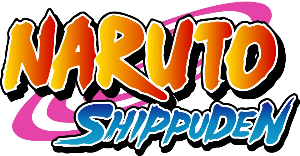
- NARUTO wordmark in the logo: Custom lettering (community identification)
- SHIPPUDEN line in the logo: Not identified
Try the free alternatives
Type anything to see it in each free font suggested for the lettering you pick. Select a font's name to test it further and download it.
-
Naruto Shippuden
-
Naruto Shippuden
NARUTO wordmark in the logo
| What it is | Custom lettering drawn for this title, not a font you can install |
|---|---|
| Licence | Proprietary: owned by the rights holder and not offered for licensing. |
Community identification Agreed by people who identify fonts, with no official word.
The logo keeps the orange NARUTO lettering of the first series. A DaFont forum thread showing this logo answers NARUTO with the fan font Ninja Naruto, and no retail typeface has been named for it.
Sources: Naruto Shippuden (DaFont forum)
Fan-made replicas
Fonts made by fans to recreate this lettering. They are not official, and each author sets their own terms.
- Ninja Naruto by sk89q. Free.
Sources: Ninja Naruto by sk89q (DaFont), Naruto Shippuden (DaFont forum)
Free alternatives
-
Knewave Similar
Heavy brushed capitals with rough, energetic strokes, the nearest in spirit to the logo. It slants more and its letters are rounder at the ends.
Compared by eye against the original.
-
Bangers Similar
Condensed, heavy comic-book capitals with a slight lean and tight spacing. Its edges are clean where the logo's are ragged.
Compared by eye against the original.
SHIPPUDEN line in the logo
This font has not been identified. In the same DaFont forum thread, the identifier who named Ninja Naruto for the top line says SHIPPUDEN is probably not a font at all, because its two P's are drawn differently. The blue, slanted, brushy capitals look hand-drawn to us as well, but nobody has documented them.
Free alternatives
-
Bangers Similar
Narrow, slanted comic capitals with the same forward energy. Its strokes are smooth and even, without the brush texture.
Compared by eye against the original.
-
Knewave Similar
Slanted brush capitals of similar weight. Its letters are rounder and lack the long flicked strokes of the S and N.
Compared by eye against the original.
-
Kaushan Script Same mood
A fast brush script that gives the same sense of motion. It is much lighter and joins its letters, so it is no look-alike.
Compared by eye against the original.
What the labels mean
- Community identification: Agreed by people who identify fonts, with no official word.
- Similar: The same style, with differences you can see.
- Same mood: Gives the same feel without being a look-alike.
What we link to
We link only to owners (the rights holder, the foundry or its official reseller) and to designers' own pages, and we host a fan-made font only with its designer's permission. Every free alternative is published under an open licence and downloads from its page on this site.
More from Naruto
- Naruto to Boruto: Shinobi Striker (2018, game) NARUTO TO BORUTO line in the logo: Modified Impact
- Boruto: Naruto Next Generations (2017, TV show) BORUTO wordmark in the logo: Modified ITC Machine
- Naruto (2002, TV show) NARUTO logo: Custom lettering
- Naruto (1999, book) NARUTO logo on the English-language volumes: Custom lettering
Naruto Shippuden and Naruto are trademarks of Masashi Kishimoto and Shueisha. Simple But How is not affiliated with or endorsed by Masashi Kishimoto and Shueisha.