
Peaky Blinders fonts
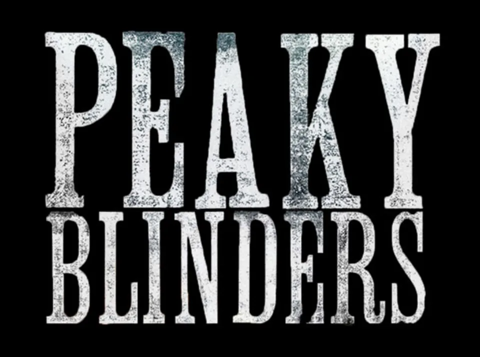
The Peaky Blinders title was not set digitally: according to Fonts In Use, the title studio Momoco printed it from old wooden letterpress type labelled Clarendon Condensed, which gives the words their worn, speckled texture. The maker of that wood type is unknown and there is no digital release of it; wood-type specialists compare it with nineteenth-century condensed Clarendons and with Jeff Levine's commercial revival Roman Wood Type JNL without finding an exact match. The 2026 Netflix film keeps the same lettering on its poster.
Films
TV shows
Peaky Blinders is a trademark of Tiger Aspect Productions and the BBC. Simple But How is not affiliated with or endorsed by Tiger Aspect Productions and the BBC.