
Peaky Blinders (2013) font
Crime drama created by Steven Knight and made by Tiger Aspect for the BBC, which ran for six series until 2022.
- TV show
- 2013
- Peaky Blinders
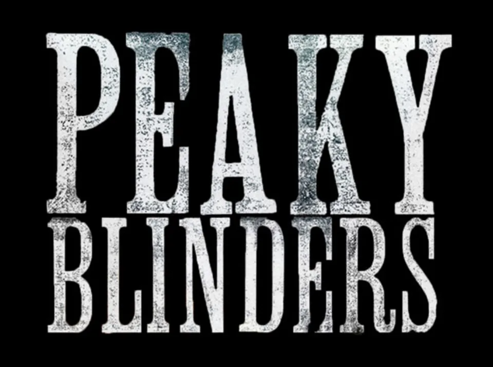
- PEAKY BLINDERS title card: Clarendon Condensed (wood type) (community identification)
Try the free alternatives
Type anything to see it in each free font. Select a font's name to test it further and download it.
-
Peaky Blinders
-
Peaky Blinders
-
Peaky Blinders
-
Peaky Blinders
PEAKY BLINDERS title card
| What it is | A typeface that was never released as a digital font |
|---|---|
| Typeface | Clarendon Condensed (wood type) |
| Licence | Never released: this typeface was never officially released as a digital font, so there is nothing to buy or download from its owner. |
Community identification Agreed by people who identify fonts, with no official word.
The Fonts In Use entry on the series says the title was produced by Momoco at East End Letterpress in London from wood type labelled Clarendon Condensed, of unknown origin; Momoco's own project page credits Miki Kato and Nic Benns with the titles for Tiger Aspect. In comments there, the wood-type historian David Shields finds it closest to American Wood Type Co.'s Clarendon X Condensed Light Face without calling it a match, and the site's editor Florian Hardwig says the digital Roman Wood Type JNL is close but differs in the E, A, K and Y. A DaFont reply suggests Clarendon Condensed squeezed and roughened by hand, which fits. On the title card the letters are tall and condensed with bracketed slab serifs, printed white with heavy speckling.
Sources: Peaky Blinders (Fonts In Use), Peaky Blinders (Momoco), Peaky Blinders (DaFont forum)
Free alternatives
-
Stint Ultra Condensed Similar
A condensed Clarendon-style face with bracketed slab serifs and the same tall, narrow capitals. It is noticeably lighter than the printed title and has none of its worn texture.
Compared by eye against the original.
-
Kelly Slab Similar
Narrow slab-serif capitals of a similar height and rhythm. Its serifs are square and unbracketed and its strokes thinner, so it reads as more mechanical.
Compared by eye against the original.
-
Libre Caslon Condensed, weight 700 Same mood
At weight 700 a condensed bold serif with a similar old printing-house feel. Its wedge-shaped serifs and stronger thick-thin contrast belong to Caslon, not to a Clarendon.
Compared by eye against the original.
-
Smokum Same mood
A condensed wood-type style face that suggests the same era of posters. Its heavy Tuscan spurs and blocky serifs are far more decorative than the title.
Compared by eye against the original.
What the labels mean
- Community identification: Agreed by people who identify fonts, with no official word.
- Similar: The same style, with differences you can see.
- Same mood: Gives the same feel without being a look-alike.
What we link to
We link only to owners (the rights holder, the foundry or its official reseller) and to designers' own pages, and we host a fan-made font only with its designer's permission. Every free alternative is published under an open licence and downloads from its page on this site.
More from Peaky Blinders
Peaky Blinders is a trademark of Tiger Aspect Productions and the BBC. Simple But How is not affiliated with or endorsed by Tiger Aspect Productions and the BBC.