
Pokémon (anime series) fonts
Animated television series produced by OLM, first broadcast in Japan in 1997; the English-language version began in 1998.
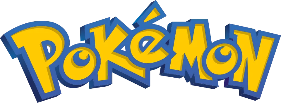
- Pokémon wordmark in the English logo: Custom lettering (our visual match)
- Episode title cards in the English version: ITC Bolt Bold (community identification)
- Who's That Pokémon? name captions: Playhouse (community identification)
Try the free alternatives
Type anything to see it in each free font suggested for the lettering you pick. Select a font's name to test it further and download it.
-
Pokémon (anime series)
-
Pokémon (anime series)
-
Pokémon (anime series)
-
Pokémon (anime series)
Pokémon wordmark in the English logo
| What it is | Custom lettering drawn for this title, not a font you can install |
|---|---|
| Licence | Proprietary: owned by the rights holder and not offered for licensing. |
Our visual match Our own judgement after comparing the lettering side by side.
The English version of the series uses the same wordmark as the games; a DaFont forum thread on the show's Who's That Pokémon? bumper, where the logo appears, is answered only with a fan font. That it is custom lettering rests on the Fonts In Use entry about the game boxes, which calls the wordmark a custom lettering job, plus our own judgement that the letters are the same.
Sources: Pokémon, "Gotta catch 'em all!" (Fonts In Use), Who's that Pokemon (Question Mark and Pokemon Logo) font (DaFont forum)
Fan-made replicas
Fonts made by fans to recreate this lettering. They are not official, and each author sets their own terms.
- Ketchum by Neale Davidson (Pixel Sagas). Free.
Sources: Ketchum (Pixel Sagas), Font License (Pixel Sagas), Pokémon, "Gotta catch 'em all!" (Fonts In Use)
- Pocket Monsters by Jackster3000. Licence not stated.
Sources: Pocket Monsters - Version 1 by Jackster3000 (DeviantArt), Pokémon, "Gotta catch 'em all!" (Fonts In Use), Pokémon font (DaFont forum)
"Personal use only" rules out commercial work: anything you sell, client projects, merchandise and monetised videos. Treat a replica with no stated licence the same way.
Free alternatives
-
Slackey Same mood
Heavy, bouncy letters that change size and angle from one to the next, the quality that makes the wordmark recognisable. It is wider and rounder, and it has none of the logo's sharp inner corners.
Compared by eye against the original.
-
Spicy Rice Same mood
A thick, playful display face with flared strokes and a lively baseline. Its letters are more regular and more upright than the wordmark's.
Compared by eye against the original.
-
Chewy Same mood
Chunky brush letters with a forward lean give a similar cartoon energy. The shapes are soft and rounded where the logo's are angular.
Compared by eye against the original.
-
Luckiest Guy Same mood
Heavy comic capitals with wedge-shaped strokes suit the same bright, outlined treatment. It has capitals only, so it cannot copy the logo's mix of large and small letters.
Compared by eye against the original.
Episode title cards in the English version
| What it is | A retail typeface |
|---|---|
| Typeface | ITC Bolt Bold |
| Foundry | ITC |
| Licence | Commercial: sold by the foundry, and most uses need a paid licence. |
Community identification Agreed by people who identify fonts, with no official word.
A DaFont forum thread on an early English title card, for the episode Clefairy and the Moon Stone, marks Bolt as the identified font. We set the first words of that title in the reseller's type tester and they match: heavy squared letters, a capital A drawn as a rounded arch, and a lowercase f that drops below the baseline. No statement from the producers was found.
Sources: Pokemon English Title Card font? (DaFont forum), ITC Bolt (MyFonts)
License ITC Bolt Bold from ITC
Free alternatives
-
Days One Similar
A heavy, rounded-square sans whose capital A is drawn as an arch, the detail that marks Bolt. Its strokes are a little lighter and its letters wider.
Compared by eye against the original.
-
Orbitron, weight 900 Similar
At weight 900 it has the same squared, rounded-corner letters and an arched A. It is wider and more evenly spaced, which makes it look more technical.
Compared by eye against the original.
-
Russo One Similar
Compact, heavy squared letters with about the weight of Bolt. Its A is an ordinary straight-sided one and its curves are tighter.
Compared by eye against the original.
-
Audiowide Same mood
A rounded-square techno face with an arched A that recalls the same 1970s display style. It is much lighter and wider.
Compared by eye against the original.
Who's That Pokémon? name captions
| What it is | A retail typeface |
|---|---|
| Typeface | Playhouse |
| Foundry | House Industries |
| Licence | Commercial: sold by the foundry, and most uses need a paid licence. |
Community identification Agreed by people who identify fonts, with no official word.
A DaFont forum thread on the name shown in the original series' Who's That Pokémon? segments marks Playhouse, from House Industries, as the identified font. A published specimen of Playhouse shows the same top-heavy cut-paper capitals as the ONIX caption in the thread's screenshot, including the slab-footed I and N. House Industries' site refused our request, so we give no shop link.
Sources: Who's That Pokémon? Font (DaFont forum)
Free alternatives
-
Irish Grover Same mood
Uneven, hand-cut capitals give a similar playful wobble. It is lighter and less angular than Playhouse.
Compared by eye against the original.
-
Slackey Same mood
Heavy, lopsided cartoon letters, with a slab-footed I, in the same spirit. It is wider and rounder.
Compared by eye against the original.
-
Skranji, weight 700 Same mood
At weight 700 its chunky letters have irregular, knife-cut angles like cut paper. It has no slab feet and its shapes are more regular.
Compared by eye against the original.
What the labels mean
- Community identification: Agreed by people who identify fonts, with no official word.
- Our visual match: Our own judgement after comparing the lettering side by side.
- Similar: The same style, with differences you can see.
- Same mood: Gives the same feel without being a look-alike.
What we link to
We link only to owners (the rights holder, the foundry or its official reseller) and to designers' own pages, and we host a fan-made font only with its designer's permission. Every free alternative is published under an open licence and downloads from its page on this site.
More from Pokémon
- Pokémon Super Extra Deluxe Essential Handbook (2021, book) Cover title and Pokémon names: Bungee
- Pokémon Detective Pikachu (2019, film) Pokémon wordmark above the title: Custom lettering
- Pokémon GO (2016, game) Pokémon wordmark in the logo: Custom lettering
- Pokémon Red and Blue (1996, game) Pokémon wordmark in the logo: Custom lettering
Pokémon (anime series) and Pokémon are trademarks of Nintendo, Creatures and Game Freak. Simple But How is not affiliated with or endorsed by Nintendo, Creatures and Game Freak.