
Pokémon Red and Blue fonts
Game Boy role-playing games developed by Game Freak; first released in Japan in 1996 as Red and Green, and in North America in 1998 with the box lettering described here.
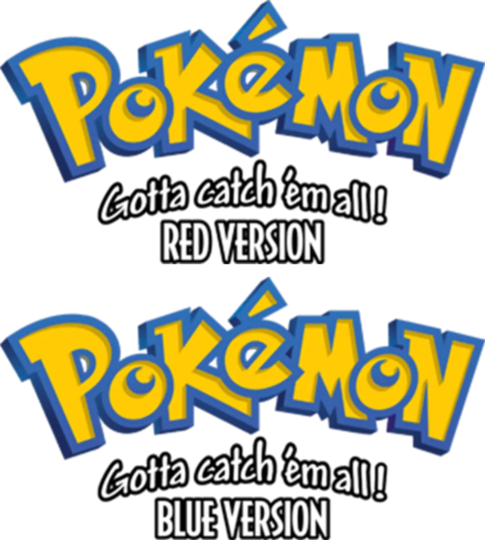
- Pokémon wordmark in the logo: Custom lettering (community identification)
- RED VERSION and BLUE VERSION lines: Decotura (community identification)
- Gotta catch 'em all! slogan on the box: Modified Andy Bold (community identification)
Try the free alternatives
Type anything to see it in each free font suggested for the lettering you pick. Select a font's name to test it further and download it.
-
Pokémon Red and Blue
-
Pokémon Red and Blue
-
Pokémon Red and Blue
-
Pokémon Red and Blue
Pokémon wordmark in the logo
| What it is | Custom lettering drawn for this title, not a font you can install |
|---|---|
| Licence | Proprietary: owned by the rights holder and not offered for licensing. |
Community identification Agreed by people who identify fonts, with no official word.
The Fonts In Use entry on the English-language box art states that the Pokémon wordmark is a custom lettering job, not a typeface, and the site's editor agrees in a comment that this is very likely, listing the fan fonts later built from it. DaFont forum threads on the wordmark are likewise answered only with fan fonts. The rights holders have not named its designer.
Sources: Pokémon, "Gotta catch 'em all!" (Fonts In Use), Pokemon Fonts (DaFont forum), Pokémon font (DaFont forum)
Fan-made replicas
Fonts made by fans to recreate this lettering. They are not official, and each author sets their own terms.
- Ketchum by Neale Davidson (Pixel Sagas). Free.
Sources: Ketchum (Pixel Sagas), Font License (Pixel Sagas), Pokémon, "Gotta catch 'em all!" (Fonts In Use)
- Pocket Monsters by Jackster3000. Licence not stated.
Sources: Pocket Monsters - Version 1 by Jackster3000 (DeviantArt), Pokémon, "Gotta catch 'em all!" (Fonts In Use), Pokémon font (DaFont forum)
"Personal use only" rules out commercial work: anything you sell, client projects, merchandise and monetised videos. Treat a replica with no stated licence the same way.
Free alternatives
-
Slackey Same mood
Heavy, bouncy letters that change size and angle from one to the next, the quality that makes the wordmark recognisable. It is wider and rounder, and it has none of the logo's sharp inner corners.
Compared by eye against the original.
-
Spicy Rice Same mood
A thick, playful display face with flared strokes and a lively baseline. Its letters are more regular and more upright than the wordmark's.
Compared by eye against the original.
-
Chewy Same mood
Chunky brush letters with a forward lean give a similar cartoon energy. The shapes are soft and rounded where the logo's are angular.
Compared by eye against the original.
-
Luckiest Guy Same mood
Heavy comic capitals with wedge-shaped strokes suit the same bright, outlined treatment. It has capitals only, so it cannot copy the logo's mix of large and small letters.
Compared by eye against the original.
RED VERSION and BLUE VERSION lines
| What it is | A retail typeface |
|---|---|
| Typeface | Decotura |
| Designer | Noel Rubin |
| Foundry | Image Club Graphics |
| Licence | Commercial: sold by the foundry, and most uses need a paid licence. |
Community identification Agreed by people who identify fonts, with no official word.
The Fonts In Use entry on the Pokémon Red box identifies the version name and the text below it as Decotura; a commenter there proposes Casablanca Bold Condensed, a closely related design, instead. We set RED VERSION in Decotura in the reseller's type tester and it matches the logo: the same narrow capitals, low crossbars and pointed V.
Sources: Pokémon, "Gotta catch 'em all!" (Fonts In Use), Decotura in use (Fonts In Use), Decotura by Image Club (MyFonts)
License Decotura from Image Club Graphics
Free alternatives
-
Mouse Memoirs Similar
Narrow capitals with a cartoon Art Deco flavour, the nearest in spirit to Decotura. Its strokes are softer and slightly uneven.
Compared by eye against the original.
-
Yanone Kaffeesatz, weight 700 Similar
At weight 700 it is a narrow, slightly quirky sans that sets a similar compact line. Its letters are more conventional, with crossbars at normal height.
Compared by eye against the original.
-
Voltaire Same mood
A narrow sans with a hint of 1930s lettering in its proportions. It is much lighter than the version line.
Compared by eye against the original.
-
League Gothic Same mood
A tall condensed gothic that fills the same narrow strip under a logo. It is a plain headline face with no Art Deco character.
Compared by eye against the original.
Gotta catch 'em all! slogan on the box
| What it is | A typeface that was altered for this title |
|---|---|
| Typeface | Andy Bold |
| Designer | Steve Matteson |
| Foundry | Monotype |
| Licence | Commercial: sold by the foundry, and most uses need a paid licence. |
Community identification Agreed by people who identify fonts, with no official word.
The Fonts In Use entry on the box art names Steve Matteson's Andy for the slogan, and two DaFont forum threads on the slogan independently mark Andy, in one case Andy Bold, as the identified font. A published specimen of Andy shows the same upright pen-written letters; on the box the words are slanted and outlined. Monotype no longer lists the font on its own shop, so the link goes to Microsoft's typography page for it.
Sources: Pokémon, "Gotta catch 'em all!" (Fonts In Use), Pokemon Fonts (DaFont forum), Pokémon Slogan (DaFont forum), Andy font family (Microsoft Typography)
License Andy Bold from Monotype
Free alternatives
-
Patrick Hand Similar
Neat, narrow marker handwriting with even strokes, close to Andy's tidy informality. It is lighter than Andy Bold and has no italic for the slant.
Compared by eye against the original.
-
Playpen Sans, weight 600 Similar
At weight 600 it is friendly handwriting with about the weight of the slogan. Its letters are rounder and wider than Andy's.
Compared by eye against the original.
-
Schoolbell Similar
Loose felt-pen handwriting with tall, long-crossed t's like the slogan's. It is thinner and more irregular.
Compared by eye against the original.
-
Comic Neue, weight 700 Same mood
At weight 700 it is a casual comic-style face with an italic available for the slant. It is rounder and more regular than handwriting; we compared the upright.
Compared by eye against the original.
What the labels mean
- Community identification: Agreed by people who identify fonts, with no official word.
- Similar: The same style, with differences you can see.
- Same mood: Gives the same feel without being a look-alike.
What we link to
We link only to owners (the rights holder, the foundry or its official reseller) and to designers' own pages, and we host a fan-made font only with its designer's permission. Every free alternative is published under an open licence and downloads from its page on this site.
More from Pokémon
- Pokémon Super Extra Deluxe Essential Handbook (2021, book) Cover title and Pokémon names: Bungee
- Pokémon Detective Pikachu (2019, film) Pokémon wordmark above the title: Custom lettering
- Pokémon GO (2016, game) Pokémon wordmark in the logo: Custom lettering
- Pokémon (anime series) (1997, TV show) Pokémon wordmark in the English logo: Custom lettering
Pokémon Red and Blue and Pokémon are trademarks of Nintendo, Creatures and Game Freak. Simple But How is not affiliated with or endorsed by Nintendo, Creatures and Game Freak.