
Squid Game fonts
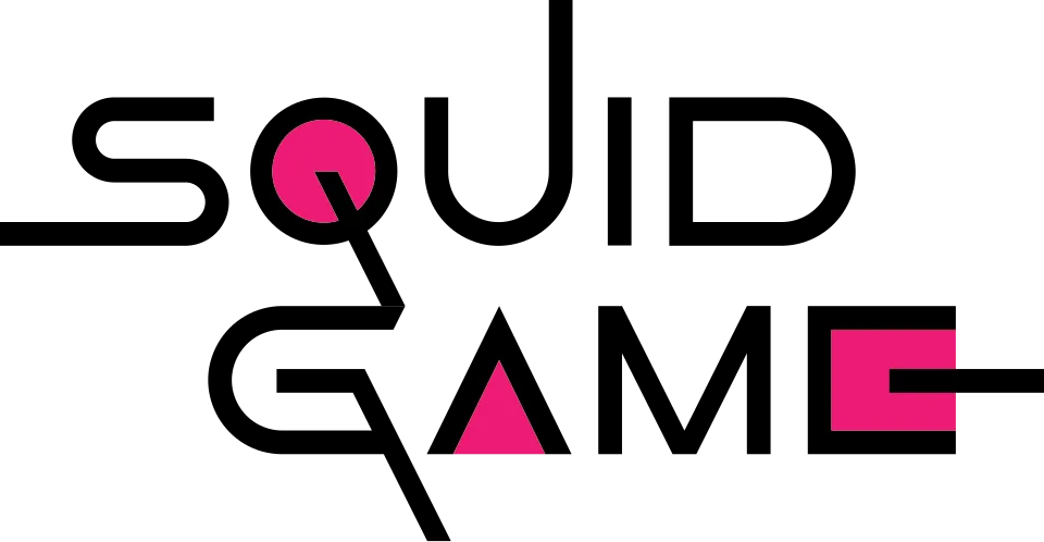
Squid Game has two logos and neither is a font. The Korean title turns the circle, triangle and square from the show into parts of three Hangul letters, and the English wordmark is geometric lettering of one stroke thickness with a triangle for the A and a square for the E; a design-press account calls it bespoke and Netflix has named no typeface. Later seasons add a pink numeral in the same style, and Squid Game: The Challenge sets the wordmark on one line above a wide yellow sans that nobody has identified.
TV shows
- Squid Game Season 3 (2025) English SQUID GAME logo with the numeral 3: Custom lettering
- Squid Game Season 2 (2024) English SQUID GAME logo with the numeral 2: Custom lettering
- Squid Game: The Challenge (2023) SQUID GAME wordmark in the logo: Custom lettering
- Squid Game (2021) English SQUID GAME logo: Custom lettering
Squid Game is a trademark of Netflix. Simple But How is not affiliated with or endorsed by Netflix.