
Squid Game (2021) fonts
South Korean Netflix series written and directed by Hwang Dong-hyuk, first released in September 2021.
- TV show
- 2021
- Squid Game
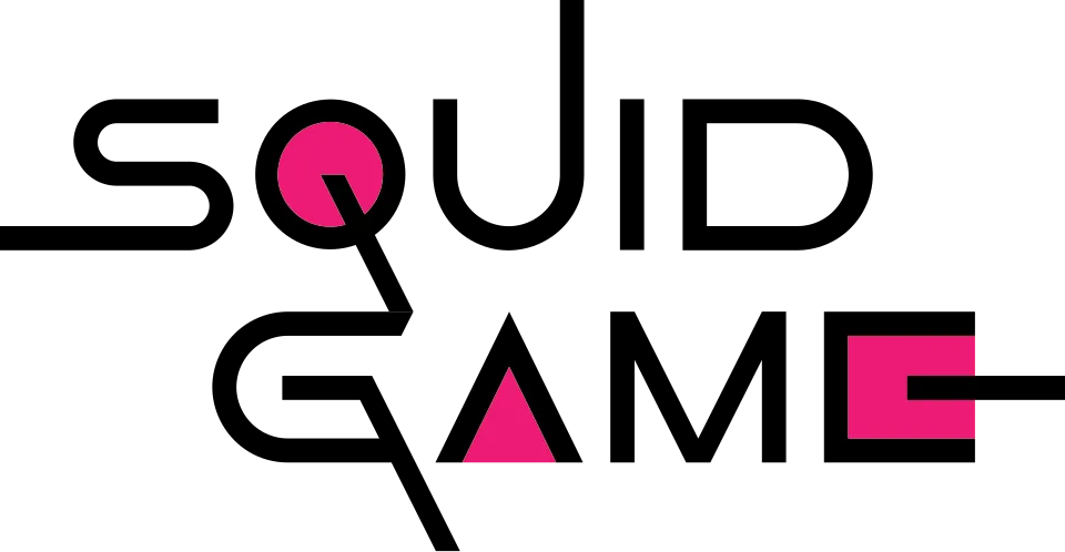
- English SQUID GAME logo: Custom lettering (community identification)
- Korean title logo with the three shapes: Custom lettering (community identification)
Try the free alternatives
Type anything to see it in each free font suggested for the lettering you pick. Select a font's name to test it further and download it.
-
Squid Game
-
Squid Game
-
Squid Game
-
Squid Game
English SQUID GAME logo
| What it is | Custom lettering drawn for this title, not a font you can install |
|---|---|
| Licence | Proprietary: owned by the rights holder and not offered for licensing. |
Community identification Agreed by people who identify fonts, with no official word.
Netflix has not named a typeface or a designer for the logo. Creative Bloq's article on the show's branding calls the logotype a bespoke typeface and shows versions drawn for other scripts. The two DaFont threads on the logo (we checked the attached images) are answered only with Game Of Squids, a fan-made font; one reply says the logo mixes Azonix and Good Times, without support. None of the fonts we rendered reproduces the S built from straight bars and half-circles, the circle Q with its long straight tail, the triangle A or the square E, which points the same way.
Sources: Squid Game is actually a brilliant lesson in brand design (Creative Bloq), Squid Game (Netflix Tudum), Squid game (DaFont forum), Squid Game (Netflix) (DaFont forum)
Fan-made replicas
Fonts made by fans to recreate this lettering. They are not official, and each author sets their own terms.
- Game Of Squids by Darrell Flood (Hawtpixel). Free.
Sources: Game Of Squids (DaFont), Game of Squids in use (Fonts In Use), Squid Game (Netflix) (DaFont forum)
Free alternatives
-
Bruno Ace Similar
Wide capitals of one even stroke thickness, with an S made of straight bars joined by round turns, a round G with a flat bar and a D with a half-circle side, as in the logo. Its A is a flat-topped arch with a crossbar where the logo has a plain triangle, and its Q is squarer.
Compared by eye against the original.
-
Michroma Similar
A wide, even-stroked sans with level-cut stroke ends, a pointed A and an M whose middle strokes reach the baseline. Its round letters are squared off where the logo uses true circles, and its A has a crossbar.
Compared by eye against the original.
-
Genos Similar
Wide capitals of similar weight with an M whose middle strokes reach the baseline. Its curves are softer and less geometric, its A has a crossbar and its Q is an oval.
Compared by eye against the original.
-
Megrim Same mood
An experimental geometric face whose A is a triangle with no crossbar, the one detail no other candidate shares with the logo. It is far thinner and narrower, so it gives the idea and not the look.
Compared by eye against the original.
Korean title logo with the three shapes
| What it is | Custom lettering drawn for this title, not a font you can install |
|---|---|
| Licence | Proprietary: owned by the rights holder and not offered for licensing. |
Community identification Agreed by people who identify fonts, with no official word.
Creative Bloq describes the original Korean logo as lettering in which the circle, triangle and square from the show form parts of the letters. On the logo itself the ieung of the first syllable is a pink ring, the jieut of the second a pink triangle and the mieum of the last a pink square, and the remaining strokes are plain bars of one thickness that run past the letters. No font has been proposed for it and Netflix has published nothing about who drew it.
Sources: Squid Game is actually a brilliant lesson in brand design (Creative Bloq), Squid Game (Netflix Tudum)
Free alternatives
-
Gugi Similar
Compared in Google Fonts' type tester, because our render tool cannot set Hangul. A geometric Korean display face with even strokes, a ring-shaped ieung and a jieut built from straight diagonals, which is the logo's construction. It is heavier, its corners are rounded and its strokes do not extend past the letters.
Compared by eye against the original.
-
Do Hyeon Same mood
Compared in Google Fonts' type tester. Squared, upright Hangul with heavy even strokes gives a similar poster tone. It is much bolder and more compact than the logo.
Compared by eye against the original.
-
Orbit Same mood
Compared in Google Fonts' type tester. Light, evenly drawn Hangul with a circular ieung and open spacing. It is a text face: thinner than the logo and without its geometric exaggeration.
Compared by eye against the original.
What the labels mean
- Community identification: Agreed by people who identify fonts, with no official word.
- Similar: The same style, with differences you can see.
- Same mood: Gives the same feel without being a look-alike.
What we link to
We link only to owners (the rights holder, the foundry or its official reseller) and to designers' own pages, and we host a fan-made font only with its designer's permission. Every free alternative is published under an open licence and downloads from its page on this site.
More from Squid Game
Squid Game is a trademark of Netflix. Simple But How is not affiliated with or endorsed by Netflix.