
Star Wars Jedi: Fallen Order fonts
Action-adventure game developed by Respawn Entertainment and published by Electronic Arts.
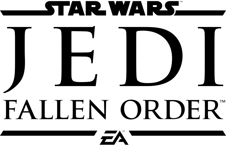
- STAR WARS wordmark in the logo: Custom lettering (our visual match)
- JEDI FALLEN ORDER lines in the logo: Not identified
Try the free alternatives
Type anything to see it in each free font suggested for the lettering you pick. Select a font's name to test it further and download it.
-
Star Wars Jedi: Fallen Order
-
Star Wars Jedi: Fallen Order
-
Star Wars Jedi: Fallen Order
-
Star Wars Jedi: Fallen Order
STAR WARS wordmark in the logo
| What it is | Custom lettering drawn for this title, not a font you can install |
|---|---|
| Licence | Proprietary: owned by the rights holder and not offered for licensing. |
Our visual match Our own judgement after comparing the lettering side by side.
Nothing we found discusses this logo. On the cover art a small STAR WARS wordmark with long S strokes sits above the title; by our own comparison it is the film logo that Suzy Rice drew and Joe Johnston revised, filled in instead of outlined. For the lettering itself we are relying on the sources for the 1977 logo.
Sources: Star Wars (1977) title sequence, with Dan Perri interview (Art of the Title), Anatomy of a Logo: Star Wars, by Alex Jay (Tenth Letter of the Alphabet)
Fan-made replicas
Fonts made by fans to recreate this lettering. They are not official, and each author sets their own terms.
- Star Jedi by Boba Fonts. Free.
Sources: Star Jedi by Boba Fonts (DaFont), Star Wars The Old Republic (DaFont forum)
- SF Distant Galaxy by ShyFonts. Personal use only.
Sources: SF Distant Galaxy by ShyFonts (DaFont), STAR WARS FONT? (DaFont forum)
"Personal use only" rules out commercial work: anything you sell, client projects, merchandise and monetised videos. Treat a replica with no stated licence the same way.
Free alternatives
-
Archivo Black Similar
A wide, very heavy grotesque with flat stroke ends and a flat-topped A, like the wordmark. It has no joined S and T or R and S, and its S ends in short terminals instead of the logo's long horizontal strokes.
Compared by eye against the original.
-
Work Sans, weight 900 Similar
At weight 900 it matches the logo's width and near-even stroke weight. Its A comes to a point and its R has a curved leg, where the logo's A is flat-topped and its R leg is straight.
Compared by eye against the original.
-
Inter, weight 900 Similar
At weight 900 it gives the same solid, upright capitals with horizontal stroke endings on S. It is a little narrower than the logo and none of its letters join.
Compared by eye against the original.
-
Golos Text, weight 900 Similar
At weight 900 the letters are as heavy and nearly as wide as the logo's, with a flat-topped A. The S is rounder and more compact.
Compared by eye against the original.
JEDI FALLEN ORDER lines in the logo
This font has not been identified. We found no statement from Respawn, Electronic Arts or Lucasfilm, no thread about this logo on the DaFont forum and no entry on Fonts In Use. On the cover the two lines are widely spaced serif capitals with thin hairlines and small sharp serifs; that description is as far as we can take it.
Free alternatives
-
Cinzel Same mood
Light inscriptional capitals with sharp serifs that suit the same wide letterspacing. We compared it with the cover art only at small size, so this is a match of feel, not of letter shapes.
Compared by eye against the original.
-
Cormorant SC, weight 600 Same mood
At weight 600 it gives tall capitals with strong contrast between thick and thin strokes, like the JEDI line. Its J drops below the line, which the logo's does not.
Compared by eye against the original.
-
Bodoni Moda, weight 500 Same mood
At weight 500 its hairline serifs and vertical stress echo the thin strokes of the logo. It is more rigid and modern in style than the cover lettering.
Compared by eye against the original.
What the labels mean
- Our visual match: Our own judgement after comparing the lettering side by side.
- Similar: The same style, with differences you can see.
- Same mood: Gives the same feel without being a look-alike.
What we link to
We link only to owners (the rights holder, the foundry or its official reseller) and to designers' own pages, and we host a fan-made font only with its designer's permission. Every free alternative is published under an open licence and downloads from its page on this site.
More from Star Wars
- The Mandalorian (2019, TV show) MANDALORIAN wordmark: Modified Agency FB
- Star Wars: The Force Awakens (2015, film) STAR WARS wordmark in the logo: Custom lettering
- The Empire Strikes Back (1980, film) STAR WARS wordmark framing the logo: Custom lettering
- Star Wars (1977, film) STAR WARS logo: Custom lettering
Star Wars Jedi: Fallen Order and Star Wars are trademarks of Lucasfilm Ltd. Simple But How is not affiliated with or endorsed by Lucasfilm Ltd.