
The Mandalorian font
Live-action series created by Jon Favreau for Disney+.
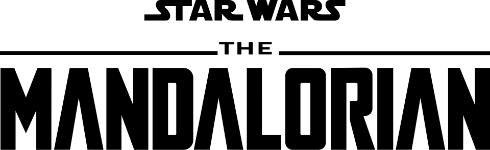
- MANDALORIAN wordmark: Modified Agency FB (community identification)
Try the free alternatives
Type anything to see it in each free font. Select a font's name to test it further and download it.
-
The Mandalorian
-
The Mandalorian
-
The Mandalorian
-
The Mandalorian
MANDALORIAN wordmark
| What it is | A typeface that was altered for this title |
|---|---|
| Typeface | Agency FB |
| Foundry | Font Bureau |
| Licence | Commercial: sold by the foundry, and most uses need a paid licence. |
Community identification Agreed by people who identify fonts, with no official word.
Two DaFont threads on this logo identify it as Agency FB with changes: the middle of the M drawn down to a point and the bar removed from the A. Beside a specimen of Agency FB Bold the logo shows the same narrow D, O and R with square shoulders and rounded corners. Lucasfilm has not named a typeface, and the small STAR WARS above it is the film wordmark.
Sources: Mandalorian logo font (DaFont forum), The Mandalorian Font? (DaFont forum), Agency FB (Adobe Fonts)
License Agency FB from Font Bureau
Fan-made replicas
Fonts made by fans to recreate this lettering. They are not official, and each author sets their own terms.
- Mandalore by Iconian Fonts. Donationware: free to use, and the author asks for a donation.
Sources: Mandalore by Iconian Fonts (DaFont), The Mandalorian - Similar Font? (DaFont forum)
Free alternatives
-
Teko, weight 700 Similar
At weight 700 it has the logo's squared D, O and R with rounded corners and even, heavy strokes. It is a little wider, its M has a short middle and its A keeps the bar.
Compared by eye against the original.
-
Saira Extra Condensed, weight 700 Similar
At weight 700 it is as narrow as the logo, with flat-sided round letters. Its corners are rounder and the strokes slightly lighter.
Compared by eye against the original.
-
Khand, weight 700 Similar
At weight 700 it is a compact, square-shouldered sans of the right weight. Its curves are softer and the N and M are wider than the logo's.
Compared by eye against the original.
-
Big Shoulders Display, weight 800 Same mood
At weight 800 it is a tall, narrow industrial sans that gives the same title-card feel. Its strokes are thinner and its letters much narrower than the logo's.
Compared by eye against the original.
What the labels mean
- Community identification: Agreed by people who identify fonts, with no official word.
- Similar: The same style, with differences you can see.
- Same mood: Gives the same feel without being a look-alike.
What we link to
We link only to owners (the rights holder, the foundry or its official reseller) and to designers' own pages, and we host a fan-made font only with its designer's permission. Every free alternative is published under an open licence and downloads from its page on this site.
More from Star Wars
- Star Wars Jedi: Fallen Order (2019, game) STAR WARS wordmark in the logo: Custom lettering
- Star Wars: The Force Awakens (2015, film) STAR WARS wordmark in the logo: Custom lettering
- The Empire Strikes Back (1980, film) STAR WARS wordmark framing the logo: Custom lettering
- Star Wars (1977, film) STAR WARS logo: Custom lettering
The Mandalorian and Star Wars are trademarks of Lucasfilm Ltd. Simple But How is not affiliated with or endorsed by Lucasfilm Ltd.