
Stranger Things (2016) fonts
Netflix series created by the Duffer Brothers; the main title sequence was made by Imaginary Forces.
- TV show
- 2016
- Stranger Things
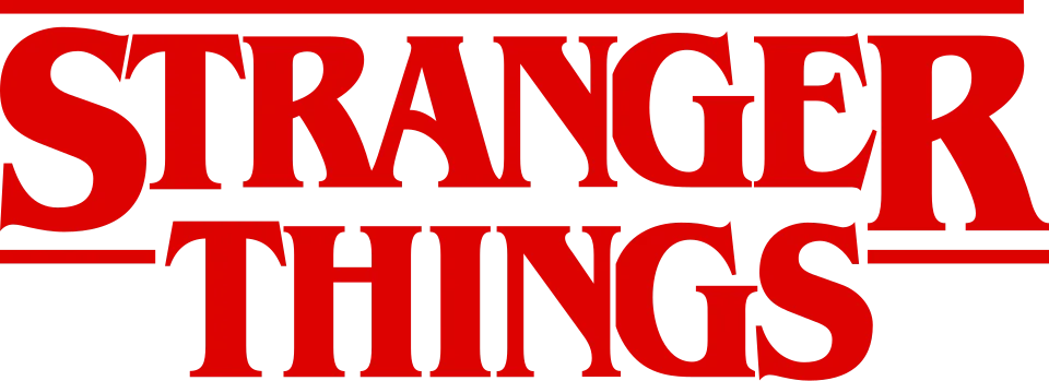
- Series logo and main title: Modified ITC Benguiat (confirmed)
- Cast names in the opening titles: ITC Avant Garde Gothic (confirmed)
- Chapter title cards: ITC Benguiat Bold (community identification)
- End credits: ITC Benguiat Bold (community identification)
Try the free alternatives
Type anything to see it in each free font suggested for the lettering you pick. Select a font's name to test it further and download it.
-
Stranger Things
-
Stranger Things
-
Stranger Things
-
Stranger Things
-
Stranger Things
Series logo and main title
| What it is | A typeface that was altered for this title |
|---|---|
| Typeface | ITC Benguiat |
| Designer | Ed Benguiat |
| Foundry | ITC (International Typeface Corporation) |
| Licence | Commercial: sold by the foundry, and most uses need a paid licence. |
Confirmed Stated by the rights holder, the designer, the foundry or official brand material.
PRINT's account of the logo quotes Jacob Boghosian of the agency Contend, whose team designed it: out of more than 20 options the ITC Benguiat one was chosen, and its contours were adjusted to make the lockup. Communication Arts' credits for the Imaginary Forces title sequence list Benguiat, and Fonts In Use files the titles under ITC Benguiat. Set in ITC Benguiat Bold in the reseller's type tester, every letter of the title matches; the logo drops the first S and the last R of STRANGER below the baseline, closes up the spacing and shows the letters as glowing outlines.
Sources: The Stranger Things Logo: From Type to Title (PRINT Magazine), Stranger Things titles (Communication Arts), Stranger Things (Fonts In Use), View LA Reflections: Stranger Things' Emmy-winning titles (Type Directors Club), ITC Benguiat by ITC (MyFonts)
License ITC Benguiat from ITC (International Typeface Corporation)
Free alternatives
-
Young Serif Similar
A single heavy weight with stubby wedge serifs and an R whose leg kicks outward, which gives much of the colour of Benguiat Bold. Its capitals are wider and more even, without Benguiat's narrow E and S or its Art Nouveau tension.
Compared by eye against the original.
-
Rakkas Similar
Compact, heavy capitals with tapered strokes and a tight fit, close to the dense texture of Benguiat Bold. It is more calligraphic: the strokes swell and thin more, and the serifs are smaller and sharper.
Compared by eye against the original.
-
Fraunces, weight 900 Similar
At weight 900 it is a soft, heavy old-style serif with bracketed wedge serifs and a similar blackness. It is wider than Benguiat, and its S and G are rounder.
Compared by eye against the original.
-
Elsie, weight 900 Same mood
At weight 900 its narrow capitals and close spacing echo Benguiat's proportions. The thick-thin contrast is far stronger and the serifs are hairlines, so it reads as a fashion Didone and not as a look-alike.
Compared by eye against the original.
-
Chonburi Same mood
A heavy display serif with a similar poster weight and a retro feel. Its contrast is much higher and its serifs are thin flat slabs where Benguiat's are stubby wedges.
Compared by eye against the original.
Cast names in the opening titles
| What it is | A retail typeface |
|---|---|
| Typeface | ITC Avant Garde Gothic |
| Designer | Herb Lubalin and Tom Carnase |
| Foundry | ITC (International Typeface Corporation) |
| Licence | Commercial: sold by the foundry, and most uses need a paid licence. |
Confirmed Stated by the rights holder, the designer, the foundry or official brand material.
Communication Arts' entry for the title sequence, which carries Imaginary Forces' credit list, names Avant Garde and Benguiat as its two typefaces; the title is the Benguiat, which leaves Avant Garde for the names. The weight is a community detail: in the comments on the Fonts In Use entry, Florian Hardwig identifies the cast names as ITC Avant Garde Gothic Bold, after a reader found that the R ruled out Arial. We had no frame of the sequence to check against a specimen ourselves.
Sources: Stranger Things titles (Communication Arts), Stranger Things (Fonts In Use), ITC Avant Garde Gothic in use (Fonts In Use), ITC Avant Garde Gothic by ITC (MyFonts)
License ITC Avant Garde Gothic from ITC (International Typeface Corporation)
Free alternatives
-
League Spartan, weight 700 Similar
At weight 700 it has the same geometric build as Avant Garde Bold: a circular O, a straight-legged R and strokes of even thickness. Its capitals are a little narrower and it is spaced more openly.
Compared by eye against the original.
-
Poppins, weight 700 Similar
At weight 700 a geometric sans with near-circular O and D and uniform strokes, close in colour to Avant Garde Bold. It reads slightly wider and its spacing is looser.
Compared by eye against the original.
-
Outfit, weight 700 Similar
At weight 700 a clean geometric sans with round bowls and compact capitals. Its strokes are a touch lighter than Avant Garde Bold at the same size.
Compared by eye against the original.
-
Urbanist, weight 700 Similar
At weight 700 it shares the circular bowls and monoline strokes. It is narrower than Avant Garde, most visibly in W, N and D.
Compared by eye against the original.
Chapter title cards
| What it is | A retail typeface |
|---|---|
| Typeface | ITC Benguiat Bold |
| Designer | Ed Benguiat |
| Foundry | ITC (International Typeface Corporation) |
| Licence | Commercial: sold by the foundry, and most uses need a paid licence. |
Community identification Agreed by people who identify fonts, with no official word.
A DaFont forum thread about a chapter title card (Chapter Five) is marked as identified with Benguiat. We set CHAPTER FIVE in ITC Benguiat Bold in the reseller's type tester and the letters match the card, including the C, A, P and R. No statement from Netflix or Imaginary Forces covers the chapter cards specifically.
Sources: Font chapter stranger things (DaFont forum), ITC Benguiat by ITC (MyFonts)
License ITC Benguiat Bold from ITC (International Typeface Corporation)
Free alternatives
-
Young Serif Similar
A single heavy weight with stubby wedge serifs and an R whose leg kicks outward, which gives much of the colour of Benguiat Bold. Its capitals are wider and more even, without Benguiat's narrow E and S or its Art Nouveau tension.
Compared by eye against the original.
-
Rakkas Similar
Compact, heavy capitals with tapered strokes and a tight fit, close to the dense texture of Benguiat Bold. It is more calligraphic: the strokes swell and thin more, and the serifs are smaller and sharper.
Compared by eye against the original.
-
Fraunces, weight 900 Similar
At weight 900 it is a soft, heavy old-style serif with bracketed wedge serifs and a similar blackness. It is wider than Benguiat, and its S and G are rounder.
Compared by eye against the original.
-
Elsie, weight 900 Same mood
At weight 900 its narrow capitals and close spacing echo Benguiat's proportions. The thick-thin contrast is far stronger and the serifs are hairlines, so it reads as a fashion Didone and not as a look-alike.
Compared by eye against the original.
-
Chonburi Same mood
A heavy display serif with a similar poster weight and a retro feel. Its contrast is much higher and its serifs are thin flat slabs where Benguiat's are stubby wedges.
Compared by eye against the original.
End credits
| What it is | A retail typeface |
|---|---|
| Typeface | ITC Benguiat Bold |
| Designer | Ed Benguiat |
| Foundry | ITC (International Typeface Corporation) |
| Licence | Commercial: sold by the foundry, and most uses need a paid licence. |
Community identification Agreed by people who identify fonts, with no official word.
In the comments on the Fonts In Use entry, Matthijs Sluiter reports that the end credits are set in Benguiat Bold and adds a video of them to the entry. Neither Netflix nor the title studio has said so, and we did not check a frame ourselves.
Sources: Stranger Things (Fonts In Use), ITC Benguiat by ITC (MyFonts)
License ITC Benguiat Bold from ITC (International Typeface Corporation)
Free alternatives
-
Young Serif Similar
A single heavy weight with stubby wedge serifs and an R whose leg kicks outward, which gives much of the colour of Benguiat Bold. Its capitals are wider and more even, without Benguiat's narrow E and S or its Art Nouveau tension.
Compared by eye against the original.
-
Rakkas Similar
Compact, heavy capitals with tapered strokes and a tight fit, close to the dense texture of Benguiat Bold. It is more calligraphic: the strokes swell and thin more, and the serifs are smaller and sharper.
Compared by eye against the original.
-
Fraunces, weight 900 Similar
At weight 900 it is a soft, heavy old-style serif with bracketed wedge serifs and a similar blackness. It is wider than Benguiat, and its S and G are rounder.
Compared by eye against the original.
-
Elsie, weight 900 Same mood
At weight 900 its narrow capitals and close spacing echo Benguiat's proportions. The thick-thin contrast is far stronger and the serifs are hairlines, so it reads as a fashion Didone and not as a look-alike.
Compared by eye against the original.
-
Chonburi Same mood
A heavy display serif with a similar poster weight and a retro feel. Its contrast is much higher and its serifs are thin flat slabs where Benguiat's are stubby wedges.
Compared by eye against the original.
What the labels mean
- Confirmed: Stated by the rights holder, the designer, the foundry or official brand material.
- Community identification: Agreed by people who identify fonts, with no official word.
- Similar: The same style, with differences you can see.
- Same mood: Gives the same feel without being a look-alike.
What we link to
We link only to owners (the rights holder, the foundry or its official reseller) and to designers' own pages, and we host a fan-made font only with its designer's permission. Every free alternative is published under an open licence and downloads from its page on this site.
More from Stranger Things
- Stranger Things 5 (2025, TV show) Series logo with the numeral 5: Modified ITC Benguiat
- Stranger Things 3: The Game (2019, game) Series logo and THE GAME line on the cover art: Modified ITC Benguiat
- Stranger Things: Suspicious Minds (2019, book) Series logo and SUSPICIOUS MINDS title on the cover: Modified ITC Benguiat
- Stranger Things 2 (2017, TV show) Series logo with the numeral 2: Modified ITC Benguiat
Stranger Things is a trademark of Netflix. Simple But How is not affiliated with or endorsed by Netflix.