
Stranger Things 5 font
Fifth and final season of the Netflix series, released in November and December 2025.
- TV show
- 2025
- Stranger Things
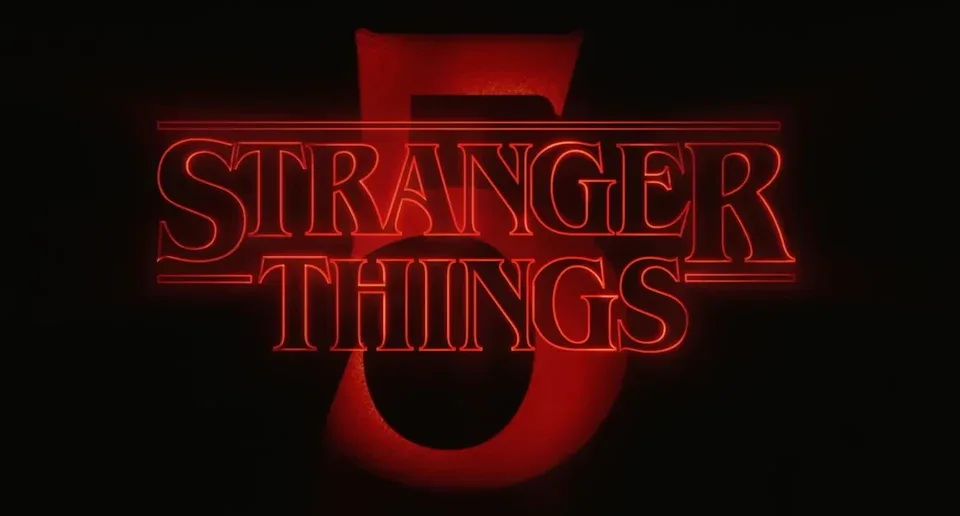
- Series logo with the numeral 5: Modified ITC Benguiat (our visual match)
Try the free alternatives
Type anything to see it in each free font. Select a font's name to test it further and download it.
-
Stranger Things 5
-
Stranger Things 5
-
Stranger Things 5
-
Stranger Things 5
-
Stranger Things 5
Series logo with the numeral 5
| What it is | A typeface that was altered for this title |
|---|---|
| Typeface | ITC Benguiat |
| Designer | Ed Benguiat |
| Foundry | ITC (International Typeface Corporation) |
| Licence | Commercial: sold by the foundry, and most uses need a paid licence. |
Our visual match Our own judgement after comparing the lettering side by side.
No source we found discusses the season 5 logo. On the poster the wordmark is, by our own comparison, the unchanged series logo, which its designers at Contend describe as ITC Benguiat with adjusted contours. A large red 5 sits behind it, as the 2 did in season 2; at poster size we could not match that numeral to a particular Benguiat style.
Sources: The Stranger Things Logo: From Type to Title (PRINT Magazine), Stranger Things (Fonts In Use), ITC Benguiat by ITC (MyFonts)
License ITC Benguiat from ITC (International Typeface Corporation)
Free alternatives
-
Young Serif Similar
A single heavy weight with stubby wedge serifs and an R whose leg kicks outward, which gives much of the colour of Benguiat Bold. Its capitals are wider and more even, without Benguiat's narrow E and S or its Art Nouveau tension.
Compared by eye against the original.
-
Rakkas Similar
Compact, heavy capitals with tapered strokes and a tight fit, close to the dense texture of Benguiat Bold. It is more calligraphic: the strokes swell and thin more, and the serifs are smaller and sharper.
Compared by eye against the original.
-
Fraunces, weight 900 Similar
At weight 900 it is a soft, heavy old-style serif with bracketed wedge serifs and a similar blackness. It is wider than Benguiat, and its S and G are rounder.
Compared by eye against the original.
-
Elsie, weight 900 Same mood
At weight 900 its narrow capitals and close spacing echo Benguiat's proportions. The thick-thin contrast is far stronger and the serifs are hairlines, so it reads as a fashion Didone and not as a look-alike.
Compared by eye against the original.
-
Chonburi Same mood
A heavy display serif with a similar poster weight and a retro feel. Its contrast is much higher and its serifs are thin flat slabs where Benguiat's are stubby wedges.
Compared by eye against the original.
What the labels mean
- Our visual match: Our own judgement after comparing the lettering side by side.
- Similar: The same style, with differences you can see.
- Same mood: Gives the same feel without being a look-alike.
What we link to
We link only to owners (the rights holder, the foundry or its official reseller) and to designers' own pages, and we host a fan-made font only with its designer's permission. Every free alternative is published under an open licence and downloads from its page on this site.
More from Stranger Things
- Stranger Things 3: The Game (2019, game) Series logo and THE GAME line on the cover art: Modified ITC Benguiat
- Stranger Things: Suspicious Minds (2019, book) Series logo and SUSPICIOUS MINDS title on the cover: Modified ITC Benguiat
- Stranger Things 2 (2017, TV show) Series logo with the numeral 2: Modified ITC Benguiat
- Stranger Things (2016, TV show) Series logo and main title: Modified ITC Benguiat
Stranger Things 5 and Stranger Things are trademarks of Netflix. Simple But How is not affiliated with or endorsed by Netflix.