
The Hunger Games fonts
The books and the films use unrelated lettering. Scholastic's covers set the titles in a customised cut of P22 Constructivist Square, a blocky face modelled on early Soviet poster lettering, with the author's name in Liquorstore and the text in Adobe Garamond Pro; we read all three names from Scholastic's own sample chapters. The Lionsgate films switched to Bank Gothic, a wide squared sans from 1930, and have kept it from the first film in 2012 to The Ballad of Songbirds & Snakes.
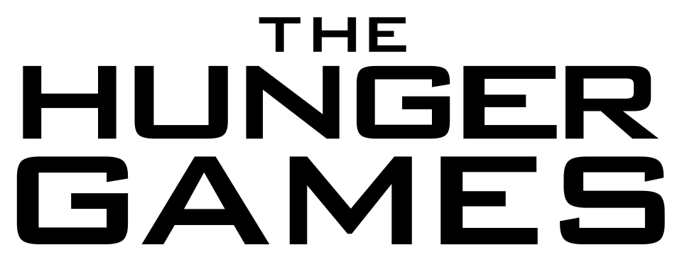
Films
Books
The Hunger Games is a trademark of District 12, LLC (Suzanne Collins) and Lionsgate. Simple But How is not affiliated with or endorsed by District 12, LLC (Suzanne Collins) and Lionsgate.