
The Hunger Games: The Ballad of Songbirds & Snakes fonts
Prequel film directed by Francis Lawrence for Lionsgate, from Suzanne Collins's 2020 novel.
- Film
- 2023
- The Hunger Games
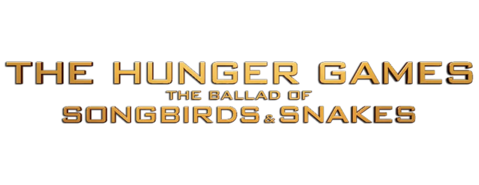
- Film logo: Bank Gothic (our visual match)
- Capitol television captions in the film: Senator (our visual match)
Try the free alternatives
Type anything to see it in each free font suggested for the lettering you pick. Select a font's name to test it further and download it.
-
The Hunger Games: The Ballad of Songbirds & Snakes
-
The Hunger Games: The Ballad of Songbirds & Snakes
-
The Hunger Games: The Ballad of Songbirds & Snakes
-
The Hunger Games: The Ballad of Songbirds & Snakes
Film logo
| What it is | A retail typeface |
|---|---|
| Typeface | Bank Gothic |
| Designer | Morris Fuller Benton |
| Foundry | Bitstream (first cast by American Type Founders) |
| Licence | Commercial: sold by the foundry, and most uses need a paid licence. |
Our visual match Our own judgement after comparing the lettering side by side.
We found no thread or article about this film's logo. By our own comparison its three lines, THE HUNGER GAMES, THE BALLAD OF and SONGBIRDS & SNAKES, are the same wide squared capitals as the earlier film logos, which the DaFont forum identifies as Bank Gothic. This entry carries that identification over.
Sources: The Hunger Games (DaFont forum), Hunger Games Catching Fire (DaFont forum), Bank Gothic by Bitstream (MyFonts)
License Bank Gothic from Bitstream (first cast by American Type Founders)
Free alternatives
-
Goldman, weight 700 Similar
At weight 700 it is a wide, heavy sans with squared curves and flat terminals, near the weight of the film logo. Its corners are rounder and its letters a little narrower.
Compared by eye against the original.
-
Aldrich Similar
A wide, square-shouldered sans with the same engineered look as Bank Gothic. It is lighter than the logo and has lowercase, which Bank Gothic lacks.
Compared by eye against the original.
-
Orbitron, weight 700 Similar
At weight 700 its capitals are wide rounded rectangles with level stroke endings. The shapes are more geometric and futuristic than Bank Gothic's.
Compared by eye against the original.
-
Michroma Same mood
Very wide capitals with squared curves that give the same broad, technical title. Its strokes are far thinner than the logo's.
Compared by eye against the original.
Capitol television captions in the film
| What it is | A retail typeface |
|---|---|
| Typeface | Senator |
| Designer | Zuzana Licko |
| Foundry | Emigre |
| Licence | Commercial: sold by the foundry, and most uses need a paid licence. |
Our visual match Our own judgement after comparing the lettering side by side.
A DaFont thread shows a frame of the Capitol broadcast, with the captions LUCY GRAY BAIRD, DISTRICT 12 and DONATIONS 1889 on a television screen; its only answer, from one member, names Emigre's Senator, and the thread is marked identified on that word. The label rests on our comparison with Emigre's specimen images: the narrow capitals with small triangular serifs and the straight-backed D with cut corners agree. The film's makers have not named it.
Sources: Hunger Games prequel font (DaFont forum), Senator (Emigre)
Free alternatives
-
Kelly Slab Similar
Narrow capitals of even stroke weight with small square serifs, close in proportion to the captions. Its serifs are flat slabs where Senator's are small triangles.
Compared by eye against the original.
-
Amarante Same mood
A narrow display face with flared, sharp-ended strokes that suits the same period-poster look. Its strokes vary much more in thickness.
Compared by eye against the original.
-
Stint Ultra Condensed Same mood
Tall slab-serif capitals that give a similar old broadcast-caption feel. It is far narrower than the captions.
Compared by eye against the original.
What the labels mean
- Our visual match: Our own judgement after comparing the lettering side by side.
- Similar: The same style, with differences you can see.
- Same mood: Gives the same feel without being a look-alike.
What we link to
We link only to owners (the rights holder, the foundry or its official reseller) and to designers' own pages, and we host a fan-made font only with its designer's permission. Every free alternative is published under an open licence and downloads from its page on this site.
More from The Hunger Games
- The Hunger Games: Catching Fire (2013, film) THE HUNGER GAMES and CATCHING FIRE lines of the logo: Bank Gothic
- The Hunger Games (2012, film) THE HUNGER GAMES logo: Bank Gothic
- Mockingjay (2010, book) Cover title: Modified P22 Constructivist Square
- The Hunger Games (2008, book) Cover title: Modified P22 Constructivist Square
The Hunger Games: The Ballad of Songbirds & Snakes and The Hunger Games are trademarks of District 12, LLC (Suzanne Collins) and Lionsgate. Simple But How is not affiliated with or endorsed by District 12, LLC (Suzanne Collins) and Lionsgate.