
The Book of Boba Fett font
Disney+ spin-off of The Mandalorian, announced in December 2020 and released from December 2021.
- TV show
- 2021
- The Mandalorian
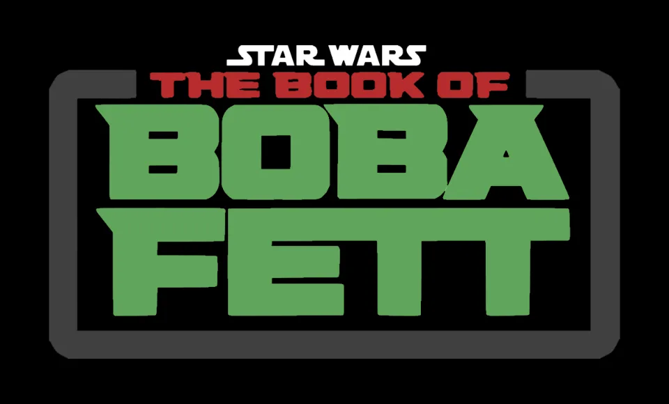
- BOBA FETT logo: Modified Hunterra (our visual match)
Try the free alternatives
Type anything to see it in each free font. Select a font's name to test it further and download it.
-
The Book of Boba Fett
-
The Book of Boba Fett
-
The Book of Boba Fett
-
The Book of Boba Fett
BOBA FETT logo
| What it is | A typeface that was altered for this title |
|---|---|
| Typeface | Hunterra |
| Foundry | Variatype |
| Licence | Commercial: sold by the foundry, and most uses need a paid licence. |
Our visual match Our own judgement after comparing the lettering side by side.
One DaFont thread about this logo names Hunterra Heavy Expanded, and nobody else there confirmed it, so the label rests on our own comparison. Against the reseller's specimens the logo shares Hunterra's very wide, flat-sided letters, the rectangular O with a square counter, and the slanted spur on the top left of B and F. The logo's A is a symmetrical trapezoid with a small triangular counter, unlike the lopsided A in the specimens, so the letters were redrawn or the match is only partial. Lucasfilm has not named a typeface.
Sources: Star Wars The Book of Boba Fett (DaFont forum), Hunterra by Variatype (YouWorkForThem), Hunterra (MyFonts)
License Hunterra from Variatype
Free alternatives
-
Russo One Similar
Heavy, wide capitals with squared bowls on B and a flat-topped A, close to the logo's weight. Its O has rounded corners and a rounded counter, and it has no spurs on B or F.
Compared by eye against the original.
-
Goldman, weight 700 Similar
At weight 700 it is as broad as the logo, with long flat tops on B, E and T. Its O is an oval and the stroke ends flare slightly.
Compared by eye against the original.
-
Orbitron, weight 900 Similar
At weight 900 its O is a rounded rectangle and its E and F have long level arms like the logo's. The strokes are thinner and the A has a flat top open at the base.
Compared by eye against the original.
-
Black Ops One Same mood
Blocky military capitals with angled cuts that echo the logo's spurs. The stencil breaks through every letter set it apart at once.
Compared by eye against the original.
What the labels mean
- Our visual match: Our own judgement after comparing the lettering side by side.
- Similar: The same style, with differences you can see.
- Same mood: Gives the same feel without being a look-alike.
What we link to
We link only to owners (the rights holder, the foundry or its official reseller) and to designers' own pages, and we host a fan-made font only with its designer's permission. Every free alternative is published under an open licence and downloads from its page on this site.
More from The Mandalorian
The Book of Boba Fett and The Mandalorian are trademarks of Lucasfilm. Simple But How is not affiliated with or endorsed by Lucasfilm.