
The Mandalorian (2019) font
Live-action Star Wars series created by Jon Favreau, on Disney+ from November 2019.
- TV show
- 2019
- The Mandalorian
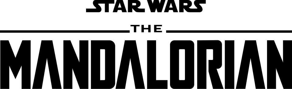
- MANDALORIAN wordmark: Modified Agency FB (community identification)
Try the free alternatives
Type anything to see it in each free font. Select a font's name to test it further and download it.
-
The Mandalorian
-
The Mandalorian
-
The Mandalorian
-
The Mandalorian
MANDALORIAN wordmark
| What it is | A typeface that was altered for this title |
|---|---|
| Typeface | Agency FB |
| Foundry | Font Bureau |
| Licence | Commercial: sold by the foundry, and most uses need a paid licence. |
Community identification Agreed by people who identify fonts, with no official word.
Two DaFont threads about this logo, answered by different regulars, identify it as Agency FB with changes: the middle of the M drawn down to a point and the bar taken out of the A. The logo has the narrow, square-shouldered D, O and R with rounded corners that Agency FB Bold has. Lucasfilm has not named a typeface, and the small STAR WARS above it is the film wordmark.
Sources: Mandalorian logo font (DaFont forum), The Mandalorian Font? (DaFont forum), Agency FB (Adobe Fonts)
License Agency FB from Font Bureau
Fan-made replicas
Fonts made by fans to recreate this lettering. They are not official, and each author sets their own terms.
- Mandalore by Iconian Fonts. Donationware: free to use, and the author asks for a donation.
Sources: Mandalore by Iconian Fonts (DaFont), The Mandalorian - Similar Font? (DaFont forum)
Free alternatives
-
Teko, weight 700 Similar
At weight 700 it has the logo's squared D, O and R with rounded corners and even, heavy strokes. It is a little wider, its M has a short middle and its A keeps the bar.
Compared by eye against the original.
-
Saira Extra Condensed, weight 700 Similar
At weight 700 it is as narrow as the logo, with flat-sided round letters. Its corners are rounder and the strokes slightly lighter.
Compared by eye against the original.
-
Khand, weight 700 Similar
At weight 700 it is a compact, square-shouldered sans of the right weight. Its curves are softer and the N and M are wider than the logo's.
Compared by eye against the original.
-
Big Shoulders Display, weight 800 Same mood
At weight 800 it is a tall, narrow industrial sans that gives the same title-card feel. Its strokes are thinner and its letters much narrower than the logo's.
Compared by eye against the original.
What the labels mean
- Community identification: Agreed by people who identify fonts, with no official word.
- Similar: The same style, with differences you can see.
- Same mood: Gives the same feel without being a look-alike.
What we link to
We link only to owners (the rights holder, the foundry or its official reseller) and to designers' own pages, and we host a fan-made font only with its designer's permission. Every free alternative is published under an open licence and downloads from its page on this site.
More from The Mandalorian
The Mandalorian is a trademark of Lucasfilm. Simple But How is not affiliated with or endorsed by Lucasfilm.