
Twilight fonts
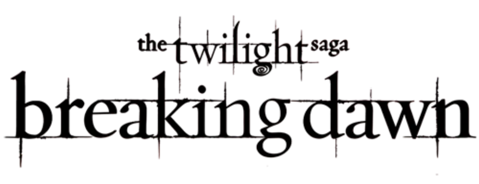
The Twilight novels set their lowercase titles in Zephyr, a calligraphic roman by Gábor Kóthay sold by P22, which names the books as a use of the font. The films did not reuse it: their logo is, by our own comparison, custom lettering in a Garamond-like old-style serif, scratched with long thin spikes and finished with a spiral under the g, and each sequel adds its own title in the same style. No designer or studio statement names a typeface for the film lettering, and we could not tie any of the look-alike fonts sold or shared under Twilight names to the studio.
Films
Books
Twilight is a trademark of Summit Entertainment. Simple But How is not affiliated with or endorsed by Summit Entertainment.